


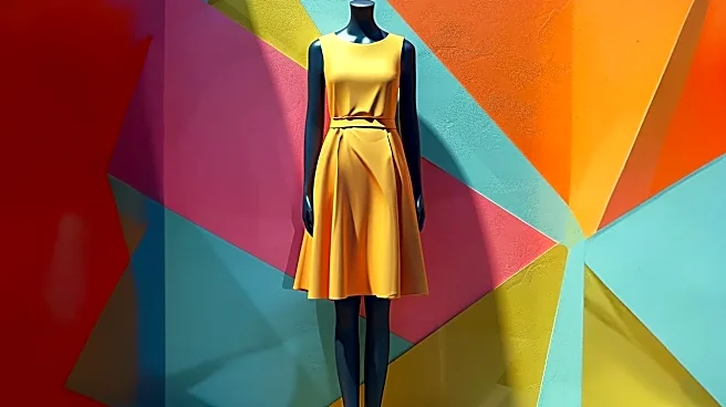
This Season’s Daring Duos
Fashion Week for Spring/Summer 2027 is sending a clear message: it's time to play with color. Forget quiet luxury's muted tones; designers are pairing shades in ways that feel both surprising and exciting. We're seeing a mix of earthy, grounded colors
and vibrant, digital-inspired brights. Two of the most talked-about combinations emerging from the runways are Terracotta and Luminous Blue, and Deep Purple with Butter Yellow. Terracotta, a warm, earthy red-brown, provides a stable base, while Luminous Blue, a vibrant cobalt, adds an electric, futuristic pop. The other key pairing matches the richness of Deep Purple, an almost-neutral aubergine shade, with the softness of a pale, creamy Butter Yellow, creating a look that’s sophisticated yet unexpected.
The 'Digital Drape' Test
So, how do you know if Terracotta and Luminous Blue will make you shine or just wash you out? The answer is a simple, zero-cost method I call the 'Digital Drape' test. It’s a modern take on the classic color analysis technique where stylists drape fabric swatches around your face to see how colors reflect on your skin. Instead of needing physical fabric, all you need is your phone. This quick process helps you see—in a real, tangible way—how a color interacts with your unique complexion before you even think about hitting the stores or adding to your online cart.
Step 1: Find Your Colors
Your first step is to gather your digital 'swatches.' Open your web browser and search for the trending colors. For the best results, use specific shade names like "Luminous Blue color swatch" or "Terracotta solid color." You want to find clean, high-resolution images that show a large block of the pure color, without patterns, gradients, or text. Look for the official Pantone references if you can find them for maximum accuracy. Save these color blocks to your phone’s photo library. Do this for each color in a trending combination, like Terracotta, Luminous Blue, Deep Purple, and Butter Yellow.
Step 2: Take a Neutral-Light Selfie
This is the most critical part of the process. Find a spot with good, natural, indirect light—near a window but not in a direct sunbeam is perfect. Make sure your face is evenly lit. Pull your hair back and remove any makeup and jewelry. You want to see how these colors react with your natural skin tone, not your foundation. Wear a neutral top, like a simple white, gray, or black t-shirt. Now, take a clear, forward-facing photo of your face and shoulders from the chest up. A neutral expression works best.
Step 3: Drape and Observe
Now, open your selfie in a photo editing app or even your phone's built-in markup tool. Import one of your saved color swatch images and place it next to your face, covering a large portion of the screen. Look closely. How does your skin react? A flattering color will make your complexion look brighter and more awake. Your eyes might look clearer and your features more defined. A color that doesn’t work for you might cast unflattering shadows, highlight blemishes or under-eye circles, or make your skin appear sallow, gray, or overly red. Swipe through the colors. Try placing two combination colors, like Terracotta and Luminous Blue, on either side of your face to see how they work together near your skin.
From Test to Wardrobe
Once you've identified which trending colors give you that 'glow,' you can shop with confidence. If a bold combination like Deep Purple and Butter Yellow both passed the test, you can try a full color-blocked outfit. If only one of the colors worked well, use that as your main piece and incorporate the other as a small accessory, like a handbag, belt, or shoe, worn away from your face. For example, a Luminous Blue dress would be stunning on someone who it flatters, while someone else might be better served by a neutral outfit with Luminous Blue heels. This test isn't about saying 'no' to trends; it's about finding the smartest way to say 'yes' for you.