





A monochromatic or tonal outfit screams confidence and sophistication. But there's a fine line between looking elegantly streamlined and looking... flat. The secret to avoiding the bland is understanding visual hierarchy—and it’s not all about color.
First, What Is Visual Hierarchy?
In design, visual hierarchy is the principle of arranging elements to show their order of importance. It’s what tells your eye where to look first, second, and third. In an outfit, it means creating a focal point and a clear visual flow. High-contrast pairings—like a black jacket over a white shirt—do this easily. But when you’re dressing in similar shades of cream, gray, or navy, you can’t rely on color to do the work. Instead, you have to create that same 'look here first' effect using other tools that add depth and interest. A successful low-contrast look feels intentional, not like a mistake. It’s a quiet statement that proves style is about more than just bold colors.
The Power of Texture
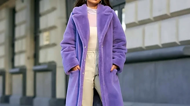
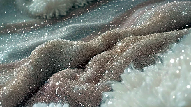
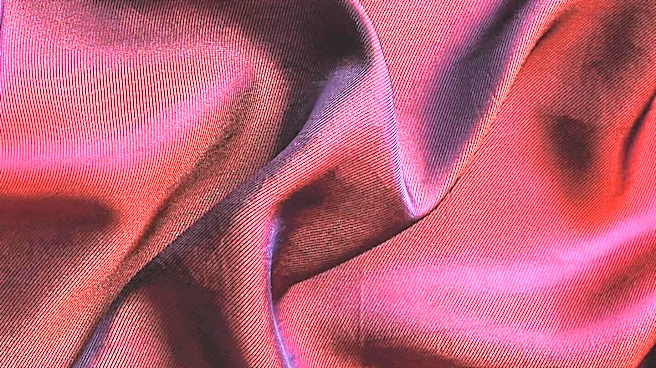
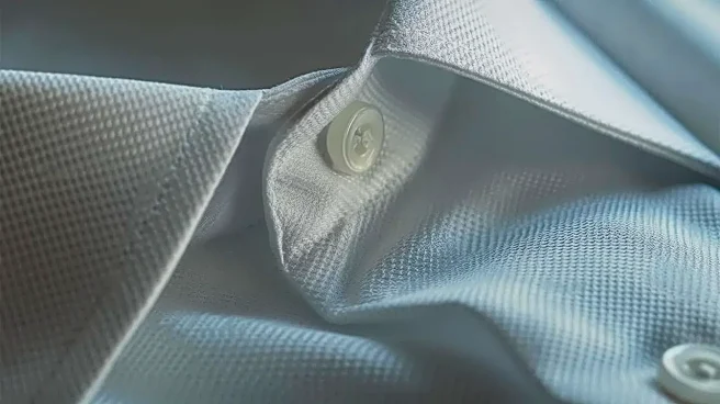
This is the cardinal rule of tonal dressing. Mixing different textures is what prevents a single-color outfit from looking one-dimensional. It creates a subtle, touchable form of contrast. Imagine an all-black outfit: a chunky wool sweater, sleek leather pants, and suede boots. Each piece is black, but the way they absorb and reflect light is completely different. The matte softness of the wool plays against the sheen of the leather and the deep, flat black of the suede. This variation gives the eye plenty of interest to keep it moving, creating a rich and dynamic look without introducing a new color. Think about combining knits with silk, denim with cashmere, or linen with soft cotton.
Play with Silhouette and Proportion
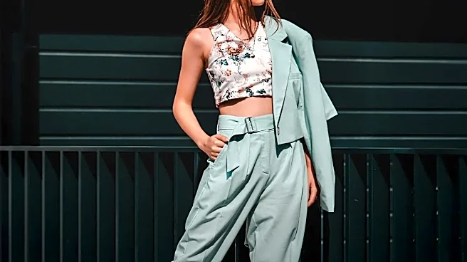
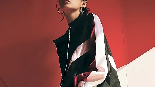
When color contrast is off the table, the shape of your clothes becomes a primary tool. Silhouette is the overall outline your body creates, and it’s one of the first things people notice, even from a distance. You can create a strong visual hierarchy by playing with proportions. For instance, pair wide-leg trousers with a form-fitting top. The difference in volume creates a clear point of emphasis. A blazer with a strong, structured shoulder over a soft, draped dress does the same thing. One element has a defined shape, while the other is more fluid. This creates an architectural interest that guides the eye and prevents the entire look from feeling like a single, undefined blob.
Use a Strategic 'Hero' Accessory
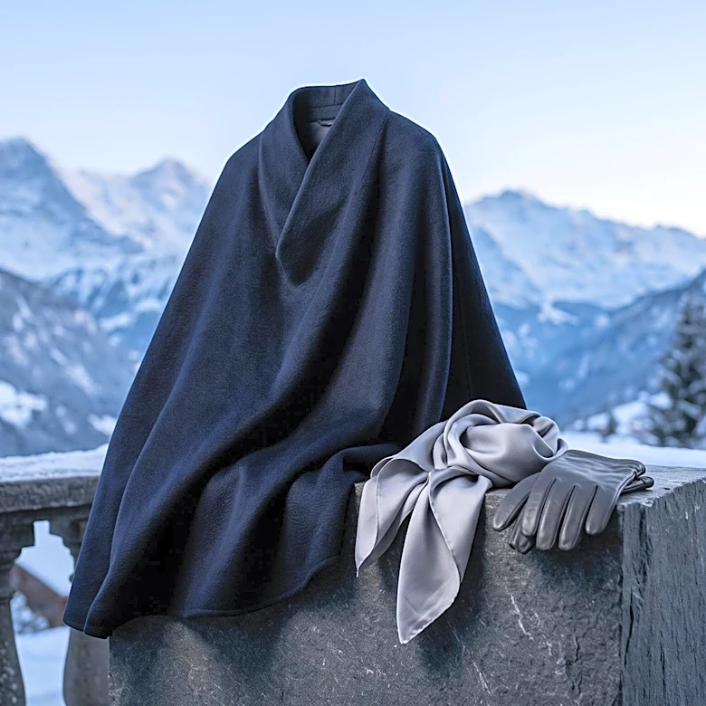
An accessory can act as the designated focal point in a low-contrast outfit. Think of it as your 'hero' piece. In an otherwise seamless sea of beige, a polished tan leather belt does more than just cinch your waist; it creates a clear anchor point for the eye. A single piece of statement jewelry, like sculptural silver earrings or a bold watch, can also serve this purpose. The key is to be intentional. The accessory shouldn't compete with the outfit but complete it. It can either stay within the same color family—like a cream bag with a white outfit—or provide a single, deliberate point of minimal contrast, such as a black bag against an all-gray look.
Vary the Shades and Finishes
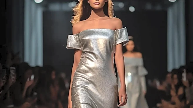
A monochromatic look doesn't have to mean wearing the exact same shade from head to toe. In fact, it often looks more sophisticated when you don't. Playing with different tones and tints within the same color family creates a subtle, gradient-like effect that adds depth. For example, you can build a beautiful earthy look by combining pieces in camel, sand, and ecru. Similarly, pay attention to the finish of your fabrics. A matte fabric next to one with a slight sheen creates its own form of lowkey contrast. Consider a matte crepe trouser with a silk satin camisole in the same hue. The difference is subtle but powerful enough to give the outfit the visual structure it needs.