




Espresso Brown & Sky Blue
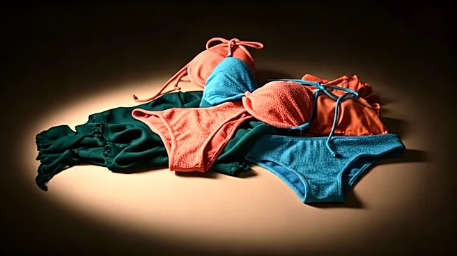
Forget basic black. The new foundation for sophisticated swimwear is a deep, rich espresso brown. On its own, it’s chic and understated, evoking Italian coastal glamour. But when paired with a crisp, optimistic sky blue, something magical happens. The combination
feels both grounded and airy, like a sun-drenched café overlooking the Mediterranean. We saw this in collections where espresso-hued one-pieces featured sharp cutouts revealing a sky-blue lining, or in color-blocked bikinis that felt more like architectural art than simple swimwear. This isn't a loud, attention-seeking palette; it's confident and worldly. It says you follow trends, but you aren't a slave to them. The earthy brown flatters a wide range of skin tones, while the pop of blue adds a necessary touch of vacation-ready brightness.
Chartreuse & Deep Cobalt
If brown and blue is a quiet conversation, chartreuse and cobalt is a joyful shout. This is the pairing for the unapologetically bold. Chartreuse, that electric, yellow-green hue, can be tricky to wear. But when anchored by the depth and intensity of cobalt blue, it becomes instantly modern and surprisingly wearable. Think of a sleek, chartreuse maillot with sharp cobalt straps, or a high-waisted cobalt bottom topped with a vibrant chartreuse bandeau. This combination appeared in the sportier, more athletic-inspired collections, where the high contrast emphasizes clean lines and dynamic shapes. It’s a nod to 80s and 90s color-blocking but refined for a 2020s audience. It feels energetic, futuristic, and radiates a kind of digital-age confidence, perfect for a photo that will stop the scroll.
Terracotta & Muted Lavender
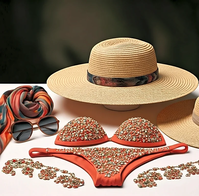
This pairing is pure poetry, capturing the dusky, romantic light of a Miami sunset. Terracotta, with its warm, sun-baked clay tones, has become a staple in swimwear, but it’s the addition of a soft, hazy lavender that gives it an editorial edge. The lavender cuts through the earthiness of the terracotta, adding an ethereal, almost dreamlike quality. This palette is less about sharp contrasts and more about a harmonious blend. On the runway, this manifested in subtle ombré effects, where a terracotta one-piece gently faded into a lavender haze at the edges, or in delicate, floral-like prints where lavender petals were scattered across a terracotta background. It’s a deeply feminine and romantic combination, but in a way that feels natural and effortless, not saccharine. It’s the color story for a slow, golden-hour walk on the beach.
Metallic Silver & Muted Sage
The future of swimwear is here, and it's shimmering. While gold metallics have long been a poolside staple, the cooler, sleeker feel of silver is what’s capturing the editorial imagination. But to keep it from looking like a space-age costume, designers are grounding it with an unexpected partner: muted, dusty sage green. The juxtaposition is brilliant. The liquid shine of the silver provides the high-fashion drama, while the soft, natural sage brings a sense of calm and sophistication. We saw this in collections featuring high-shine silver bikinis with matte sage trim, or in reversible pieces that offered a flash of metallic against a more subdued base. This pairing feels intellectual and coolly detached, perfect for the minimalist who still wants to make an impact. It's less about tropical flamboyance and more about a sleek, almost sculptural approach to beachwear.