


Chocolate Brown & Powder Blue
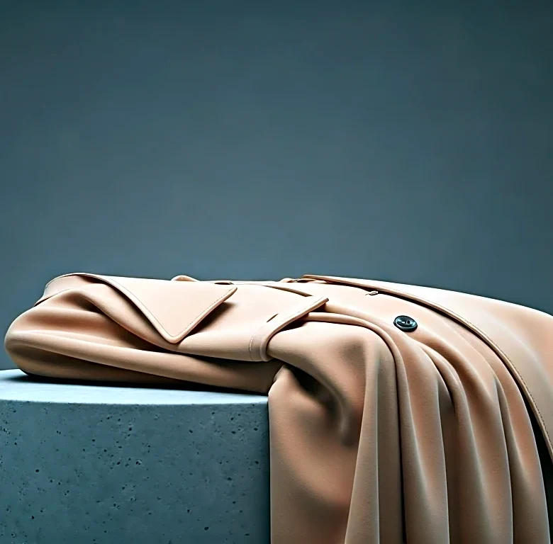
Move over, navy and white. There’s a new preppy-adjacent power couple in town. Chocolate brown, with its rich, earthy depth, found an unlikely partner in the lightest, airiest shades of powder blue. Seen on the runways at legacy houses like Burberry and in the sharp
tailoring of rising stars, this combination feels both nostalgic and utterly modern. It’s a sophisticated pairing that works because it plays with expectations. The deep, grounding brown keeps the delicate blue from feeling too sweet or juvenile. Think of a sharp, chocolate-brown leather trench coat worn over a pale blue silk blouse, or a cozy brown knit paired with light-wash denim. It’s a look that says you appreciate the classics but aren’t afraid to give them a contemporary twist. For those hesitant to dive in, start with accessories: a brown belt with a blue dress, or a sky-blue bag against a brown wool coat.
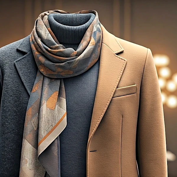
Cherry Red & Camel
While red is a perennial attention-grabber, its pairing this season felt refreshingly understated. Instead of clashing with other brights, vibrant cherry red was frequently grounded by classic, elegant camel. This isn't the loud, look-at-me red of seasons past; it's a confident, grown-up statement. The warmth of the camel provides the perfect neutral canvas, allowing a pop of red to feel intentional and chic, not overwhelming. We saw it in street style outside the shows and in collections that prioritized timelessness, like a camel coat with a flash of red lining or a bright red sweater tucked into tailored camel trousers. This duo is the epitome of quiet luxury with a wink. It feels expensive, polished, and effortlessly cool, proving that sometimes the most impactful statements are made by pairing a bold hue with a steadfast classic.
Pistachio Green & Deep Burgundy
This might be the most daring combination to emerge from London, and it’s a masterclass in tonal tension. Soft, milky pistachio green—a color that screams spring—was thrown into a beautiful contrast with deep, wine-stained burgundy. It’s a pairing that shouldn't work on paper, blending a muted pastel with a rich, heavy jewel tone. But on the runway, it was magic. Designers like JW Anderson have long played with these kinds of off-kilter palettes, and this season others followed suit. The key is in the texture and proportion. A pistachio knit looks incredible with a burgundy leather skirt, or a silk burgundy dress can be modernized with a pistachio-colored handbag. The combination feels intellectual, slightly eccentric, and deeply fashionable. It’s for the person who is tired of predictable color stories and ready to embrace something with more character and depth.
Marigold Yellow & Slate Gray
If you’re looking for a way to inject optimism into your wardrobe without going full-on dopamine-dressing, this is your answer. Bright, sunny marigold yellow was tempered by the cool, industrial seriousness of slate gray. It’s a perfect city-dweller’s combination: the gray speaks to the urban landscape, while the yellow provides a necessary jolt of energy and light. Across London, this pairing showed up in sharp suiting, with gray blazers revealing marigold turtlenecks, and in separates that mixed gray flannel trousers with vibrant yellow silk tops. It’s a practical and powerful duo. The gray anchors the look, making the yellow feel more sophisticated and less whimsical. This is how you wear a “happy” color to the office without feeling out of place. It’s confident, modern, and communicates a sense of creative pragmatism.