


A Brand That Haunts in Unison
Before a single guest screams, a team of designers, artists, and strategists at Universal Creative faces a monumental task: create a single, cohesive identity for Halloween Horror Nights (HHN). This isn't just about a logo; it's about building an entire
visual and emotional universe that can be communicated in a split second on a highway billboard, worn proudly on a T-shirt, and navigated on a park map in the dark. The creative process often starts as early as January, with teams pinning up inspiration boards, debating art styles, and aligning on the year's overarching theme. The goal is to create a consistent thread that weaves through every aspect of the event, from the marketing to the merchandise and even the food and beverage offerings. This ensures that whether you see a social media ad or a piece of concept art, it feels unmistakably like that year's HHN.
The Icon, The Billboard, and The Split-Second Story
Much of the event's branding hinges on its marketing. This is where the annual "icon" often comes into play—an original character created by Universal to serve as the face of the event for that year. Characters like Jack the Clown, The Storyteller, or The Director become the focal point, their stories and aesthetics driving the design of everything from TV commercials to print ads. The challenge for large-scale advertising like billboards is distillation. How do you take the complex lore of a new icon or the terror of ten different haunted houses and boil it down into one image that grabs a driver's attention? The answer lies in powerful, evocative artwork that tells a story instantly. The branding has to be potent enough to be recognizable at 60 miles per hour, creating a sense of dread and excitement that makes people pull out their phones and buy a ticket.
From Wearable Trophies to Functional Art
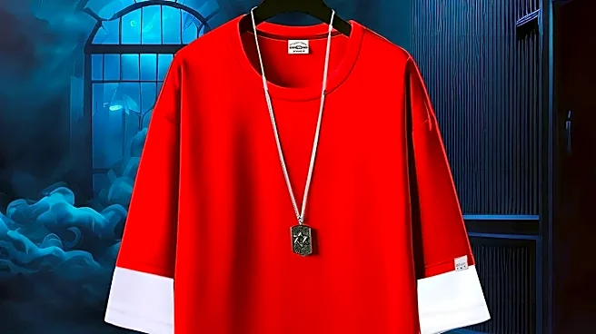
Once guests are through the gates, the branding shifts from attraction to interaction. A T-shirt isn't just a T-shirt; it's a badge of honor, a wearable memory of survival. The merchandise design team works to capture the essence of HHN in styles that fans will want to integrate into their daily lives. Designs are shopped around to various departments to ensure they align with the total vision for the event. Simultaneously, practical items like park maps must be both functional and thematic. A guest fumbling in the dark needs a clear, legible guide, but that guide should still feel like a cursed artifact from the world they've entered. Even food and beverage kiosks are meticulously designed and art-directed to fit the theme, turning a simple transaction into an immersive experience. This is where the brand proves its flexibility—succeeding as both a coveted collectible and a practical tool.
Building an Unforgettable Memory
Ultimately, the most important canvas for HHN's brand is the guest's memory. The collective goal of all this work—the terrifying icon, the cohesive artwork, the perfectly themed merchandise—is to create an emotional imprint that lasts long after the fog machines are turned off. It’s about forging a connection with fans, many of whom have been attending for decades. The creative teams fill the event with details and “Easter eggs” that reward hardcore fans, like using props from past houses in the highly themed Tribute Store. This deep level of detail fosters a cult-like following and a sense of community. The event has evolved over the years, shifting between original icons and major intellectual properties (IPs) like "The Last of Us" or "Stranger Things," but the principle remains the same: use branding to build a world. The true success of HHN's branding isn't measured in T-shirts sold, but in the desire to return year after year to face the fear all over again.