
The Silent Pitch in a Crowded Room
Imagine scrolling through the TIFF 2026 lineup. It’s a dizzying sea of titles, synopses, and screening times. What makes you stop? Often, it’s a single, static image. A film poster is more than just an advertisement;
it’s a film’s visual ambassador, a calling card designed to cut through the noise. In a high-stakes environment like a film festival, where buzz is currency, a compelling poster can be the deciding factor that gets an industry executive or a curious moviegoer to take a chance on an unknown film. It's the first piece of storytelling, making a promise about the experience to come, and a strong one is crucial for survival.
Speaking Volumes with Color
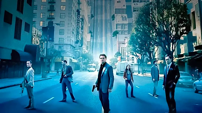
Color is the fastest way to communicate mood and genre. Designers use color psychology as a deliberate tool to manage an audience's emotional expectations. A poster dominated by cool blues and grays might suggest a serious drama or a cerebral sci-fi story, like the deep blues of "Interstellar" that conveyed vastness and melancholy. Conversely, warm reds and oranges often signal passion, danger, or high-octane action. Think of the fiery, chaotic palette of "Mad Max: Fury Road." Even desaturated, washed-out tones send a message, hinting at a period piece or a gritty, realistic drama. At a glance, the color palette tells you what emotional territory you're about to enter.
The Personality of Typography
After color sets the mood, typography gives the film its voice. The choice of font is a critical, often subconscious, signal to the viewer. Elegant, traditional serif fonts—the ones with the little “feet” on the letters—can evoke a sense of history, seriousness, or legacy, making them a fit for prestigious dramas or even intense horror films like "The Exorcist," where the font choice implied a serious, lasting dread. On the other hand, clean, modern sans-serif fonts often point to a contemporary setting, a sleek thriller, or a forward-looking sci-fi film. Playful, handwritten script might suggest a quirky indie comedy or a heartfelt romance. The lettering doesn't just spell out the title; it infuses it with personality.
The Star's Face vs. The Evocative Symbol
One of the fundamental choices in poster design is what to show: the stars or the concept. A poster featuring a tight close-up of a well-known actor is selling star power. It’s a direct appeal, assuring audiences they’ll see a performer they know and love. But for many independent or international films at TIFF, the concept is the star. This is where symbolic imagery shines. A poster might distill the entire film down to a single, intriguing object or an abstract composition. This approach trades the immediate recognition of a celebrity for mystery and curiosity. It invites the audience to ask, "What does that mean?" and in a festival setting, sparking that question is a huge victory.
Minimalism in a Maximalist World
While Hollywood blockbusters often favor maximalist designs, packed with floating heads and explosive action, the festival circuit has seen a powerful counter-trend: minimalism. A minimalist poster strips a film down to its absolute essence, using negative space, a limited color palette, and a single, strong graphic idea. In a sea of visual noise, a clean, confident, and simple design can stand out precisely because it is quiet. It suggests intelligence and confidence in the film's core idea, trusting that a clever visual is enough to pique interest. This approach is particularly effective for indie films that need to feel distinct and artful.
The All-Important Thumbnail Test
Decades ago, a poster only had to work from across a theater lobby. Today, it has to work as a one-inch square on a phone. A design must be high-contrast and clear enough to be legible and compelling when shrunk down for a festival app or a social media feed. Complex, low-contrast designs can turn into an indistinguishable smudge at a small size. This modern constraint has pushed designers toward bolder, more graphic solutions. A poster that looks great on a giant screen but gets lost in a sea of thumbnails has failed a crucial part of its mission in the digital age. A successful TIFF poster must work at every scale, from the side of a building to the palm of your hand.