




The Foundation: Purely Warm Undertones
Before we get to the secret sauce, let’s cover the main ingredient. The absolute, non-negotiable starting point for a True Spring is warmth. Every color in this palette has a clear, golden-yellow undertone. Think of the difference between a cool, blue-based
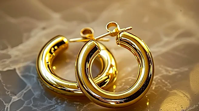
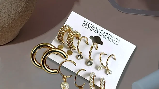
magenta and a warm, orangey-red poppy; True Spring is always the poppy. This means there are no cool, blue-based tones anywhere in the palette. Even the blues are warm, appearing as turquoise, teal, and periwinkle. If a color has any coolness or ashiness, it will clash with the natural coloring of a True Spring, making them look drained. Gold jewelry will always look more harmonious than silver. This pure warmth is what separates Springs from the cool-toned Summers and Winters.
The Hidden Detail: Warmth Plus Clarity
Here's the detail that changes everything: True Spring is defined by the combination of warmth and brightness. This quality is also known as chroma or saturation. True Spring colors are clear, vivid, and saturated, with no hint of muted, dusty, or grayish tones. This is the crucial difference between a True Spring and a True Autumn. Both seasons are fully warm, but Autumn’s colors are muted and earthy, like a fall landscape. True Spring's colors are like a field of wildflowers in the bright midday sun—fresh, lively, and crisp. This combination of warmth and clarity creates the vibrant, energetic feel of the palette. It’s not just about wearing yellow or orange; it’s about wearing a clear, sunny yellow or a vibrant, juicy orange.
How to Spot a True Spring
While anyone can have their colors professionally analyzed, there are some common traits. A True Spring's overall appearance is characterized by warmth and a certain freshness. Skin tones have clear golden or peachy undertones, from fair to tan. Hair is often in the range of golden blonde, strawberry blonde, coppery red, or a light golden brown. Eyes are typically bright and clear, in shades like warm green, turquoise blue, or a light, golden brown. The key is that the features contrast with each other rather than blending, creating a fresh and clear appearance without any muddiness. Celebrities often cited as examples of True Springs include Blake Lively, Amy Adams, and Jessica Chastain, all known for their radiant, warm coloring.
Building Your Wardrobe: Key Colors and Neutrals
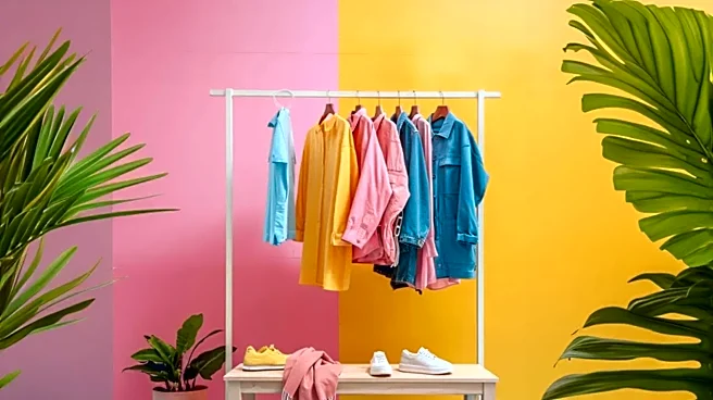
So, what does this look like in practice? A True Spring wardrobe is built on a foundation of warm, bright colors. Think coral, poppy red, lime green, turquoise, and daffodil yellow. These are your power colors. When it comes to neutrals, you’ll want to skip the harsh black and pure white. Instead, your best neutrals are warm and inviting. Think camel, warm beiges, light cream, and rich caramel or golden browns. Even navy can work, as long as it’s a warmer, brighter version. These neutrals provide a base that allows your more vibrant colors to shine without creating an overwhelming look. The goal is to maintain that overall impression of warmth and clarity.
Common Pitfalls and Colors to Avoid
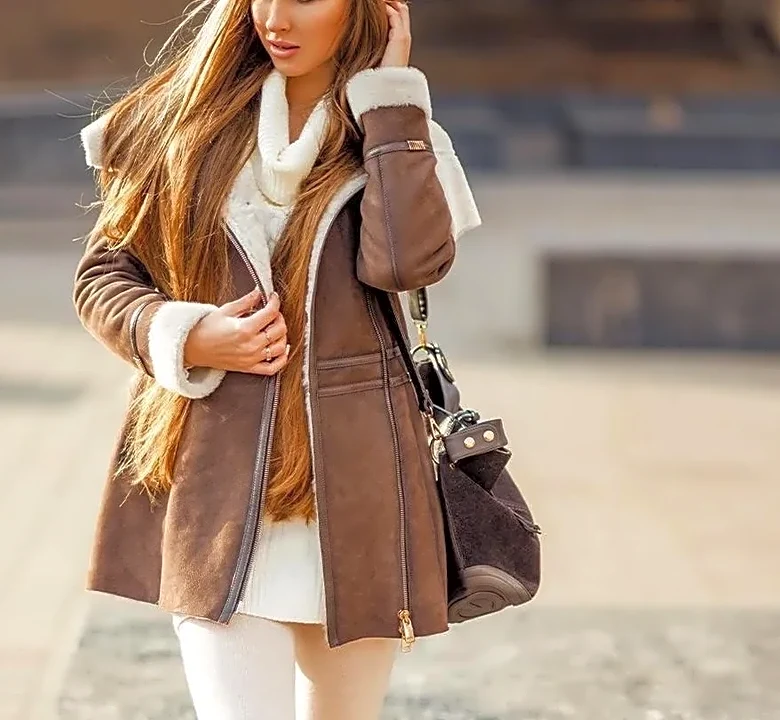
Understanding what doesn't work is just as important as knowing what does. The biggest mistake a True Spring can make is wearing muted, dusty colors. Earth tones like muddy brown and dusty olive belong to Autumn and will instantly drain a Spring’s vibrancy. The other major pitfall is cool colors. Icy pastels, fuchsia, and stark grays are part of the Summer and Winter palettes and will clash with a True Spring’s golden undertones, making them look unwell. The key is to always check for two things: Is the color warm? And is it clear? If the answer to either is no, it’s likely not your best shade.