
Selling a Feeling, Not a Story
Horror, more than any other genre, is about eliciting a direct, physiological response. People watch horror to feel dread, suspense, terror, and ultimately, catharsis. The marketing for a horror series
understands this fundamental contract. Its primary job isn’t to summarize a three-act structure; it’s to make a promise about the emotional experience to come. Key art is the first handshake, and in horror, that handshake needs to be cold and unsettling. Designers use a specific visual language—high-contrast lighting, unsettling negative space, and a color palette of deep reds and mysterious blacks—to communicate a mood instantly. The poster for a show like The Haunting of Hill House doesn’t show you a family tree; it shows you a gothic mansion that feels alive and malevolent. It sells the promise of being haunted, which is far more enticing than a plot summary.
The Power of What's Left Unsaid
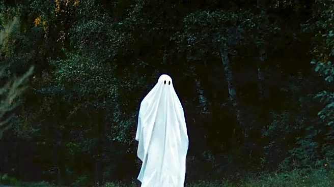
One of horror’s most effective tools is the fear of the unknown. Our imaginations can conjure terrors far more personal and potent than any CGI monster. Key art that withholds information weaponizes this tendency. By presenting a cryptic image—a strange symbol, a single figure facing away from the camera, or a door that’s slightly ajar—the poster creates an information gap. Your brain rushes to fill in that gap with its own anxieties. The iconic poster for Alien, with its simple tagline "In space no one can hear you scream" and a mysterious, cracking egg, tells you almost nothing about the plot. It tells you everything, however, about the feelings of isolation and biological dread you'll experience. This approach is more engaging because it makes the viewer an active participant in creating the fear before the show even begins.
Protecting the All-Important Twist
Modern television, especially in the horror and thriller genres, is built on suspense and narrative twists. Revealing too much, too early is promotional malpractice. A poster that lays out all the characters and their relationships is not only boring but potentially ruinous to the viewing experience. Selling mood is a way to generate hype while keeping the story's secrets locked away. Consider the promotional campaigns for American Horror Story. Each season’s art is a series of bizarre, symbolic vignettes that hint at the theme (a circus, a coven, an apocalypse) without ever giving away the central mysteries. The art is designed to be discussed, dissected, and theorized about, building a community of suspense and anticipation. It teases the flavor of the horror without giving away the recipe. This strategy respects the audience and, more importantly, protects the integrity of the narrative.
Building an Unforgettable Vibe
Finally, mood-driven key art is essential for building a strong, recognizable brand identity. Horror is an aesthetic. When you think of a filmmaker like Mike Flanagan or a franchise like The Conjuring, a specific visual and atmospheric style comes to mind. That style is cultivated and reinforced through its marketing. A consistent, atmospheric visual campaign ensures a series is instantly recognizable across billboards, social media feeds, and streaming menus. The goal is to create a vibe so distinct that the audience knows what they're getting into just from the font and color grade. This turns the key art from a simple advertisement into a collectible piece of the show's world. It’s not just a poster; it’s the first chapter of the story, told not with words, but with a feeling.