

The Power of Simplicity
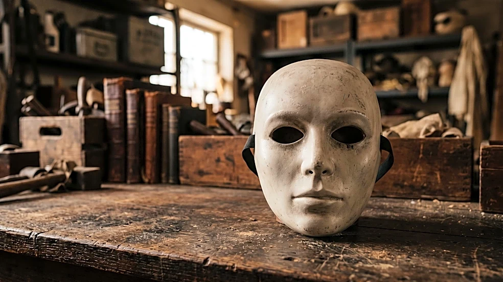
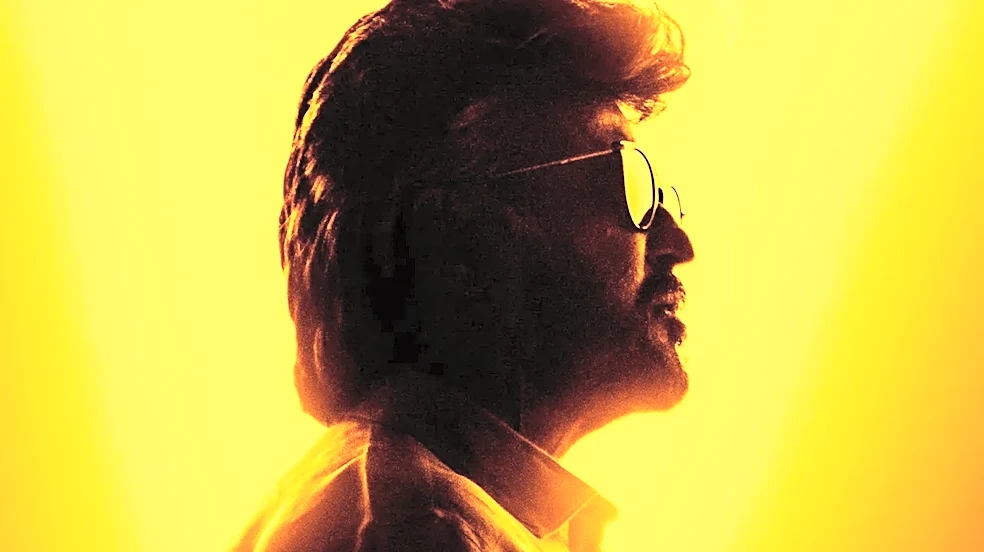
In a world of complex CGI monsters and elaborate villains, the visual identity of Michael Myers is almost primitive. It’s a man in dark overalls, a pale mask, and a kitchen knife. That’s it. The silhouette reduces this even further: a hulking shape with
a ghostly white dot where a face should be. This minimalism is its greatest strength. It’s instantly recognizable, easily reproducible, and requires no explanation. In the original 1978 film, directed by John Carpenter, Michael is credited as 'The Shape'. This was a deliberate choice, framing him not as a man but as a walking embodiment of dread. The silhouette removes all humanity, leaving only a form that promises violence. This branding is so potent that even when posters for the first two films didn't prominently feature his full figure, the stark, menacing aesthetic set a new standard for horror marketing.
A Blank Canvas for Fear
The true genius of the silhouette lies in what it doesn't show. The featureless mask and shadowed form act as a blank slate onto which audiences project their own deepest fears. Is he a man? A ghost? A supernatural force? The marketing never gives a definitive answer, and neither does the silhouette. He is simply 'evil on two legs', as his psychiatrist Dr. Loomis describes him. This ambiguity is far more terrifying than any specific monster could be. While Freddy Krueger has a backstory and Jason Voorhees has a clear motive, the original Michael Myers had none, a fact that made him profoundly unsettling. The silhouette perfectly captures this lack of reason. We can't see his expression or guess his intent; we only see the shape of a threat, forcing our own imaginations to fill in the horrifying details. It taps into a primal survival instinct, where the brain’s threat response kicks in before rational thought can process it.
Rooted in a Deeper Horror Tradition
The use of shadow and simplified forms to create terror isn't new. Michael Myers' silhouette stands on the shoulders of giants, drawing from a long cinematic history of using darkness to evoke fear. This tradition has roots in early 20th-century German Expressionist films like 'The Cabinet of Dr. Caligari' and 'Nosferatu', which used distorted angles and heavy shadows to create a world of psychological dread. Michael Myers is a modern evolution of this concept. John Carpenter and cinematographer Dean Cundey mastered the art of placing The Shape in the background, half-hidden in shadow, turning an ordinary suburban street into a landscape of lurking terror. Interestingly, a poster in Laurie Strode's bedroom in the 1978 film is by the expressionist painter James Ensor, who was famous for his use of grotesque masks, hinting at the film's artistic influences.
The Unchanging Anchor of a Franchise
The 'Halloween' franchise has had a notoriously convoluted history, with multiple timelines, reboots, and retcons. The quality of the films has varied wildly, and Michael's backstory and motivations have been changed and re-explained numerous times. Through all this, the one constant has been the silhouette. It's the franchise's anchor, a visual throughline that immediately signals 'Halloween' to any prospective viewer. Marketing for new installments, from 'Halloween H20' to the recent David Gordon Green trilogy, consistently returns to that core image: The Shape standing in a doorway, at the end of a street, or emerging from darkness. It has become a symbol of reliability for horror fans. No matter what the new movie holds, you are guaranteed the presence of that iconic, terrifying figure. This consistent branding has given Michael Myers a staying power that few other horror icons can match, ensuring his place in the pop culture pantheon.