


Identifying the 'Bridesmaid' Blunder
The mistake isn't choosing florals; it's choosing the wrong kind of floral. The culprit is the small-scale, repetitive, 'ditsy' print, especially on lightweight, unstructured fabrics like jersey or thin cotton. While charming for a casual Sunday brunch
or a country wedding, at a formal event like Royal Ascot, this type of print reads as unsophisticated and generic. It evokes the image of a pre-selected bridesmaid dress—safe, unassuming, and chosen by committee. It lacks the intentionality and drama required for an event where fashion is a spectator sport. The print gets lost from a distance, merging into a vague, pastel blur rather than making a distinct and memorable statement.
The Solution: Embrace Dramatic Scale
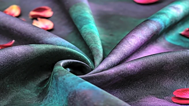
The antidote to the ditsy print is scale. To elevate a floral from everyday to exceptional, think big. Look for oversized blooms, painterly strokes, or graphic, almost abstract interpretations of flowers. A large-scale print turns the dress into a canvas, creating a bold, confident statement that holds its own in a crowd. It demonstrates a command of style, suggesting the wearer chose a piece of wearable art, not just a simple pattern. This is where the 'bespoke' feeling comes from. The fabric is also crucial. A dramatic print needs a worthy foundation. Opt for structured materials like silk faille, taffeta, organza, or a bonded crepe that can support the print's grandeur and maintain a sharp, elegant silhouette throughout the day.
Mastering Color and Contrast
Beyond scale, the color palette is your most powerful tool. The 'bridesmaid' trap is often set with predictable, washed-out pastels—think pale pinks, baby blues, and mint greens all mixed together. While lovely, they can lack impact. A bespoke floral look often hinges on a more sophisticated use of color. Consider a floral pattern set against a dark, dramatic background like navy, black, or emerald green. This makes the colors of the flowers pop with intensity. Alternatively, explore a monochromatic scheme, where different shades of a single color create a nuanced and impossibly chic floral texture. Another advanced move is choosing a dress with an unexpected color combination—like marigold yellow with deep magenta, or coral with teal—which feels modern, personal, and far from off-the-rack.
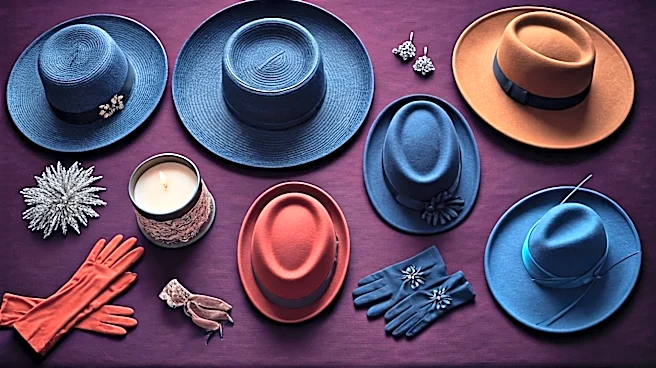
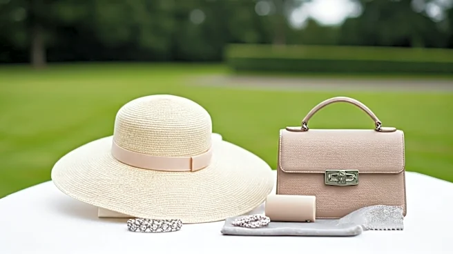
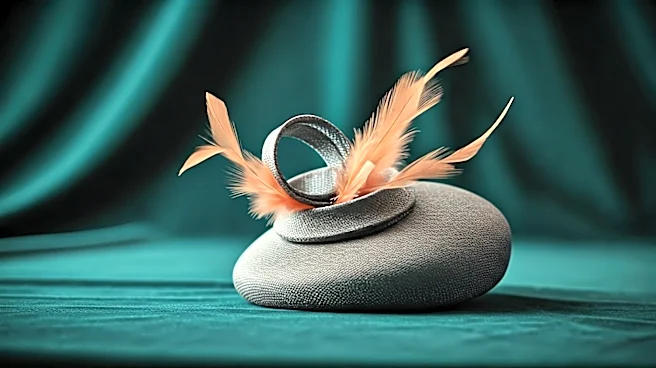
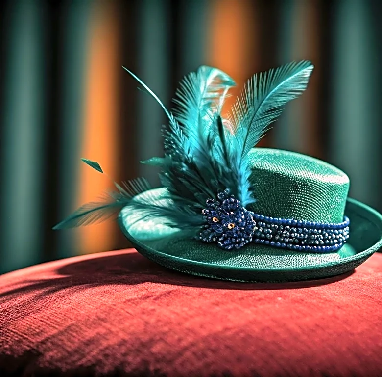
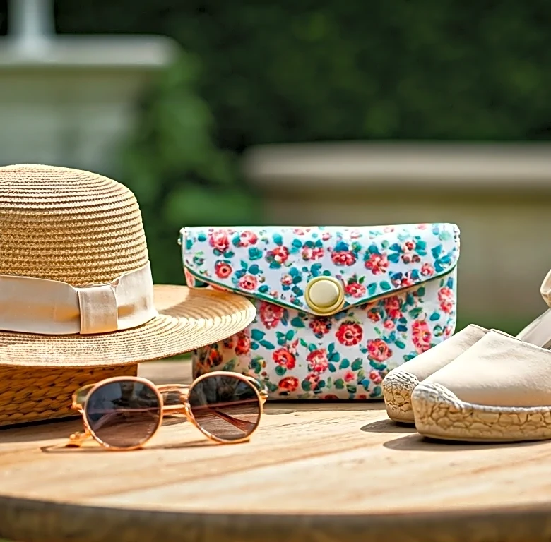
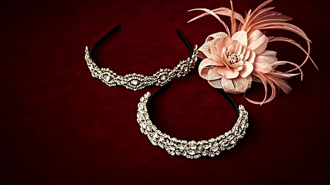
Accessorize with Restraint and Intent
A magnificent floral dress can be easily undermined by fussy, competitive accessories. When your dress is the main event, the rest of your outfit should play a supporting role. This is the golden rule that separates the seasoned style veterans from the novices. Instead of a floral fascinator that matches the dress (a look that can feel too literal and matronly), opt for a sculptural headpiece in a solid, complementary color pulled from the print. Keep your handbag and shoes simple and elegant, again in a solid shade. Let the dress do the talking. The goal is a cohesive, polished ensemble, not a chaotic garden. Think of your accessories as the frame for your masterpiece—they should enhance the art, not distract from it.