








Fallout: A Tale of Two Wastelands
Adapting a beloved video game is a minefield, but the team behind 'Fallout' navigated it by perfectly capturing the game's core aesthetic: a bizarre fusion of 1950s optimism and post-nuclear apocalypse grit. Production Designer Howard Cummings is nominated
for his team's work in balancing these two extremes. The genius lies in the details. On one hand, you have the underground Vaults—pristine, modular, and humming with a retro-futuristic idealism that feels both comforting and deeply sinister. Every prop, from the Nuka-Cola machines to the ergonomic Vault Boy logos, feels like a preserved relic of a world that never was. Then you have the surface, a blasted wasteland of rust, decay, and desperation. The contrast isn't just visual; it's narrative. The sterile, controlled environment of the Vaults creates characters who are naive and unprepared for the chaotic, anything-goes world above ground. The design choices externalize the story’s central themes of lost innocence and brutal survival. It’s a world that feels both beautiful and grungy, a difficult tonal tightrope to walk.
The Gilded Age: Old Money vs. New Ambition
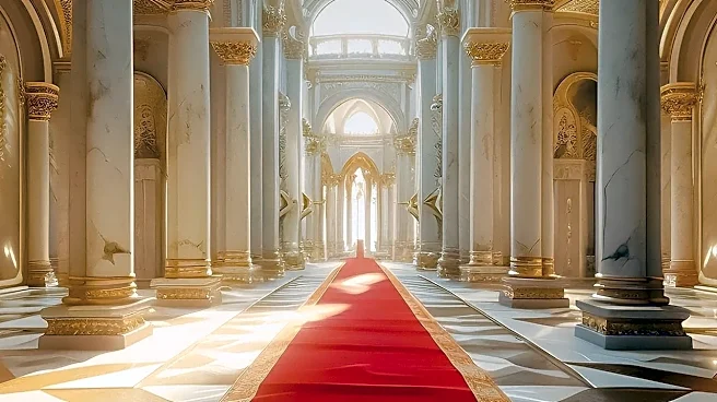
In 'The Gilded Age,' the architecture isn't just a backdrop; it’s a battlefield. The central conflict between old New York aristocracy and the ruthlessly ambitious new-money crowd is fought in ballrooms and drawing rooms. Nominated production designer Bob Shaw and his team masterfully use two key sets to visualize this war. The van Rhijn-Brook house, home to the established elite, is elegant, rooted in history, and just a little bit worn. Its spaces are grand but intimate, reflecting a confidence that doesn't need to shout. Across the street, the Russell mansion is an explosion of opulent, European-inspired grandeur. It's newer, shinier, and almost overwhelmingly vast—a deliberate statement of power from a family desperate to prove they belong. The design communicates character and intent without a word of dialogue. Bertha Russell's relentless social climbing is mirrored in her home’s ever-more-lavish decor, designed to outdo and intimidate. The show’s creative team drew inspiration from paintings of the era to create a heightened sense of reality, ensuring that every wallpaper and piece of furniture served the narrative.
Stranger Things: The Upside Down Matures
For its final season, 'Stranger Things' had to elevate its iconic visual language, and the production design, led by nominee Chris Trujillo, rose to the challenge. The show has always excelled at creating a lived-in, nostalgia-soaked version of the 1980s, from the wood-paneled basements to the neon-lit malls. But its true design signature is the Upside Down—a dark, decaying echo of the real world. This season, the visual threat of the alternate dimension became more sophisticated and menacing. The design team had to imagine how this monstrous world would further encroach upon and corrupt the familiar settings of Hawkins. The result is a masterful blend of practical sets and visual effects that shows the decay spreading in terrifying new ways. The visual storytelling lies in how the corruption of the Upside Down manifests physically, twisting beloved locations into nightmarish versions of themselves. This visual evolution reflects the growing stakes for the characters, making their final stand feel earned and visually spectacular.
Palm Royale: The Sun-Drenched Social Ladder
'Palm Royale' transports viewers to the exclusive, high-society world of 1969 Palm Beach, a setting that drips with color, aspiration, and social anxiety. Jon Carlos, the nominated production designer, was tasked with creating a world that is both invitingly beautiful and rigidly hierarchical. The design perfectly captures the era's aesthetic, with its vibrant pastels, bold patterns, and lush, tropical foliage. But beneath the sunny veneer, every location is a carefully calibrated social stage. The exclusive clubs, the perfectly manicured lawns, and the luxurious private residences all serve to reinforce the show's themes of belonging and exclusion. The visual language distinguishes the established elite from the outsiders, like Maxine Simmons, who are desperately trying to claw their way in. The settings are characters in themselves, from the sun-bleached poolside patios to the shadowy corners of the club where real power is brokered. This attention to environmental detail makes the social climbing feel palpable and the stakes incredibly high, all while looking like a vintage postcard.