






From 'Matching' to 'Coordinating'
The old 'matchy-matchy' rule likely has its roots in mid-century department store culture, where selling a matching set of shoes and a handbag was a simple way to create a 'put-together' look. It suggested order and careful planning. Today, however, that
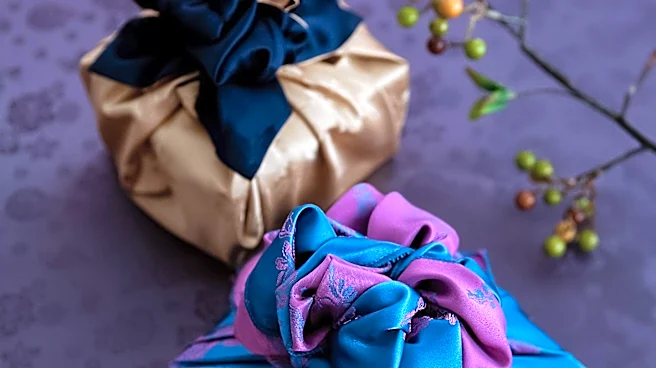
same precision can read as dated, rigid, or uninspired. The modern approach is to coordinate, which is far more creative and personal. Coordination means the pieces of your outfit don't have to be identical; instead, they should relate to one another through a shared color palette, mood, or texture. It’s the difference between a room painted entirely in one shade of beige and a room with a harmonious blend of cream, tan, and brown with a pop of color. One is flat, and the other has depth.
Use Color Theory, Not a Single Color
Instead of matching a blue top with an identical blue skirt, think like a designer and use the color wheel. A color palette for an outfit can be built using several harmonious principles. For a subtle look, pair analogous colors—shades that sit next to each other on the color wheel, like blue and green. For a bolder, more energetic statement, try complementary colors, which sit opposite each other, like blue and orange. A great way to execute this is with the 60/30/10 rule, borrowed from interior design: 60% of your look is a dominant color, 30% is a secondary, complementary shade, and 10% is a small accent. This creates balance and intention without relying on a single, repetitive hue.
The Shoe and Bag Myth, Busted
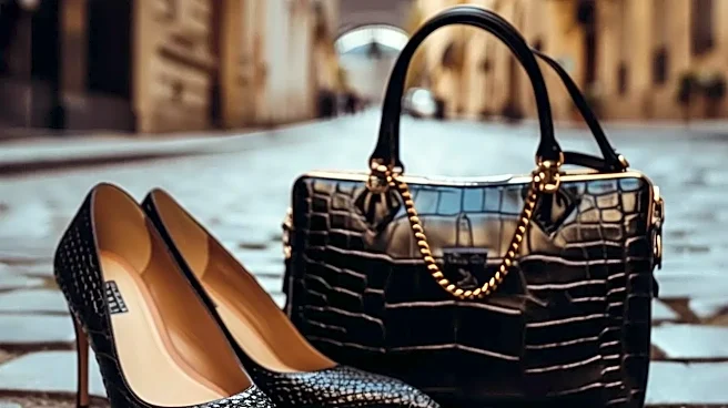
The most persistent iteration of the matching rule is that your shoes and handbag must be the same color. This is officially an outdated concept. While a black bag and black shoes will always be a clean, acceptable choice, it’s far from the only option. A more contemporary approach is to let one accessory take the lead. If you have a statement handbag, let your shoes be more neutral, and vice versa. You can also create harmony by matching tones rather than exact colors. For instance, warm-toned accessories like a camel bag and cognac shoes work beautifully together because they share the same underlying warmth. The goal is a relationship between the pieces, not a carbon copy.
Mix Your Prints and Textures
The idea that you shouldn't mix prints or textures stems from the same fear of looking chaotic. But when done thoughtfully, mixing is the hallmark of a confident styler. The key is to create cohesion. To mix prints successfully, vary their scale; pair a large, bold floral with a smaller, more subtle stripe. Another trick is to ensure the different patterns share at least one common color to tie them together. Similarly, mixing textures adds depth and interest that matching can't. A chunky knit sweater with a silk skirt, or rugged denim with a smooth leather jacket, creates a tactile contrast that is visually rich. Start by grounding your look with a neutral piece and then layer in one or two different patterns or textures.