

The Promise of Fear, Not the Payoff
The most effective horror thumbnails operate on a simple principle: suggestion is scarier than spectacle. Instead of showing the monster, they show the shadow of the monster. Instead of a jump scare, they show the terrified face of someone reacting to
it just off-screen. This approach leverages our own imagination, which is often more potent than any special effect. Designers know that hinting at violence or a threat is more psychologically effective than showing it outright. A thumbnail for a show like The Witch might feature a lone, sinister goat against a dark background, leaving the narrative to our own uneasy minds. This creates a powerful curiosity gap; the thumbnail poses a question—what is so terrifying?—that can only be answered by clicking play.
A Carefully Calibrated Color Palette
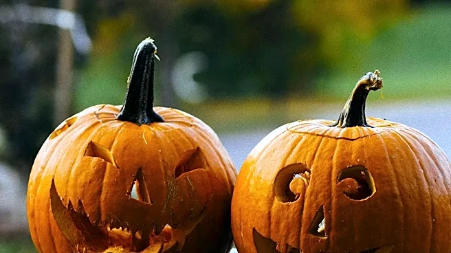
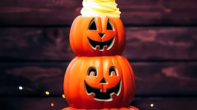
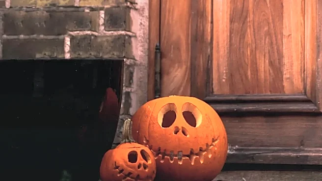
Color is the fastest way to communicate mood, and horror thumbnails use a specific and intentional palette to create an immediate emotional response. Deep reds suggest danger, while high-contrast black and white can evoke mystery and dread, as seen in the classic poster for The Exorcist. Desaturated blues and sickly greens can create a sense of unease or otherworldliness. For Halloween-specific content, splashes of orange are often used to tap into the season's eerie atmosphere. These color choices aren't just for show; they are a visual shorthand that tells your brain what kind of fear to expect—be it a bloody slasher or a quiet, psychological haunting—before you even read the title.
The Unnerving Power of the Human Face
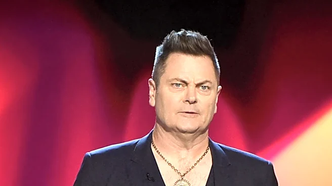
Research shows that human faces are one of the most powerful tools for grabbing attention. In horror, this is amplified. A thumbnail featuring a character with wide, terrified eyes looking directly at the viewer creates an immediate, unsettling connection. We are forced into the position of whatever is frightening them. Conversely, a thumbnail showing a character looking away in fear directs our attention off-screen, making us wonder what unseen horror they are witnessing. Distorted or partially obscured faces are another common trope, playing on our natural aversion to things that seem uncanny or not quite right. It taps into a primal sense of unease.
Typography That Sets the Tone
The font is the unsung hero of the horror thumbnail. It does heavy lifting in establishing the sub-genre. Elegant serif fonts with sharp edges might suggest a gothic horror story, full of vampires and haunted mansions. A gritty, distressed, or seemingly handwritten font can signal a more visceral, found-footage or slasher film, like the textured typography used for The Texas Chainsaw Massacre reboot. Minimalist, clean text, on the other hand, often accompanies psychological thrillers, allowing the imagery to carry the weight of the suspense. The text isn't just there to provide information; it's a key design element that contributes to the overall feeling of dread.
The Science Behind the Scare
Ultimately, what you see isn't left to chance. Major streaming platforms like Netflix and YouTube employ sophisticated A/B testing to determine which thumbnail is most effective. An army of algorithms analyzes thousands of frames from a single episode to identify the images most likely to resonate. Your viewing history plays a huge role; if you watch a lot of action films, you might be shown a thumbnail for a horror series that highlights an explosive moment, while a viewer who prefers dramas might see one focused on a character's emotional distress. These platforms know they have only a few seconds to capture your interest, so every pixel is optimized to make you pause, wonder, and ultimately, press play.