






The Psychology of Warmth and Nostalgia
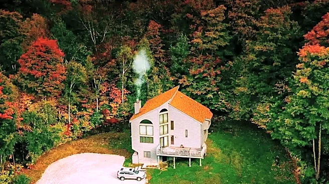
At its core, the use of an autumn palette is a direct line to our emotions. Colors like amber, orange, and rust psychologically evoke feelings of warmth, comfort, and coziness. This palette mimics the soft, golden light of late afternoon, creating a sense
of familiarity and peace. But it's not just about feeling snug; it's about nostalgia. These colors are visually similar to the faded, yellowish tint of old photographs, subconsciously connecting the on-screen world to our own memories and the passage of time. Autumn itself is a season of transition, poised between the vibrancy of summer and the dormancy of winter. This makes its color scheme the perfect visual metaphor for stories centered on reflection, change, maturity, or looking back on the past with a mix of warmth and melancholy.
A Visual Shortcut for Storytellers
Filmmakers use color as a powerful and efficient storytelling tool. Applying a warm, autumnal grade is a form of cinematic shorthand that instantly establishes a movie's mood and themes without needing a single line of dialogue. Comedies, love stories, and family dramas often lean on these warmer palettes to signal a comforting, heartfelt, or approachable tone. Think of the romantic comedies set in New York in the fall; the colors do as much to set the mood as the plot itself. This is often enhanced by shooting during the 'golden hour,' the period shortly after sunrise or before sunset when daylight is redder and softer. This natural light intensifies the golden and amber tones, wrapping the scene in a naturally beautiful and evocative glow that feels both personal and thoughtful.
The Power of Contrast: Orange and Teal
One of the most common applications of this trend is the famous 'orange and teal' color grade. This isn't just about making things look autumnal; it's a technique rooted in color theory. Orange and blue are complementary colors, meaning they sit opposite each other on the color wheel. Placing them side-by-side creates the strongest possible visual contrast. Since human skin tones naturally fall within the orange spectrum, filmmakers can push the backgrounds—skies, shadows, buildings—toward teal and blue. This makes the actors pop from the screen, drawing the viewer's eye exactly where the director wants it: on the human element of the story. This technique provides a sense of depth and visual tension, separating the warm, living characters from their cooler, more inert surroundings.
Meeting Audience and Genre Expectations
Over time, the frequent use of these colors has created a set of expectations in the audience's mind. We've been conditioned to associate these palettes with certain types of stories. When we see a movie poster dominated by earthy tones, we might subconsciously prepare for a historical drama or a Western. A film drenched in warm, golden light immediately signals themes of love, family, or personal growth. This is especially true for genres deeply connected to the season, like stories set in academic environments, which often begin with the fall semester. By using a visual language the audience already understands, filmmakers can more easily immerse us in the intended emotional landscape. The palette becomes part of the comfort food experience, delivering on the cozy, introspective feeling that viewers seek from an “autumn film.”