








The Secret Language of Color
The “one choice” that can unify an entire series is the deliberate and disciplined use of a specific color palette. It’s more than just making things look pretty; it's a form of visual storytelling that works on a subconscious level. Production designers
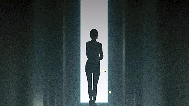
and directors select a limited range of hues, saturations, and brightness levels and apply them rigorously across costumes, set dressing, and even the lighting of every scene. This creates a visual fingerprint for the show. Think of it like a musical score, but for your eyes. By sticking to a predefined palette—say, earthy greens and browns for a rural drama or sharp, cold blues for a sci-fi thriller—creators build a world that feels distinct and internally consistent from the very first frame.
More Than Just a Pretty Picture
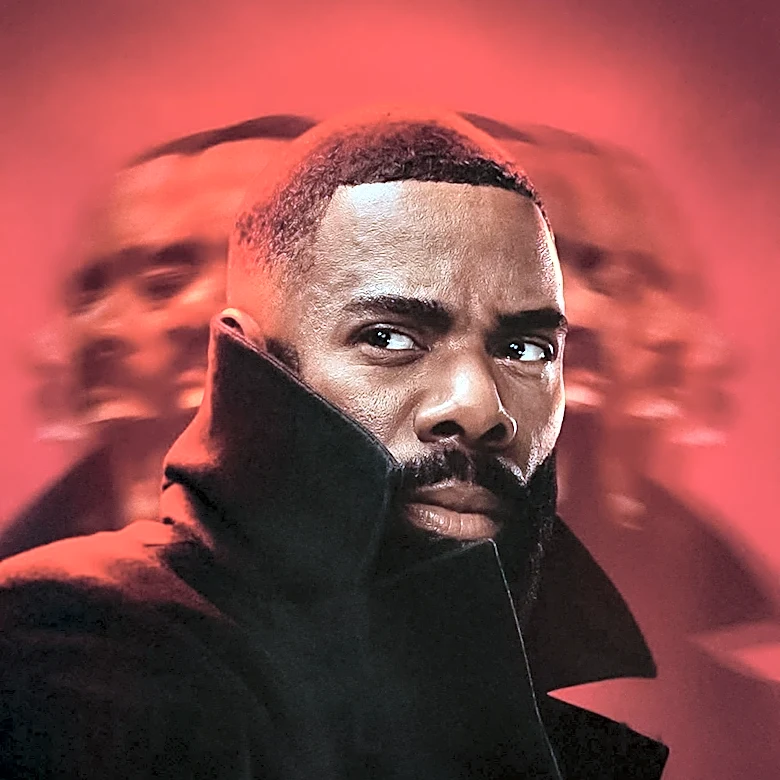
A strong color palette does more than establish a vibe; it guides your emotional response. Filmmakers have long known that color is a psychological tool. Warm colors like reds and oranges can increase our heart rate, suggesting passion or danger, while cool colors like blues and greens can feel calming or, in another context, sterile and alienating. When a show commits to a palette, it’s making a pact with the viewer. A world drenched in desaturated blues and grays tells us we’re in a somber, perhaps hopeless place. A series bursting with vibrant, saturated yellows and pinks promises energy, youth, or even hidden menace. This consistency makes the world feel governed by its own set of rules, and our brains, which love patterns, respond by accepting that world as a coherent reality.
From King's Landing to 'The Matrix'
This technique is everywhere once you start looking for it. In The Matrix, the world inside the computer simulation is defined by an iconic, sickly green tint, immediately distinguishing it from the cooler, blue-toned reality of the human world. The creators used this color choice to emphasize the story's core themes of artificiality and control. Similarly, shows with sprawling settings use color to create order. In Game of Thrones, the cold, blue-and-white palette of the North stood in stark contrast to the warm, golden-red hues of King's Landing, giving each location a distinct identity. Wes Anderson is a master of this, using meticulously crafted palettes to create a sense of harmony and belonging among his characters and their environments. By linking characters and settings with specific colors, the story becomes richer and easier to follow, without a single word of exposition.
How to Spot It This Fall
As you dive into the new slate of fall television, you now have the toolkit to see past the plot and appreciate the artistry. Pay attention to the background details. What colors dominate the furniture, the walls, and the clothes people are wearing? Notice the color of the light. Is a scene washed in a warm, golden glow or a stark, clinical white? Look for complementary colors—opposites on the color wheel like orange and blue—which are often used to create visual tension or highlight a conflict between characters or ideas. Once you see how a show is using its palette, you'll gain a new appreciation for how its mood is built. You'll notice when a character breaks the color rule—like wearing a bright red dress in a world of muted tones—and understand it’s a deliberate signal of their importance or rebellion.