


The Philosophical Divide: Perfection vs. Pragmatism
The core difference isn't just in the clothes; it's in the philosophy. Milanese minimalism is a 'warm' minimalism, rooted in the art of sprezzatura—a studied carelessness that conceals immense effort. It’s about perfecting a classic form. Think of a Zegna
suit or a Prada knit: the goal is to distill menswear down to its most luxurious and impeccably crafted essence. The silhouette is revered, the fabric is noble, and the final look is an ode to timeless elegance. It’s minimalism as an ideal. Copenhagen operates on the opposite end of the spectrum with its 'cold' minimalism. This is style born from function. With its famously fickle weather, Danish design prioritizes utility, comfort, and versatility. Brands like Rains and mfpen create pieces that are modular, layerable, and often weatherproof. The minimalism here is pragmatic, not precious. It asks, 'How can I look good while biking to work in a drizzle?' rather than, 'How can I achieve sartorial perfection?' It’s minimalism as a solution.
Silhouette: Sharp Lines vs. Soft Boxes
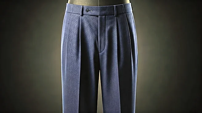
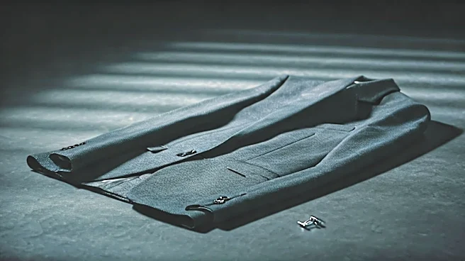
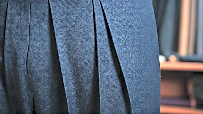
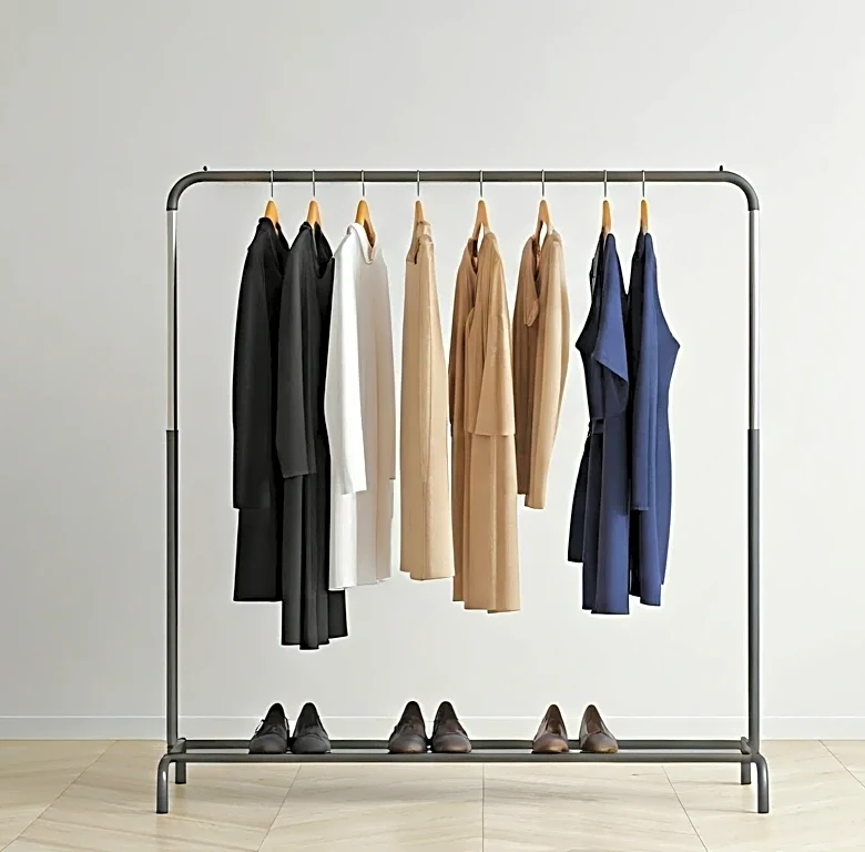
This philosophical split is most obvious in the silhouette. In Milan, the cut is king. Trousers have a clean break, shoulders are defined (even when soft), and the waist is often accentuated. It’s a look that traces and honors the lines of the body. Tailoring is paramount, creating a sense of structure and expensive polish. Even a casual knit polo from a Milanese house will have a certain anatomical correctness to it.
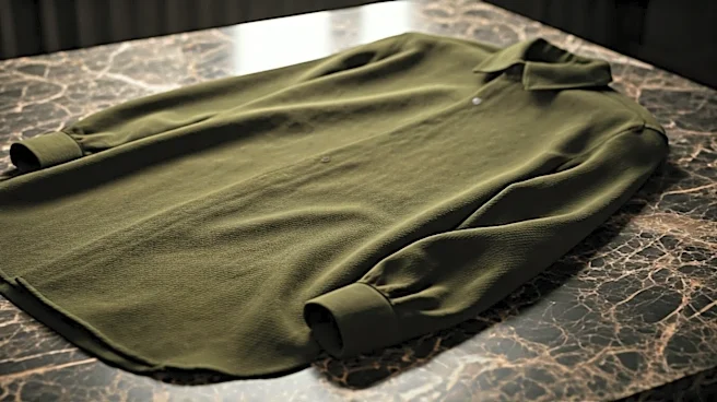
Conversely, Copenhagen’s signature is the relaxed, often boxy silhouette. It’s a style built for layering and movement. Trousers are wider, outerwear is roomier, and shirts are cut for comfort rather than constriction. This approach creates a softer, more approachable shape that feels less formal and more in tune with everyday life. It’s less about a single, perfect garment and more about how different, functional pieces can be combined.
Color Palette: Earth Tones vs. Muted Hues
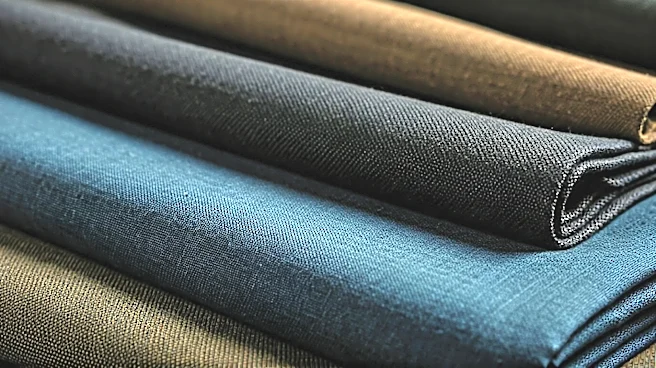
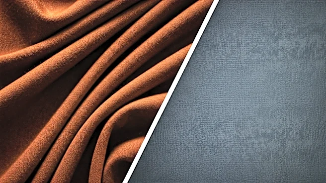
Color tells a similar story of two different climates. Milan’s palette is warm and rich, drawing from the Italian landscape and classic art. You’ll find deep navies, creamy whites, rich camels, olive greens, and sophisticated burgundies. These are colors that feel expensive and permanent, designed to be worn for years. They are grounded, earthy, and exude a quiet confidence.
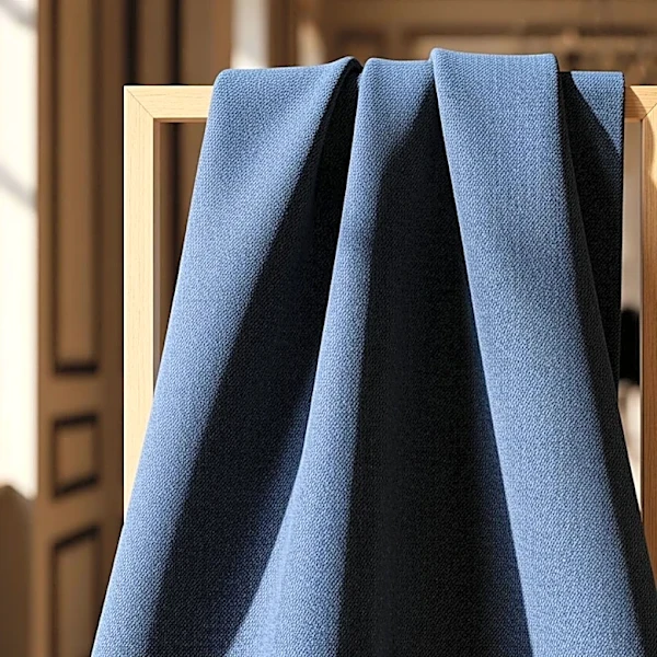
Copenhagen’s palette is cooler and more subdued, reflecting the soft, often-overcast Nordic light. It’s a world of concrete grays, muted blues, pale greens, and lots of functional black. But where Scandi style gets interesting is its use of an unexpected 'pop' color—a bright beanie, a colorful sneaker, or a playfully patterned sock. This small burst of color against a neutral backdrop is the sartorial equivalent of a single wildflower in a concrete courtyard; a touch of defiant joy.
Finishing Touches: Polished Leather vs. Practical Kicks
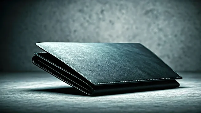
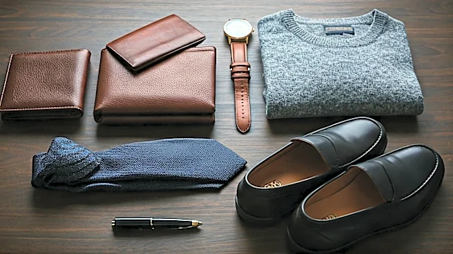
Accessories are the final tell. The Milanese man completes his look with accessories that signal quiet luxury: a perfectly polished leather loafer, a slim watch, a fine leather belt. The items are few, but they are flawless. The goal is to add a final touch of refinement without adding noise.
In Copenhagen, accessories are an extension of the functional uniform. The footwear of choice is often a comfortable, high-quality sneaker from a brand like Salomon or a chunky boot. The bag is a practical tote or a technical cross-body, big enough to hold a laptop and an extra layer. The ever-present beanie is as much a style statement as it is a practical defense against the wind. It’s less about polish and more about preparedness.