








First, What Is True Summer?
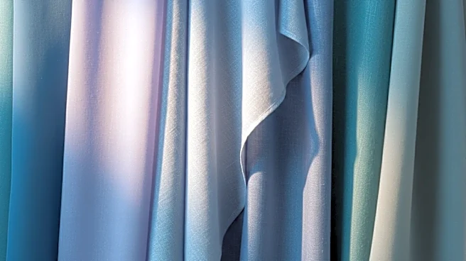
Before we get into the mistakes, let's define what True Summer actually is. In the world of seasonal color analysis, True Summer is the original, quintessential summer palette. Its dominant characteristic is being 'cool,' with blue undertones, followed
by a secondary trait of being 'muted' or 'soft.' Think of the colors of a coastal landscape on a hazy day: everything is seen through a gentle, cool filter. The palette includes shades like dusty rose, periwinkle, lavender, and soft navy. The overall effect is gentle, blended, and serene. It's not about being light or dark, but about a mid-range coolness and softness that creates a sophisticated harmony.
Misconception 1: It’s Just ‘Cool’
The biggest mistake is focusing only on the 'cool' aspect. Yes, True Summer is a cool season, but so is True Winter. People often confuse the two and reach for bright, icy, high-contrast colors like pure white or electric blue. These shades belong to Winter and will overpower a True Summer's more delicate coloring. The key difference is 'chroma' or saturation. Winter colors are crisp and intense, while Summer colors are muted and softened, as if a little grey has been blended into every hue. So, while both seasons share blue undertones, a True Summer needs the soft, dusty version of a color, not its jewel-toned cousin.
Misconception 2: Muted Means Washed Out
Another common error is thinking that 'muted' means boring or drab. When people hear 'soft' or 'dusty,' they imagine a palette of nothing but beige and grey, and worry it will wash them out. But the True Summer palette is full of beautiful, nuanced colors. It's not about lacking color; it's about the quality of that color. The palette contains rich berry tones, deep teals, and lovely purples—they are just the softened versions. A True Summer looks radiant in dusty rose, but tired in a bright, warm coral. The goal is to create harmony, and for a True Summer, that harmony comes from colors that are blended and serene, not loud and bright.
Misconception 3: Confusing It With Other Summers
The Summer family has three sub-seasons: Light, Soft, and True. It's easy to get them mixed up. Light Summer is lighter and airier, bordering on Spring. Soft Summer is the most muted and has a slight neutral-cool quality, borrowing a hint of dustiness from the Autumn palette. True Summer is the purest of the three, sitting right in the middle, defined by its undeniable coolness first and its softness second. Someone might misidentify as a Soft Summer and wear colors that are too greyed-out and slightly warm, which can dull their complexion. Or they might think they are a Light Summer and choose pastels that are too pale, making them look washed out. Finding the right balance of pure cool and medium softness is the key.
Misconception 4: Reaching for Black and Pure White
In American wardrobes, black and pure white are go-to staples. For a True Summer, this is a significant mistake. True black is a Winter color; it's too dark and harsh, and can make a True Summer appear tired or aged. The same goes for stark, optic white, which is too bright. The True Summer palette has beautiful alternatives that serve the same purpose. Instead of black, a True Summer shines in soft navy, charcoal grey, or cool taupe. In place of pure white, they should opt for a soft white or light grey. These neutrals maintain the necessary coolness without creating the harsh contrast that drains the color from a Summer's complexion.