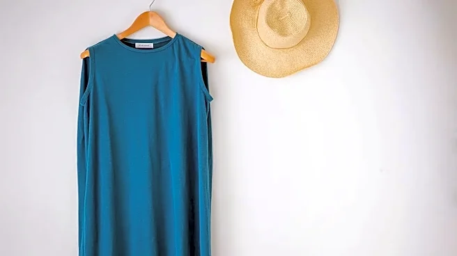








Have you ever bought a sweater in a stunning, vibrant color, only to feel it's 'too much' when you put it on? The secret isn't the color—it's the location. Where you wear a bold hue on your body dramatically changes its impact.
The Powerful Face-Framing Effect
There’s a scientific reason
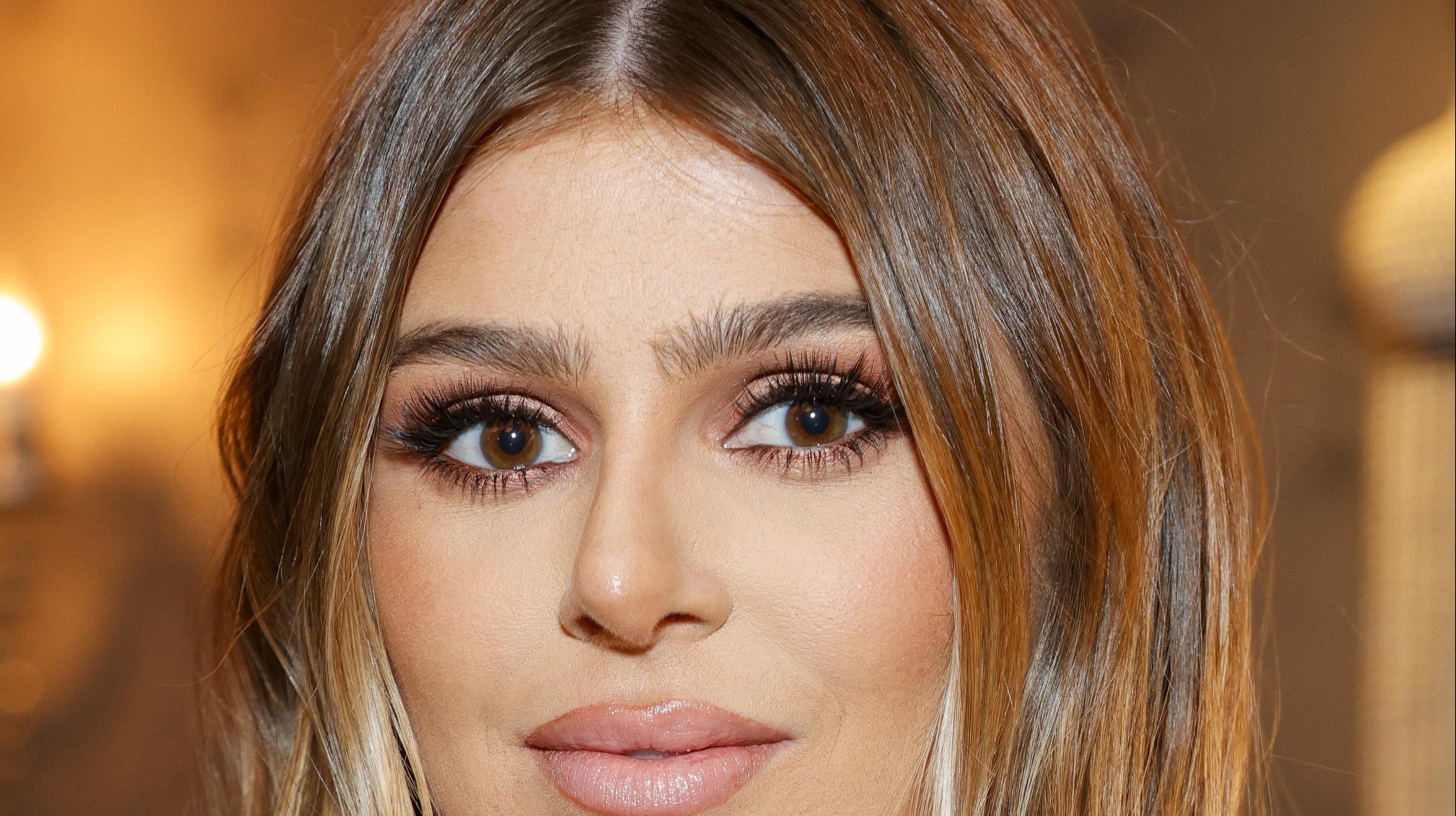
why a color worn near your face feels so significant. Every color you wear reflects its specific light wavelengths onto your skin. When a color is close to your face—in a top, scarf, or statement necklace—that reflected light can either harmonize with or clash with your natural skin tone. The right color can make your eyes sparkle and your skin look clear and radiant. The wrong one can cast unflattering shadows, highlight redness or undereye circles, and make you look tired. This is why a bright yellow top might feel overwhelming, while yellow shoes feel fun and manageable. The stakes are simply higher the closer a color gets to your complexion.
Start Far From the Face
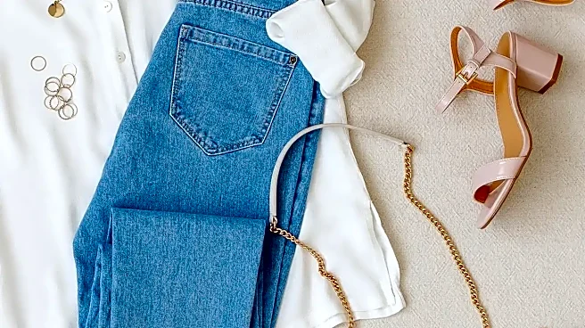
The easiest and safest way to start building your color confidence is by wearing bold hues as far from your face as possible. This is your experimental playground. Think colorful shoes, a vibrant handbag, or a bold skirt or pair of pants paired with a neutral top. By placing the color on your lower body or in an accessory, you get all the mood-boosting benefits of a bright shade without worrying about it clashing with your skin tone. A pair of electric blue flats or a bright pink crossbody bag can add a powerful pop of personality to an otherwise simple outfit of jeans and a white tee, making the look feel intentional and stylish. This approach allows you to get comfortable with seeing that color in your daily life.
Use Prints and Patterns as a Bridge
If you're ready to bring color closer but not prepared for a solid block of it, patterns are your best friend. A patterned blouse or dress that incorporates a bold shade alongside more familiar neutrals is the perfect intermediate step. A floral print with splashes of fuchsia or a striped top with a single bold color can feel much less intimidating than a solid garment. The print does the work of breaking up the intensity of the color, and the neutral elements within the pattern help it pair easily with the staples you already own. You can pull one of the accent colors from the print and repeat it in a small accessory, like an earring or a handbag, to create a cohesive, polished look.
Mastering Color Near the Face
When you're ready to wear that vibrant sweater or bold collared shirt, there are a few things to keep in mind. First, consider your skin's undertone—generally categorized as warm (leaning yellow/peachy), cool (leaning pink/blue), or neutral. Warm undertones are often flattered by earthy tones, like rust and olive, while cool undertones may shine in jewel tones like emerald and sapphire. However, these are just guidelines. The most important test is to hold the color up to your face in natural light and see how it makes you look and feel. If you love a color that doesn't seem to love you back, you can still wear it. Try it in a V-neck to put some space between the fabric and your chin, or use makeup, like a complementary lipstick, to create a harmonious balance.