
The Unspoken Language of Spooky
Before a single line of dialogue is spoken, a set has already told you where you are, what to feel, and what to fear. In filmmaking, this is called "visual shorthand," and it's the bedrock of creating
a Halloween atmosphere. Production designers aren't just decorating a room; they're building an emotional trap. Their job is to tap into a collective cultural memory of what makes something feel eerie, unsettling, or just plain fun-scary. Every choice, from a crooked picture frame to the type of dust on a bookshelf, is a deliberate word in a visual sentence. The goal is to give the viewer a massive amount of information without having to say a thing, creating a world that feels immediately and intuitively right for the season.
A Masterclass in Color Psychology
The classic Halloween palette of orange and black is just the beginning. Designers use color to manipulate an audience's mood on a subconscious level. Orange evokes the warmth of bonfires and the glow of jack-o'-lanterns, but it's often paired with deep blacks and purples to suggest something sinister hiding just beyond the light. Desaturated colors—faded whites, sterile grays, and sickly greens—can make a normal space feel lonely, threatening, and untrustworthy. In modern horror, even bright, sunny settings can be twisted. By over-saturating normally cheerful colors, designers create a sense of hyper-reality that feels manic and wrong, proving that fear doesn't always live in the dark. It’s about creating a palette that makes the viewer feel that something is fundamentally off, even if they can't put their finger on why.
Storytelling Through Texture and Decay
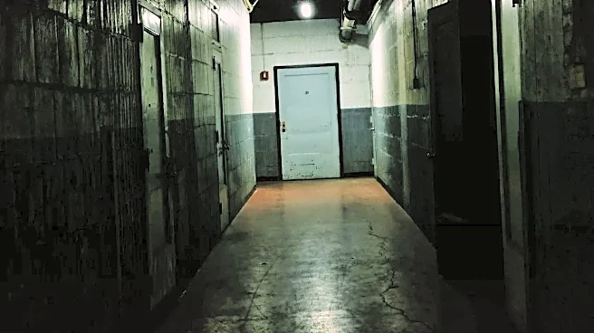
A pristine, modern house is rarely the setting for a ghost story. Production designers rely on texture to tell a story of time, neglect, and death. Think of peeling wallpaper, rotting floorboards, thick layers of dust, and professionally applied cobwebs. These elements do more than make a place look old; they suggest a history. Who lived here before? Why was it abandoned? The physical decay of the environment mirrors a moral or spiritual decay at the heart of the story. Designers might use specific materials, like damp-stained fabrics or brittle, yellowed paper, to trigger our innate aversion to rot and decomposition. It’s a tactile way of building dread, making the audience feel the grime and history of a location long before the ghost makes its first appearance.
Lighting to Hide and Reveal
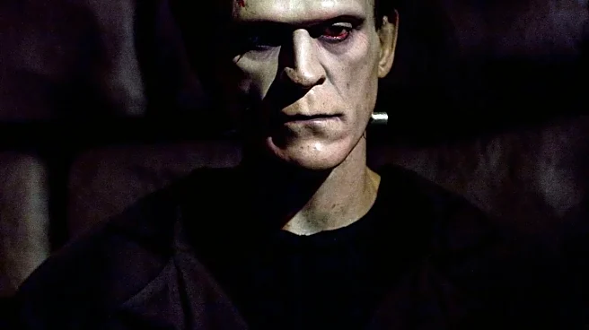
What you don't see is often scarier than what you do. Set design works hand-in-hand with lighting to create a landscape of fear. Darkness is a key tool, used to obscure parts of the frame and force the audience's imagination to fill in the terrifying blanks. Techniques like uplighting—shining a light from below a face or object—are classic because they mimic the look of a campfire horror story, creating unnatural and menacing shadows. Silhouettes are another powerful tool, turning a recognizable shape into a featureless threat. Even the fog that rolls across a graveyard set isn't just for looks; it diffuses light, softens edges, and creates a sense of mystery and isolation, making the world feel smaller and more threatening.
Props That Carry a Sinister Past
On a Halloween set, a prop is never just a prop. It's a piece of history, a carrier of dread. Production designers are meticulous about selecting or creating objects that feel loaded with unspoken stories. A child's rocking horse in an empty nursery, a collection of porcelain dolls with vacant stares, or a music box that plays a slightly off-key tune—these objects are chosen for their ability to be both innocent and deeply unsettling. Designers often 'age' or 'distress' props to make them feel used and haunted. A brand-new knife isn't scary, but a rusted one found in a dusty toolbox implies a dark purpose. This imbues the entire set with a sense of being lived-in and, potentially, died-in, turning every object into a potential clue or a future threat.