

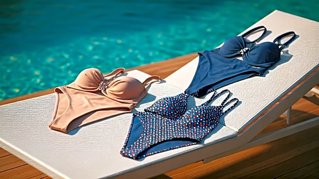
Apricot Crush and Papaya Orange
Why does a juicy, sun-drenched orange feel so right for summer? This year, designers leaned heavily into shades like apricot, papaya, and terracotta. In color psychology, orange is a beacon of optimism, creativity, and energy. It’s a social color, evoking
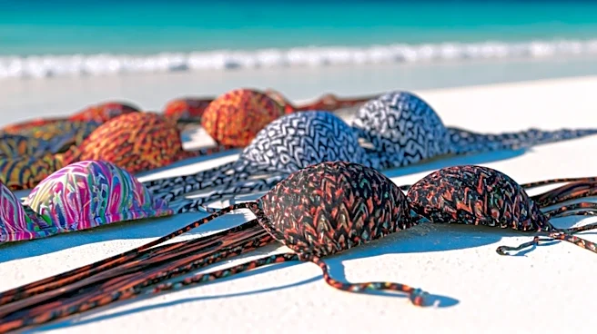
warmth and spontaneity—everything a perfect vacation is made of. Unlike a harsh, traffic-cone orange, these softer, earthier versions feel more sophisticated and accessible. They tap into the wellness trend, reminiscent of nourishing fruits and restorative sunsets. On the runway, these shades appeared in everything from sleek one-pieces to flowing kaftans, often rendered in textured fabrics that mimicked the feel of citrus peel or soft clay. It’s a color that doesn’t just say 'look at me'; it says 'let's go have fun.'
Aquatic Blues and Deep Cerulean
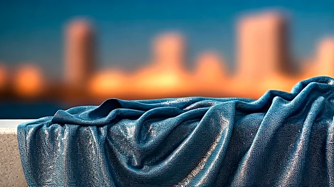
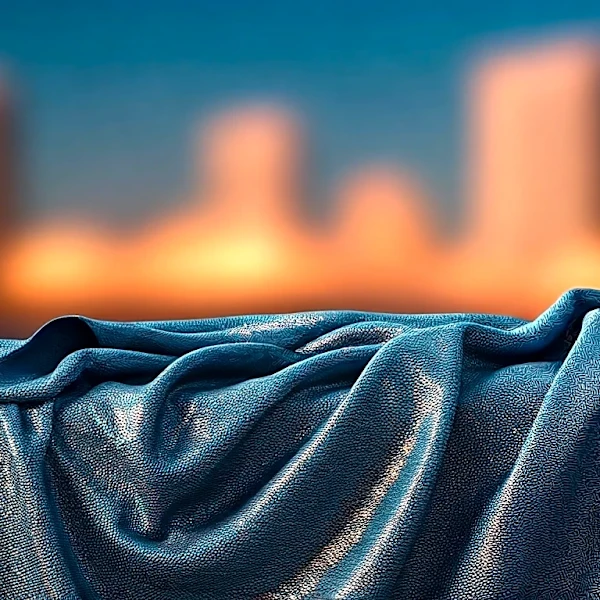
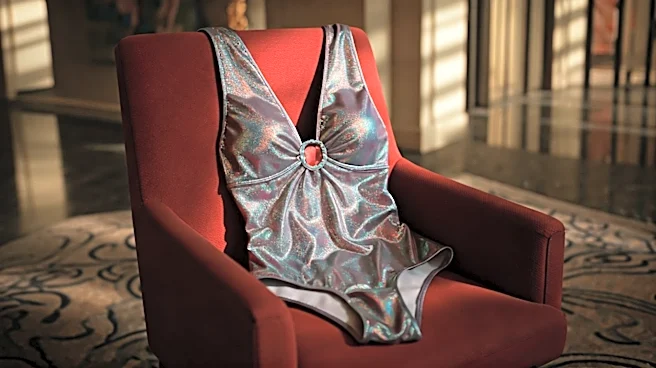
If orange is the sunset, blue is the escape. From the pale, crystalline blue of a shallow lagoon to the deep, commanding cerulean of the open ocean, aquatic blues offered a cool counterpoint to the season's fiery tones. Blue is universally associated with calm, stability, and tranquility. In a hectic world, wearing blue is like carrying a pocket of peace with you. For swimwear, it’s a no-brainer, directly referencing the water. But the specific blues at Swim Week felt intentional. They weren’t just navy; they were vibrant, living blues that suggested depth and clarity. Designers used these shades in high-sheen fabrics to mimic the reflective quality of water, creating a look that felt both powerful and serene. This palette is for the wearer who seeks refuge and confidence in equal measure.
Digital Lavender and Wisteria
For a few seasons now, trend forecasters have been talking about 'Digital Lavender.' Initially seen as a color for our online lives, it has officially made the jump into our real-world wardrobes. This muted, gentle purple was a surprise standout in Miami. Unlike its more regal and dramatic cousin, royal purple, lavender speaks to serenity, wellness, and a quiet sense of spirituality. It has a calming effect that feels both modern and timeless. Its digital-age origins give it a slightly futuristic, ethereal quality, making it an unexpected but intriguing choice for swimwear. Paired with minimalist designs, it looks chic and forward-thinking. In ruffled, romantic styles, it feels soft and dreamy. It’s the color for someone who wants to embrace calm without fading into the background.
Radiant Pink and Bold Magenta
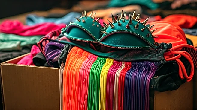
You can thank 'Barbiecore' for its staying power, but this season's pink is more than just a pop culture echo. It’s an unapologetic declaration of joy. Hot pinks and magentas dominated, serving up pure, unadulterated fun. From a color theory perspective, pink is associated with playfulness, femininity, and romance. But when you dial up the intensity to magenta, it takes on an electrifying confidence. It’s a color that refuses to be ignored. On the runway, it was used for maximum impact: think monochrome bikinis, dramatic cut-outs, and bold cover-ups. This isn't a shy, retiring color; it’s for making an entrance. It taps into a desire to shed the anxieties of the past few years and embrace pure, vibrant, main-character energy.
Earthy Greens from Olive to Matcha
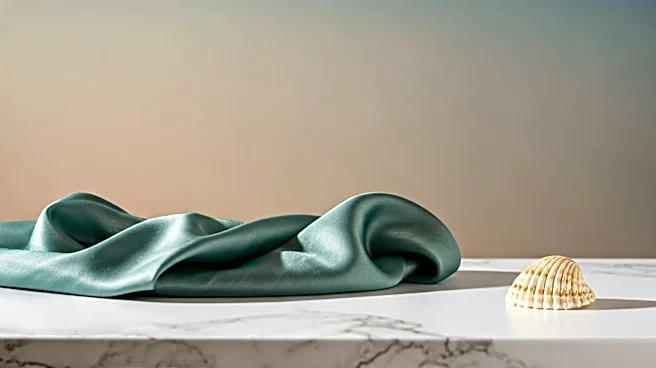
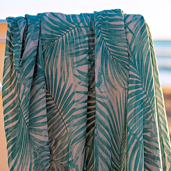
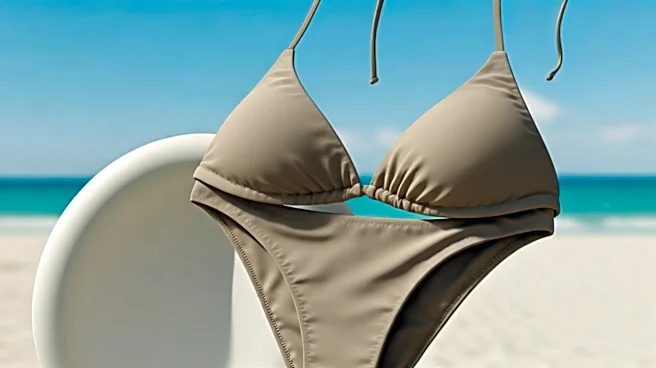
While brights had their moment, a more grounded palette also made a strong showing. Sophisticated, earthy greens—from deep olive to pale, dusty matcha—offered a chic alternative to neon. Green is the color of nature, balance, and harmony. These muted, organic tones feel grounding and centering. Unlike the lime greens of past summers, which screamed energy and youth, olive and matcha whisper elegance and timelessness. These shades flatter a wide range of skin tones and act as a 'fashion neutral,' pairing beautifully with classic black, cream, or even the season's vibrant oranges. Designers used these greens in ribbed fabrics and simple, classic cuts, emphasizing a return to nature and a desire for durable, lasting style over fleeting trends.