
Art, Not Just Correction
First, let's clear up a common point of confusion: color grading is not the same as color correction. Color correction is the technical first step, like tuning an instrument. It involves balancing the image
to make sure whites are white, blacks are black, and everything looks natural and consistent from shot to shot. It’s about creating a clean, realistic baseline. Color grading, however, is the performance. It's the creative process of stylizing those corrected images to evoke a specific mood or feeling. Think of it as applying an artistic filter over the entire film to tell a story visually. While correction is about accuracy, grading is about atmosphere, transforming a neutral scene into something charged with emotion.
The Psychology of the Palette
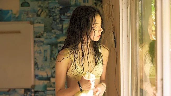
Our brains are hardwired to associate colors with feelings. Filmmakers lean on this shared psychological language to manipulate our experience. Cool tones, like blues, greens, and grays, can create a sense of melancholy, isolation, or unease. Think of the cold, sterile world of a hospital drama or the lonely emptiness of a post-apocalyptic landscape. Conversely, warm colors like reds, oranges, and yellows often communicate passion, happiness, nostalgia, and energy. A flashback to a cherished childhood memory might be bathed in a golden hue, while a tense, passionate argument might be intensified with deep reds. This isn’t an accident; it’s a deliberate choice to guide your emotional response without a single line of dialogue.
The 'Blockbuster' Look and Beyond
Once you start noticing color grading, you'll see it everywhere. One of the most common palettes in modern cinema is the “orange and teal” look, often dubbed the "blockbuster" style. This scheme uses the complementary colors of orange—often found in skin tones and explosions—and teal or blue in the shadows. The contrast makes the image pop, creating a dynamic, high-energy feel perfect for action films. But other styles are just as powerful. The sickly green tint of The Matrix created a digital, unnatural world. The sun-bleached, sepia tones of O Brother, Where Art Thou? transported audiences to the Depression-era South. And the fiercely saturated, graphic-novel style of Mad Max: Fury Road made its desert wasteland feel paradoxically vibrant and brutal. Each choice serves the story first.
How It All Comes Together
A colorist, working with the director and cinematographer, doesn't just apply a single look and call it a day. They sculpt the film's visual journey scene by scene. A character’s emotional arc can be mirrored by a shift in the color palette. For instance, a story about a protagonist finding hope might slowly transition from cold, desaturated colors to warmer, more vibrant ones. This is what separates masterful filmmaking from a simple Instagram filter. The color becomes an active participant in the narrative, enhancing the performances and themes. It’s a subtle art, but its impact is immense, capable of making a happy scene feel unsettling or a quiet moment feel profoundly warm.