
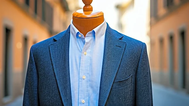


The Spirit of Pitti: 'Sprezzatura'
Before we name the culprit, we need to understand the scene of the crime. Pitti Uomo, the semi-annual menswear trade show in Florence, is famous for its attendees—the so-called “Pitti peacocks”—who parade outside the main event in dazzling displays of tailoring.
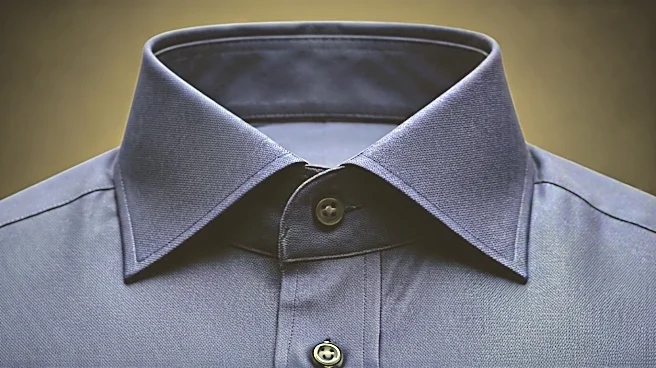
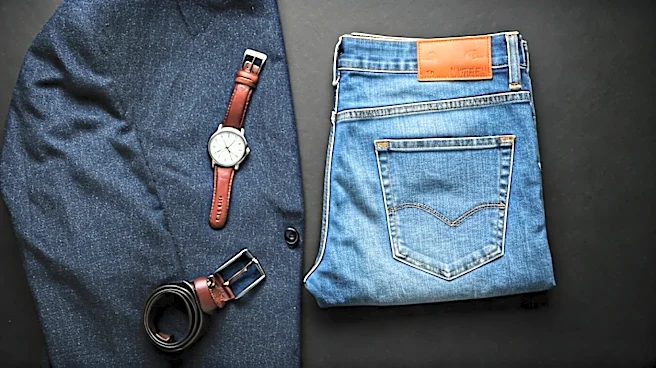
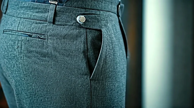
At its best, this isn’t about being flashy; it’s about mastering an Italian concept called *sprezzatura*. Coined in the 16th century, sprezzatura means “a certain nonchalance, so as to conceal all art and make whatever one does or says appear to be without effort and almost without any thought about it.” In style terms, it’s studied carelessness. It’s the perfectly tailored suit jacket worn with worn-in sneakers. It’s the watch strap left undone, the deliberately unkempt hair, or the tie knot that’s just a little askew. It’s the art of looking like you rolled out of bed looking this good, even if it took an hour of quiet consideration. This philosophy is the soul of advanced personal style.
The One Ruinous Mistake
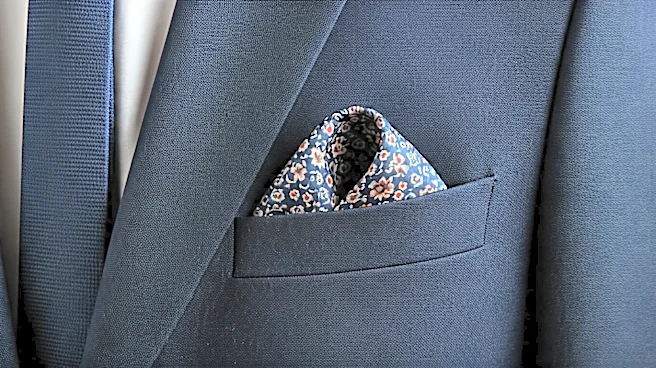
So, what’s the single mistake that shatters this carefully constructed illusion of ease? It’s not wearing a clashing color or a bold pattern. In fact, those can be signs of confidence. The real mistake is the opposite of nonchalance: contrived perfection. We’re talking about the pre-packaged pocket square and tie set. The one you buy in a neat little box at a department store, where the silk of the square is the exact same fabric, pattern, and color as the tie. It is the sartorial equivalent of a paint-by-numbers kit. A close second is the overly rigid, architecturally folded square that looks like it was starched, ironed, and set in place with a protractor. It sits in the pocket like a pristine, unmovable tombstone, screaming “I spent twenty minutes on YouTube learning this one specific fold.”
Why Perfection Is the Enemy
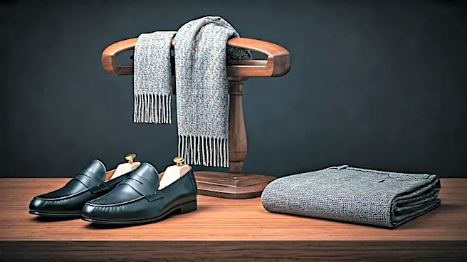
This kind of forced perfection is the mortal enemy of sprezzatura. It instantly signals that you’re not comfortable or confident enough to make your own choices. A matching tie-and-square set doesn’t say, “I have great taste.” It says, “Someone at a factory had great taste, and I bought their pre-approved combo.” It removes all personality from the equation, turning an opportunity for expression into a demonstration of obedience. Think of it this way: a great outfit is a conversation between different pieces. The textures, colors, and patterns should complement and play off one another. When the tie and pocket square are identical, that part of the conversation becomes a dull monologue. There's no harmony, just a single, boring note repeated. It looks amateurish because it suggests you don’t trust yourself to coordinate colors and patterns on your own. True style is about making connections, not perfect matches.
How to Get It Right
Avoiding this trap is simple, and it opens up a world of creative possibilities. The guiding principle is to complement, not match. Your pocket square should have a friendly relationship with your tie and shirt, not an identical one. Here’s how: 1. **Pull a Secondary Color:** Look at your tie or shirt. Is there a minor color in the pattern—a fleck of burgundy, a light blue stripe? Find a pocket square that picks up on that secondary color as its primary shade. This creates a visual link that is sophisticated and intentional, but not obvious. 2. **Vary the Pattern and Texture:** If your tie is a smooth silk with a small, repeating pattern, try a pocket square in a different material like linen or a wool-silk blend with a larger, more abstract pattern like a paisley. The contrast in texture and pattern scale adds depth and visual interest. 3. **Embrace the Imperfect Fold:** Forget the razor-sharp presidential fold for all but the most formal occasions. The easiest and most versatile option is the puff fold. Just lay the square flat, pinch it from the center, lift it, and gently stuff the base into your pocket, arranging the blossoming top. It should look relaxed and spontaneous. A little imperfection here is a sign of confidence, not sloppiness.