



The Wild West of the Video Aisle
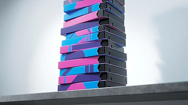
In the 1980s, before streaming algorithms and instant trailers, the video rental store was a battleground for your attention. With hundreds of titles lining the shelves, a movie had one chance to make a first impression, and that chance was its cover.
For the horror genre, this created a visual arms race. Distributors knew their audience was looking for a thrill, and the box art became the primary tool to promise it. This was especially true for the burgeoning direct-to-video market, where films with low budgets and extreme content could find an audience without ever hitting a theater. The cover was everything; a silent, static salesperson that had to scream louder than every other movie on the shelf.
An Illustrated Language of Terror
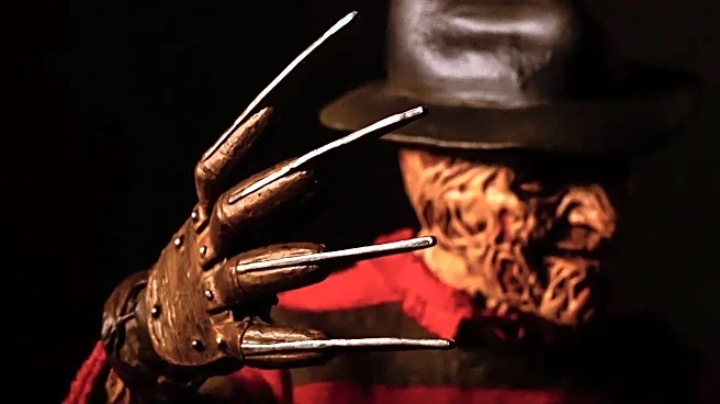
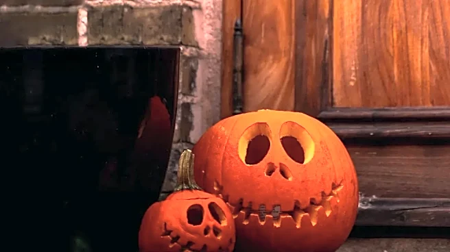
A distinct visual language quickly emerged. The goal was to grab your eye and spark a morbid curiosity. Common tropes included high-contrast images, often with a single, central figure of terror: a brightly lit pumpkin with a knife, a creepy doll, or a monster bursting from an unexpected place, like a toilet in Ghoulies. Bold, often bloody fonts and simplified color palettes—usually black and white with a shocking splash of red or orange—were standard. The artwork, frequently hand-painted or airbrushed, promised a level of visceral horror and spectacle that the film itself might not even contain. Covers for films like A Nightmare on Elm Street or The Evil Dead perfectly communicated supernatural menace, burning images into the minds of anyone who dared to browse the horror section.
From Physical Box to Digital Click
The death of the video store and the rise of streaming changed the game. The oversized, tangible VHS box has been replaced by a tiny, algorithmically-chosen thumbnail on a screen. You might think this would render the old-school design principles obsolete. Yet, the core challenge remains the same: how to stand out in a sea of content and get someone to click. The AIDA marketing model—Attention, Interest, Desire, Action—that drove VHS cover design is still fundamentally at play. The art still needs to arrest a scrolling thumb, create interest with a compelling image, and generate the desire to press play. While the canvas is smaller, the psychological triggers are identical.
The Retro Echo in Modern Spooky Season
Every October, as studios roll out their biggest scares, the ghosts of the video store return. The most obvious influence is in nostalgia-heavy projects like Stranger Things, whose posters explicitly mimic the painted, montage style of classic 80s films. But the influence runs deeper. Look at the marketing for acclaimed modern horrors like It Follows, which utilized a retro poster style to convey its timeless, dread-filled atmosphere. You can see the DNA of old-school design in the high-contrast lighting, the focus on a single, terrifying symbol, and the bold typography used in posters for countless recent horror releases. This isn't just lazy nostalgia; it’s a recognition that this visual language works. It efficiently tells the audience what kind of experience they're in for, tapping into a shared cultural understanding of what makes a horror movie look right.