

The Runway's Relentless Color Wheel
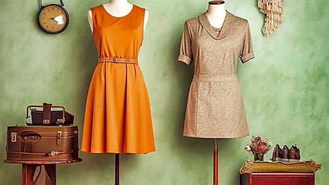
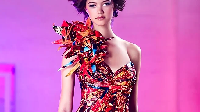
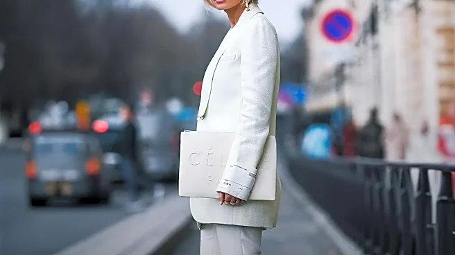
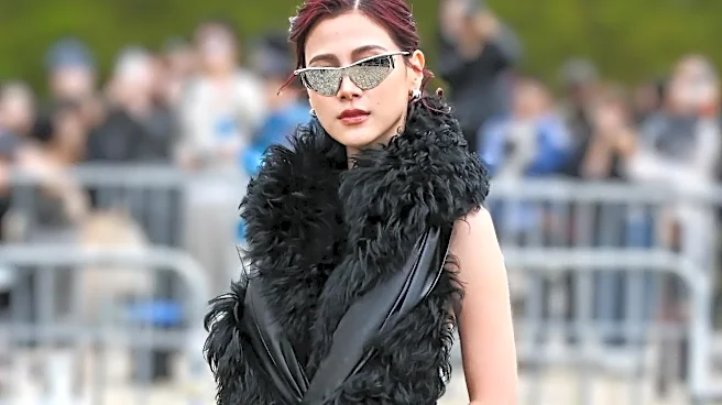
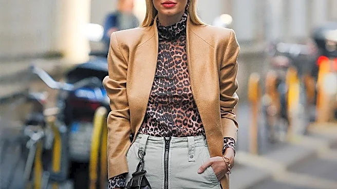
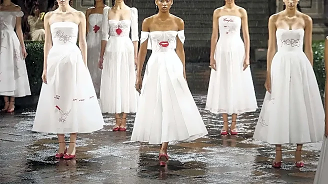
New York Fashion Week (NYFW) operates as the fashion world’s opening bell, setting the tone for the season ahead. For September 2026, a specific vision is being broadcast: runways and street style are ablaze with bold reds, while earthy tones like rich
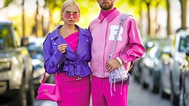
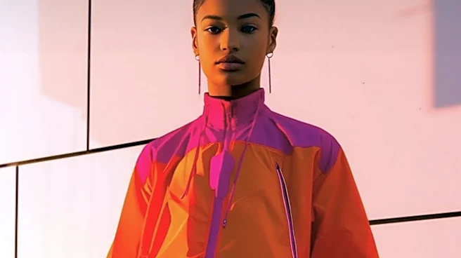
browns and fawn prints are also making a strong appearance. Trend forecasting agencies predicted a mix of nature-inspired greens, soft purples, and calming neutrals would dominate the year. This seasonal color mandate creates a familiar pressure. Suddenly, that specific shade of “Festival Fuchsia” or “Neptune Green” feels like a must-have, driving a cycle of consumption that can feel both exhilarating and exhausting. The industry is built on this churn; trends are designed to have a life cycle of introduction, rise, peak, decline, and eventual obsolescence, a process now hyper-accelerated by social media. The result is often a wardrobe filled with once-trendy items that quickly feel dated.
The Personal Palette Pushback
In the face of this rapid-fire trend cycle, a counter-movement is gaining quiet but significant traction: personal color analysis. Far from a new concept, this system is experiencing a major resurgence, championed on social media platforms as a way to find colors that harmonize with your natural skin, hair, and eye tones. The theory categorizes individuals into “seasons”—typically Winter, Spring, Summer, or Autumn—each with a corresponding palette of flattering hues. A "Winter," for example, shines in cool, bright, high-contrast colors like black and ruby red, while an "Autumn" glows in warm, muted, earthy shades like mustard and olive green. Instead of chasing Pantone's color of the year, people are using this framework to build a timeless, cohesive wardrobe that works for them, regardless of what’s trending. This shift reflects a broader consumer fatigue with micro-trends and a growing desire for longevity and sustainability in fashion.
The Psychology of Your Best Colors
The power of personal color analysis lies in psychology. Wearing colors that clash with your natural undertones can make you look tired or sallow, while the right shades can make your features appear brighter and more defined. This isn't just about aesthetics; it's about confidence. Color psychology research shows that different hues evoke specific emotional responses. Red can signal power and passion, while blue often conveys trustworthiness and calm. When you wear colors from your personal palette, you're not just looking better—you often feel better. This phenomenon, sometimes called "enclothed cognition," suggests our clothing directly affects our psychological state. By consciously choosing colors that make you feel energized and authentic, you’re less likely to be swayed by the fleeting validation of a trend. The compliment shifts from "I love that trendy color" to "That color looks amazing on you."
Your Colors vs. The Industry's
So what happens when your season’s colors don’t align with NYFW’s? Absolutely nothing—and that’s the entire point. Embracing a personal palette doesn’t mean you have to ignore fashion week entirely. Instead, it equips you with a filter. You can observe the rise of a trendy color like, say, the bright reds seen this season, and assess it with newfound clarity. If it’s in your palette, great. If not, you can confidently skip it, knowing it wouldn't serve you anyway. This approach transforms you from a passive consumer into an active curator of your own style. It’s a shift from asking, "Is this in style?" to "Is this right for me?" This mindset fosters a more sustainable and economically sound approach to shopping, prioritizing high-quality pieces in your best shades over disposable fast-fashion items designed to capture a fleeting moment. It’s the ultimate long-term style strategy, reducing the power of external validation by strengthening your internal sense of self.