

The Case for Pastels: Timeless Elegance
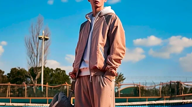
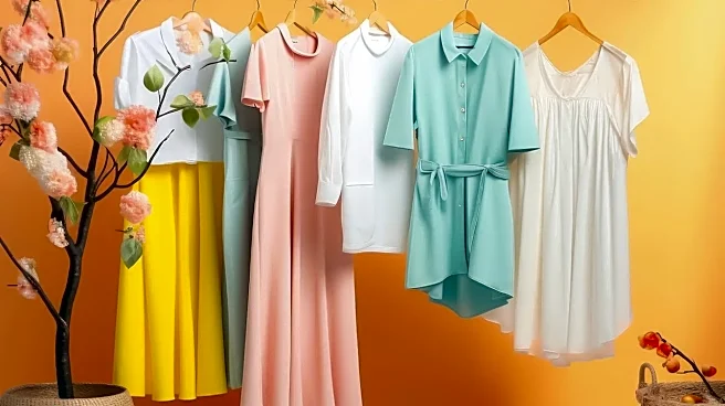
The pastel palette is deeply rooted in the history of tennis fashion. Think of the classic, old-money aesthetic of country club courts and the refined style of early tennis stars. Shades like mint green, soft lavender, butter yellow, and baby blue evoke
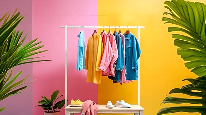
a sense of sophisticated calm and playful elegance. This look is less about shouting for attention and more about a quiet confidence. A pastel tennis dress or a pleated skirt in a soft hue feels light, airy, and perfectly suited for a sunny spring day. It’s a nod to the sport's genteel origins, when white and other light colors were favored. Choosing pastels aligns your style with the 'quiet luxury' movement, creating a look that’s preppy and polished without feeling stuffy.
How to Style the Pastel Look
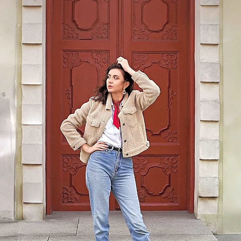
Wearing pastels well is all about balance. To avoid looking washed out, pair your chosen pastel piece with crisp white sneakers and classic crew socks to ground the outfit. A monochrome look—like a mint green top with a matching skirt—can be incredibly chic and elongates your silhouette. Fabric is also key; the structure of a pleated skirt or the texture of a cable-knit sweater vest in a pastel shade adds dimension. Don't be afraid to layer different soft tones, like a pale blue polo under a cream-colored V-neck sweater. For accessories, keep it simple with delicate jewelry and a canvas tote to maintain that effortlessly put-together feel.
The Case for High-Contrast: Modern Energy
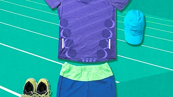
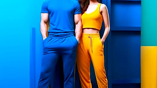
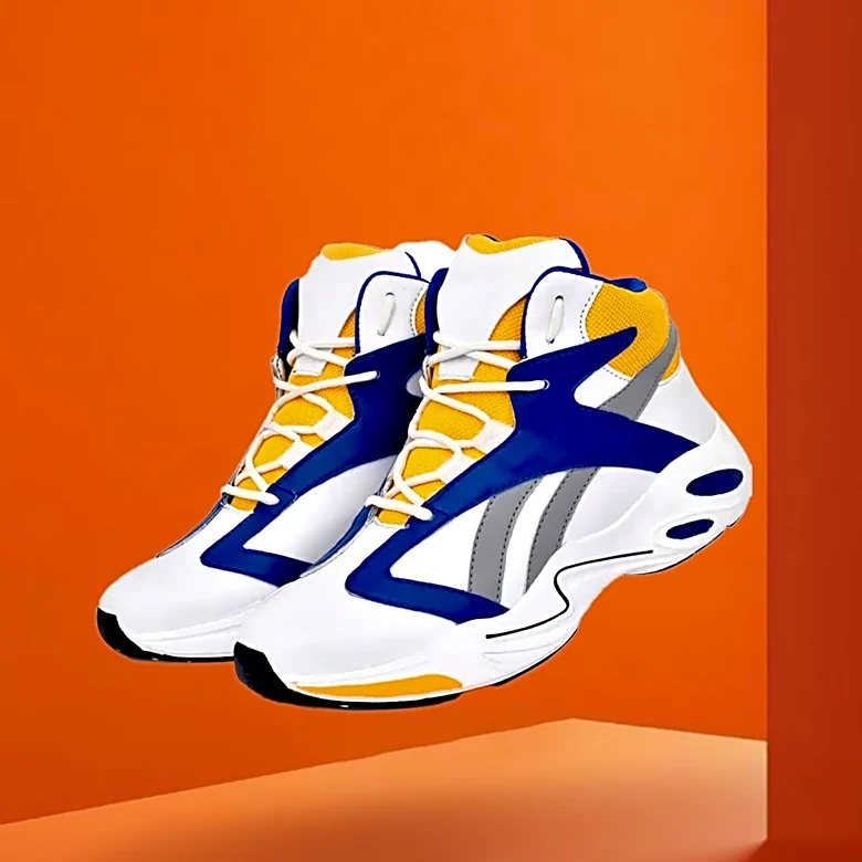
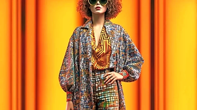
If pastels represent tradition, high-contrast color-blocking is all about the future of tennis fashion. This trend reflects the sport's evolution—faster, more powerful, and with a bold, international energy. It draws inspiration from streetwear and the vibrant, attention-grabbing outfits worn by modern tennis icons like Venus and Serena Williams. Think sharp geometric blocks of neon yellow against navy blue, or electric pink paired with charcoal grey. This style makes a statement, conveying dynamism and a competitive edge. It’s for the player who wants their outfit to be as high-impact as their forehand. Brands are increasingly blending performance fabrics with these eye-catching designs, creating pieces that are both functional and fashion-forward.
How to Rock a High-Contrast Outfit
The key to pulling off a high-contrast look is confidence. Let the bold colors be the star of the show by keeping the silhouettes classic. A traditional A-line tennis dress, for instance, feels fresh and exciting with unexpected color panels. When mixing and matching, try pairing one vibrant piece, like a neon green skirt, with a top in a grounding neutral like black or white. This creates a focal point without overwhelming the eye. You can also use accessories to introduce contrast; bright, striped crew socks or a colorful visor can add a pop of energy to an otherwise simple outfit. To care for these garments, always wash them in cold water to prevent the bright and dark colors from bleeding into one another.
So, Which Palette Is Right for You?
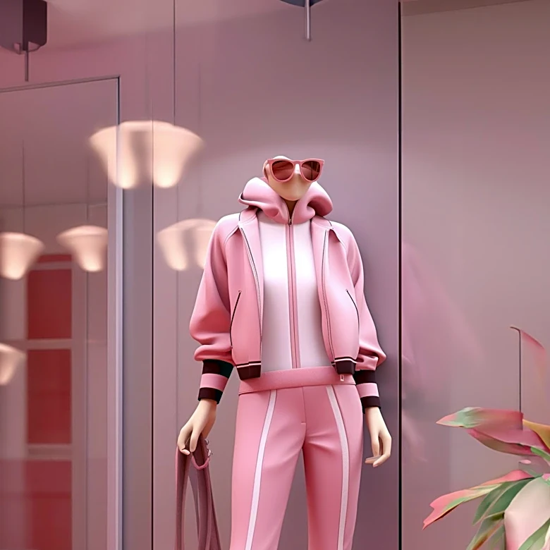
Choosing between these two distinct styles ultimately comes down to your personality and the mood you want to project. Ask yourself a few questions: Is your personal style more classic and understated, or modern and bold? Are you dressing for a relaxed weekend brunch or a high-energy match? Pastels are perfect for a softer, more romantic take on the tenniscore trend, ideal for everyday wear and tapping into a vintage, preppy feel. High-contrast colors are your go-to when you want to feel powerful, look dynamic, and stand out from the crowd, both on and off the court. Remember, your wardrobe doesn't have to be exclusively one or the other. Many of the most stylish tenniscore enthusiasts mix elements of both, creating a look that is uniquely their own.