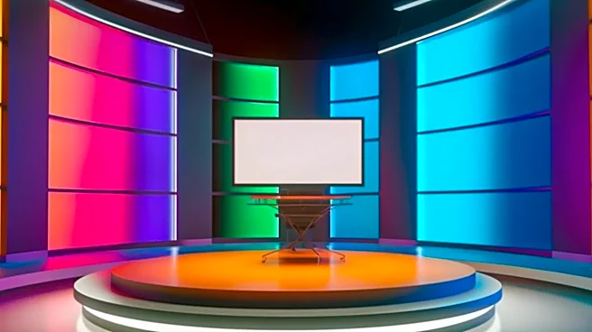









1. The Lighting Is Too Safe and Even
The most common culprit behind a flat image is flat lighting. It’s an easy mistake to make, born from a desire to ensure everything is visible. You blast the set with soft, even light from the front, eliminating every shadow. While this makes the set bright,
it also kills dimension. Without shadows, the brain has no cues for depth, and every surface blends together. This is often called “broadside lighting,” where the key light is placed near the camera. The result is a washed-out image that lacks texture and drama. A well-lit set uses a combination of light and shadow to create shape. The foundational three-point lighting system—using a key light, fill light, and backlight—is a starting point for a reason. The key light creates shape, the fill softens shadows (without eliminating them), and the backlight separates your subject from the background, creating an essential layer of depth. Don't be afraid of shadows; they are your most powerful tool for creating a three-dimensional feel.
2. The Camera Never Moves
A static camera can make even the most dynamic set feel like a painted backdrop. When the camera is locked down in one position, the viewer loses a powerful sense of parallax—the effect where objects in the foreground move faster than objects in the background. This subtle motion is critical for conveying depth and making the space feel real and immersive. Even small, deliberate movements can bring a set to life. A slow push-in, a gentle slide, or a subtle crane shot can reveal layers and change the relationship between the foreground, midground, and background. This doesn't mean you need constant, dizzying motion. It’s about motivating the camera to explore the space you’ve built. Furthermore, avoid placing the camera dead-center and at eye level for every shot. Changing the angle and height can dramatically alter the perception of the set, making it feel larger, more intimate, or more imposing.
3. The Color and Textures Are All the Same
In the real world, a minimalist, low-contrast set might feel chic and sophisticated. But on camera, it can look like a monotonous void. The camera lens compresses space, and without sufficient contrast in color and texture, elements tend to blend together. If your host is wearing a gray suit while sitting on a gray couch in front of a gray wall, you’ve created a flat, uninteresting image, no matter how expensive the furniture is. Use color to create separation. This can be as simple as ensuring your talent's wardrobe contrasts with the set furniture or using colored light on the background to make it pop. Texture plays a similar role. A mix of surfaces—like wood grain, fabric weaves, glossy finishes, and rough materials—catches light differently, creating subtle highlights and shadows that add visual interest and a sense of realism. Overly busy patterns can be distracting, but a complete lack of texture is a recipe for a flat broadcast.
4. You're Designing a Room, Not a Shot
Set designers can fall into the trap of creating a perfect room instead of a perfect shot. A live set has to function from 360 degrees, but a broadcast set only has to work for the angles the camera will see. The key is to think in layers, or what artists call the Z-axis (the axis of depth). A great broadcast set intentionally places elements in the foreground, midground, and background to create a deep, layered image. This could mean having a plant or a monitor in the foreground (just out of focus), the talent in the midground, and a textured wall or cityscape in the background. Each layer adds to the illusion of depth. Overcrowding is a risk, but leaving wide, empty spaces is often worse. Stage your set specifically for your most common camera shots, ensuring there's always something in the frame to establish scale and perspective.
5. You’re Ignoring the Screens on Set
In modern broadcast design, video screens are practically furniture. But they come with their own set of problems that can instantly make a set feel cheap or artificial. Mismatched color temperatures are a major issue; a screen with a default cool, bluish tint will look jarring next to warmer studio lights (around 3200K). Most professional screens allow you to adjust the color temperature to match your lighting. Another common issue is flicker or scan lines, especially with older screens or when using the wrong camera shutter speed. Using a shutter speed of 1/60 or slower can often mitigate this. Finally, the content on the screen matters. A screen that is too bright will blow out on camera, losing all detail. It's better to slightly underexpose the screen's content and ensure it complements, rather than competes with, the main subject.