






A Masterstroke of High Contrast
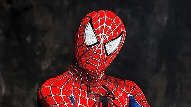
The core of the suit’s genius is its breathtaking simplicity and contrast. The design, created by artist Steve Ditko, uses large, bold blocks of color. This isn’t just red and blue; it’s a brilliant interplay of value. The bright, aggressive red of the torso,
mask, gloves, and boots pops against the cooler, darker blue of the limbs and sides. This high contrast creates a distinct silhouette that your brain can identify in a fraction of a second, regardless of distance. While other heroes of the era also used primary colors, Ditko’s specific arrangement for Spider-Man—dividing the body into these unforgettable zones of color—is what makes it so visually sticky and unique. Even without the fine web details, the core shapes do all the work.
A Design Born From Technical Limits
The choice of red and blue wasn't arbitrary or even story-based—no spider is naturally those colors. It was a practical solution to the technological constraints of 1960s comic book printing. At the time, comics were printed using a cheap, four-color process (cyan, magenta, yellow, and black) on low-quality newsprint. Bold, primary colors like red and blue were among the few that could be reproduced reliably without turning into a muddy mess. Subtle shades were impossible. Ditko and his contemporaries had to create characters that would pop off the newsstand rack. The vibrant red and blue ensured Spider-Man would be instantly visible against the often gray and muted backgrounds of New York City panels, a crucial factor for grabbing a reader's attention.
The Psychology of a Hero
Beyond the technical brilliance, the colors perfectly encapsulate Peter Parker’s character. Red is universally associated with passion, energy, determination, and sometimes danger or aggression. Blue conveys stability, confidence, responsibility, and wisdom. This combination tells Spider-Man’s entire story: he is a passionate, energetic teenager (red) burdened with immense power and the solemn responsibility that comes with it (blue). It’s the visual representation of the 'great power, great responsibility' theme. The two colors exist in a dynamic balance, just like the two halves of Peter Parker's life. This combination is so effective that many of pop culture's greatest heroes, from Superman to Captain America, use a similar palette to project heroism.
The Finishing Touches That Matter
While the color blocking provides the foundation, two other key elements seal the deal. First, the full face mask. Ditko's decision to completely obscure Peter Parker's face was a major departure from other heroes. This unintentionally made Spider-Man a universal figure; anyone could imagine themselves under that mask. Second, the web pattern. This was another Ditko innovation, as patterned costumes were rare due to the extra work required. The thin black webbing breaks up the large fields of red, adding texture and dimension that catches the eye. It constantly reinforces the 'spider' theme on a costume that otherwise has little to do with arachnids. Together, these elements—bold color, a universal mask, and a defining pattern—create a design that is not just readable, but timeless.