



The Lure of the Lone Statement Piece
The problem doesn't start in your closet; it starts in the store. Summer fashion is a celebration of vibrant, optimistic color. Retailers lean into this, showcasing mood-boosting brights designed to catch your eye. Think of the current season's popular
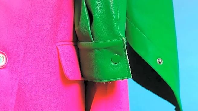
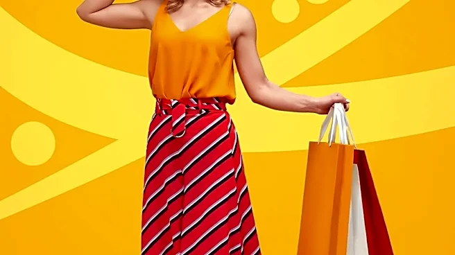
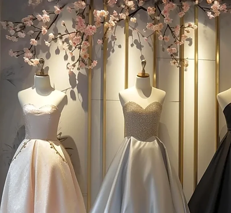
fire engine reds, feel-good greens, and cerulean blues. These are what marketers call “accent colors.” They are designed to create an emotional response and feel exciting, special, and essential for the perfect summer vibe. The trap is that these pieces are often displayed and sold as individual heroes. That brilliant lime chartreuse top looks incredible on the mannequin, but it's a solo artist. First-time shoppers, and even experienced ones, get seduced by the beauty of a single item without a plan for how it will fit into their larger wardrobe. The result is a closet full of beautiful but incompatible statement pieces—a team of all-stars who can't play together.
The Psychology of a Bad Decision
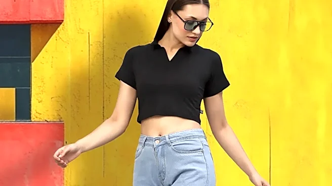
Retail environments are engineered to encourage impulse buys, and color is their most powerful tool. Bright, saturated colors like the turquoise, tomato red, and citrus yellow trending this summer are associated with energy, excitement, and optimism—the very feelings we chase during the warmer months. When you see that that perfect piece, your brain gets a hit of dopamine. You're not just buying a shirt; you're buying the feeling of a perfect beach day or a fun evening out. The issue is that these high-emotion colors often clash. Retailers understand that a strategic color palette is a business decision, not just an aesthetic one. By filling the front of the store with trendy, eye-catching colors, they increase the chances you’ll fall in love with an item on its own merits, rather than considering its practicality. They’ve made a sale, but you’re left with a wardrobe puzzle.
The Three-Color Wardrobe, Solved
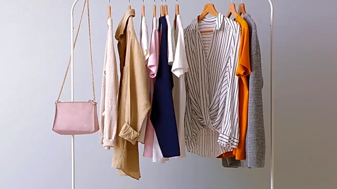
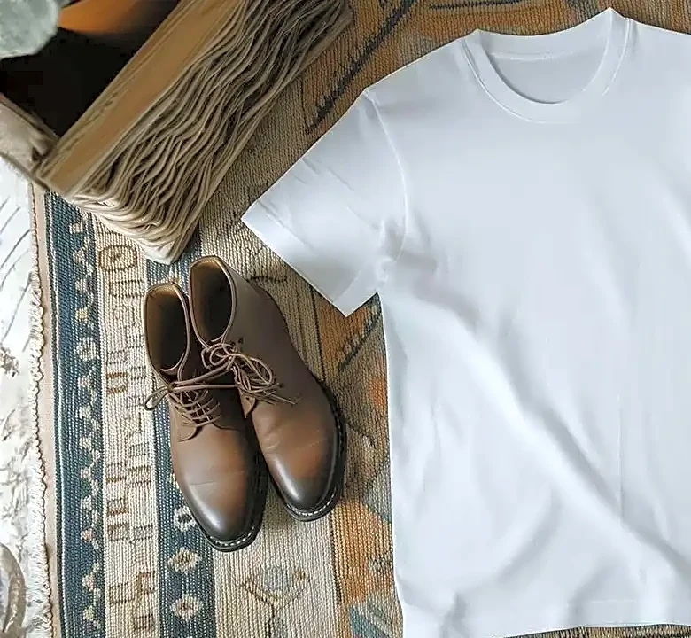
The fix is surprisingly simple: stop thinking about individual items and start thinking in palettes. The most effective way to build a functional wardrobe is to establish a core set of colors before you even start shopping. A classic rule is to build your wardrobe around two or three neutral base colors and one or two main or accent colors. Your base neutrals are the foundation. These are the versatile, timeless shades that will make up the bulk of your essentials, like shorts, trousers, and basic tops. For summer, forget heavy black. Think softer, lighter neutrals like cloud dancer white, stone, soft grey, navy, or chocolate brown. These colors are the quiet backbone of your wardrobe; they go with everything, especially each other.
Building Your Perfect Summer Palette
Once you have your neutrals, you can strategically add your fun colors. Choose one or two main colors and one or two accent colors that you genuinely love and that work well together. For example, if your neutrals are soft white and navy, you could choose pale blue as a main color and sunshine yellow as an accent. Suddenly, your shopping trip has a filter. The pale blue dress? It works with your white sandals. The yellow top? It pairs perfectly with your navy shorts. You can even mix them for a more dynamic look. The 80/20 rule is a helpful guide: aim for 80% of your wardrobe to be these versatile neutral and main colors, and reserve 20% for those fun, bold accent pieces. This structure ensures almost everything you own can be mixed and matched, creating dozens of outfits from a handful of carefully chosen items.