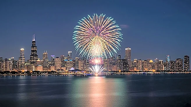


A Symbol Hiding in Plain Sight
Once you see it, you can’t unsee it. It’s a simple, three-pronged shape, often enclosed in a circle: a 'Y'. This character is embedded in the city’s DNA, appearing on everything from historic buildings and bridges to manhole covers and lampposts. It even
graces the iconic marquee of the Chicago Theatre. For the casual visitor, it’s just a decorative flourish. For those in the know, it’s a map of the city’s past and a key to its very existence. This isn’t just any letter; it’s Chicago’s official “Municipal Device,” a symbol meant to instill civic pride, though it has long been overshadowed by the city's more famous four-star flag.
The River That Made a City
So, what does it mean? The 'Y' is a graphic representation of the Chicago River. Specifically, it depicts the crucial point at Wolf Point, where the river’s North and South branches converge before flowing as one main stem into Lake Michigan. This confluence isn't just a picturesque feature; it’s the geographic reason Chicago is where it is. Early on, this fork in the river was a vital hub for Native American tribes and, later, for French fur traders, serving as a critical link in the water route connecting the Great Lakes to the Mississippi River and, by extension, the Gulf of Mexico. Wolf Point became the site of Chicago's first tavern, hotel, and theater, establishing itself as the city’s original commercial and social center.
From Geography to Iconography
The symbol's journey from a geographical feature to an official emblem began in 1892. In the run-up to the World's Columbian Exposition, the Chicago Tribune held a contest to design a symbol that would unify the city. A Danish-born architect, Alfred J. Roewad, submitted the winning design, proposing the 'Y' to represent the three branches of the river. While his initial color suggestions were cheekily dismissed as looking like “liver and lard,” the symbol itself stuck. It was officially adopted by the City Council in 1917, the same year as the city flag, and designated for public use to promote a sense of shared identity. Roewad himself noted the design symbolized the city's three divisions—North, West, and South—coming together.
A Symbol's Fading and Revival
Despite its official status, the Municipal Device fell into relative obscurity for a period in the 20th century. Some speculate its resemblance to the peace sign, especially when inverted, made it less popular with city officials during the Vietnam War era. In fact, some agencies intentionally flipped the 'Y' to celebrate the monumental engineering feat of reversing the Chicago River's flow in 1900. Today, however, the 'Y' is experiencing a quiet comeback. It's featured in the new Cook County flag, incorporated into the massive Wacker Drive reconstruction project, and embraced by a new generation of Chicagoans who appreciate the deep-rooted story it tells. It’s a scavenger hunt for architecture buffs and a subtle nod to the city’s foundational history.