





The Sunshine-Soaked Setup
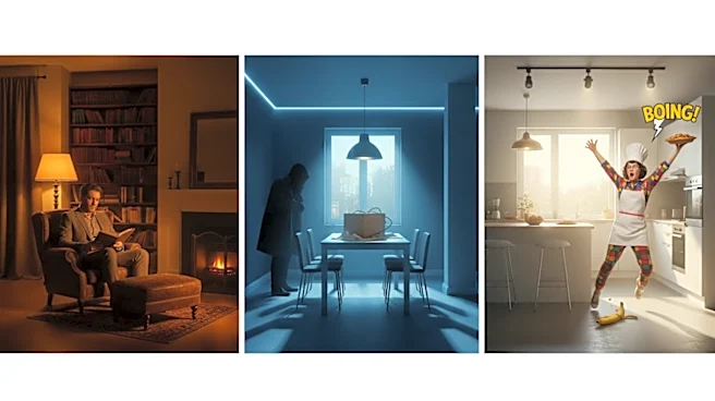
Think of a classic comedy or rom-com. The visual world is typically bright, warm, and inviting. Colors are often saturated and clear, emphasizing a feeling of safety, fun, and optimism. Cinematographers use warm color temperatures, featuring soft golds,
vibrant primary colors, and natural skin tones that make characters feel approachable and relatable. This high-key lighting, with minimal harsh shadows, creates an open, honest atmosphere. It’s a visual language that says, “relax, you’re in a safe space, and everything is going to be okay.” The world feels cheerful and straightforward, mirroring the lighthearted tone of the narrative.
The Desaturation of Safety
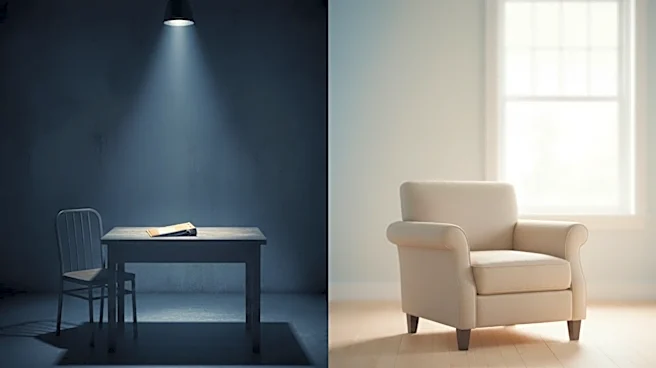
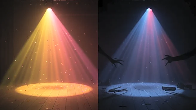
The turn happens when that warmth begins to drain away. As a story veers into darker, more dangerous territory—be it psychological thriller, horror, or tragedy—the color palette often shifts dramatically. The vibrant saturation gets dialed down, replaced by muted, desaturated, or cooler tones. Bright, sunny days are replaced by overcast gloom, and interiors become awash in clinical blues, sterile grays, and sickly greens. Shadows deepen and become more pronounced, creating a high-contrast look that feels tense and oppressive. This isn't just a stylistic whim; it's a psychological cue. Cool palettes can make an environment feel raw, alienating, and unsettled, mirroring a character's internal descent or the intrusion of an external threat.
Case Study: When the Laughs Curdle
This technique is a hallmark of modern genre-bending storytelling. In Bong Joon-ho's masterpiece Parasite, the wealthy Park family home is initially shown in warm, bright, and natural tones, full of lush greens and sunlit spaces. As the Kim family's infiltration deepens and the underlying tensions surface, the palette becomes colder, dominated by sterile blues, grays, and the oppressive shadows of the basement. The climactic, bloody birthday party happens under a bright, cheerful sun, but the introduction of shocking red breaks the established visual peace entirely. Similarly, HBO's Barry masterfully charts its protagonist's moral decay through color. The series begins with the brighter, sometimes flat lighting typical of a comedy, but as Barry's worlds of acting and killing collide, the look becomes progressively darker and more cinematic. The final season, in particular, leans into deep shadows and a desaturated, claustrophobic feel, even in wide-open landscapes, visually trapping the characters in the consequences of their actions.
The Psychology of the Palette
Why does this work so well? On a subconscious level, we are wired to associate colors with specific emotions and feelings. Warm colors like yellows and soft oranges often feel inviting and nostalgic, while cool colors like blue and gray can evoke sadness, detachment, or a clinical coldness. A sudden shift toward a monochromatic or heavily desaturated look signals a loss of vitality and hope. Specific colors are used as warnings. Green, often a symbol of life, can be twisted to feel artificial, corrupt, or eerie, as seen in films like The Matrix or Joker. A sickly, jaundiced yellow can suggest moral decay and madness. By stripping away the comforting warmth of a traditional comedy palette, filmmakers remove our sense of security. They visually communicate that the rules have changed, and the characters—and the audience—are no longer safe.