



The Power of a Blank Canvas
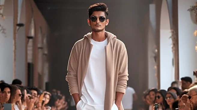
When a designer strips away the distraction of vibrant patterns and competing hues, something fascinating happens: the audience is forced to see the clothes differently. A restrained color palette—think monochrome looks or a tight selection of neutrals
like black, ivory, grey, and charcoal—acts as a blank canvas. This intentional lack of color noise directs the eye toward elements that a riot of color might otherwise obscure. Suddenly, the focus shifts to the foundational pillars of design: silhouette, cut, and construction. As designer Pierpaolo Piccioli noted about a monochromatic Valentino collection, the goal was to “remove distractions and concentrate the viewers’ eyes on distinguishing the differences between silhouette and detail.” This approach is an act of supreme confidence, a declaration that the garment's form and craftsmanship are so strong they don’t need color to make an impact.
Spotlighting Silhouette and Texture
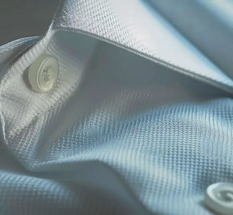
With color taking a backseat, texture and fabric become the main characters. A single-color ensemble can become a complex landscape of varied materials—the subtle sheen of silk against the matte finish of wool, the structure of leather paired with the softness of cashmere. This interplay creates a rich, tactile dimension that engages the senses on a deeper level. Brands like The Row have built an entire aesthetic on this principle. Their collections often feature soft, connected colors where black, cream, brown, and navy coexist with very little sharp contrast. The result is that the eye notices the cut and the graceful movement of the clothes first. Designers like Rick Owens, known for his dark and sculptural work, use a muted palette to transform the human body, treating it as material for avant-garde shapes where fabric, shadow, and form are everything. It’s a philosophy that proves visual interest doesn’t require a rainbow; it can be found in the subtle dialogue between different surfaces.
A Masterclass in Mood
Color is intrinsically linked to emotion, a tool designers use to set the tone of a collection. While bright colors often evoke energy and joy, a muted or monochromatic palette can create a powerful and specific atmosphere. The use of all-black can signal sophistication, rebellion, or mystery, while a collection steeped in shades of white might convey purity and minimalism. It’s a form of psychological stage-setting. This philosophy is evident in the minimalist movement, which rejects the visual excess of fast fashion in favor of timelessness and tranquility. The calming effect of neutral colors can provide a sense of stability and elegance, allowing the wearer's personality to shine without being overshadowed by loud prints. This control over mood demonstrates that restraint is not an absence of creativity but a highly focused and intentional form of expression.
The Confidence of Quiet Luxury
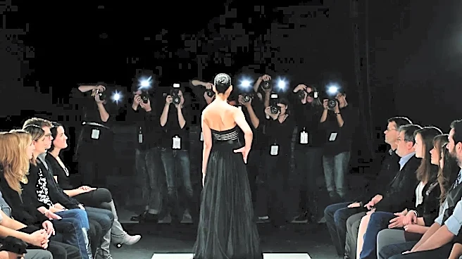
In an era increasingly defined by “quiet luxury,” a restrained palette is the ultimate status symbol. It telegraphs a sense of permanence and investment over fleeting trends. Neutral, timeless pieces are inherently more versatile and have greater longevity, aligning with a more sustainable approach to building a wardrobe. On the runway, this translates to a look that feels curated and intelligent. By choosing a simple color story, a designer communicates that their work is not about chasing the flavor of the month but about creating enduring pieces of art. This approach challenges the very idea of what it means to be “bold.” It suggests that true impact isn't about being the loudest in the room, but about having the confidence to speak in a measured, deliberate tone, knowing that every word—and every stitch—will be heard.