





You’ve been there: pairing a black cotton tee with black silk trousers, only to find they don't quite match. This isn't a trick of the eye; it's a complex interplay of fiber, texture, and light that makes monochromatic dressing a real challenge.
It Starts with the Fiber
The root
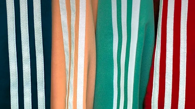
of color inconsistency lies in the fundamental difference between fabric types. Natural fibers like cotton, wool, and linen are porous and highly absorbent. Their cellular or protein structures readily soak up water-soluble dyes, allowing color to penetrate deeply. Think of cotton like a sponge; it drinks in the dye, which results in rich, consistent color. Silk, a protein fiber, is also excellent at absorbing dye, which contributes to its reputation for vibrant, lustrous hues. Synthetic fibers such as polyester, nylon, and acrylic are a different story. They are essentially plastics, meaning their fibers are non-porous and water-resistant. Dyeing them is less about absorption and more about forcing color into the material using chemical processes, high temperatures, and specialized dyes, like disperse dyes for polyester. Because the dye bonds differently—or less deeply—than with natural fibers, the resulting color can appear less saturated or have a different undertone.
Texture and the Trick of Light
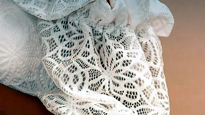
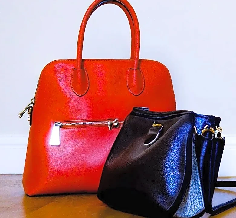
Even if two fabrics are made of the same fiber and colored with the exact same dye, their texture can make them look like different shades. Texture refers to the surface quality of a fabric and how it interacts with light. A smooth, shiny surface like satin or silk reflects light directly and evenly, making colors appear more intense, vibrant, and brighter. A matte or rough texture, like that of linen, tweed, or a chunky wool knit, scatters light in multiple directions. This diffusion of light softens the color, making it appear more subdued, muted, or even darker. A velvet garment is a perfect example; the color shifts as the pile moves because the angle of light reflection is constantly changing. This is why a navy velvet blazer can look drastically different from a navy cotton twill pant, even if they started in the same dye bath.
The Metamerism Mystery
Have you ever bought two items that matched perfectly in the store, only to find they clash in daylight? You've experienced metamerism. This phenomenon occurs when two colors appear identical under one light source but look different under another. This happens because the items are likely colored with different dye formulas, even if they are aiming for the same target shade. Different light sources—like fluorescent store lights, warm incandescent bulbs at home, and natural sunlight—have different spectral compositions. A color is simply the light that a surface reflects. If two fabrics have different dye makeups, their spectral reflectance curves are different. Under one type of light, these different curves might trick our eyes into seeing the same color. But when the light source changes, that illusion breaks, and the underlying differences in the dyes are revealed. This is especially common in garments that mix materials, like a jacket with a cotton body, polyester thread, and nylon trim.
Weave, Weight, and Blends
Beyond just fiber and texture, the construction of the fabric itself plays a role. The density of a weave can influence how color is perceived. A tightly woven fabric, like cotton satin, can make colors appear more saturated because the pigment sits concentrated on the surface. A looser weave or a thicker fabric might slightly darken the color. Blended fabrics present their own unique challenge. A common cotton-polyester blend, for instance, will often result in a 'heathered' look. The cotton fibers absorb the dye readily, while the polyester fibers resist it, creating a speckled, multi-toned effect. This is often an intentional design choice, but it highlights how difficult it is to achieve a flat, solid color when fibers with different properties are combined in a single yarn.