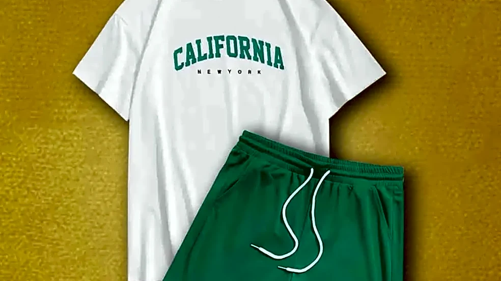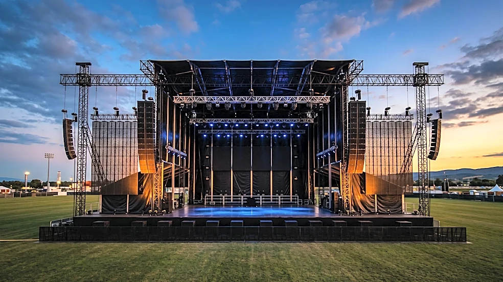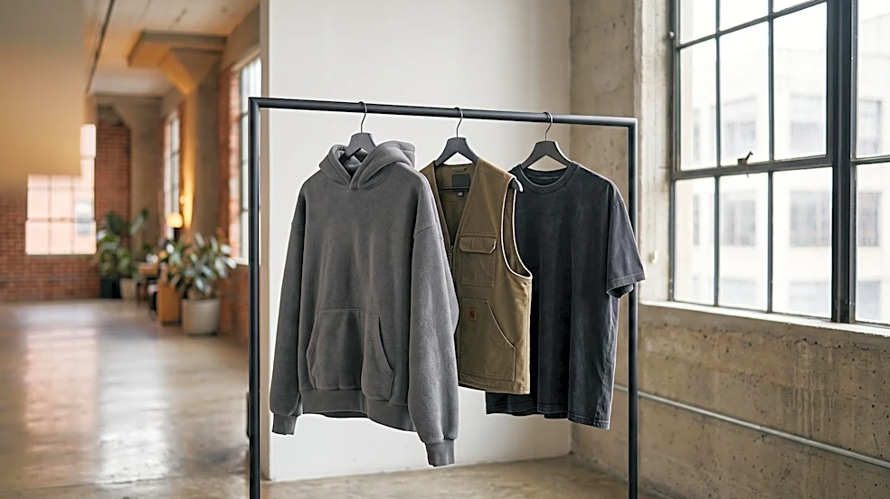





In the world of festival merchandise, Camp Flog Gnaw isn't just selling hoodies; it's offering entry into a universe. Curated by Tyler, the Creator, its visual style is a masterclass in brand-building that feels authentic, not corporate.
Build a World, Not Just a Brand
The magic of Camp
Flog Gnaw's aesthetic is its deep connection to the larger world of Tyler, the Creator. It’s not a standalone festival identity but an extension of his Golf Wang fashion line, which itself is a spoonerism of 'Wolf Gang' from his Odd Future days. This creates a cohesive universe where the merch, the music, and the artist's persona are all speaking the same visual language. The designs feel personal because they are part of a long-running narrative. For designers, the lesson is to think beyond a single logo or event. Create a collection of symbols, characters, and color palettes that can evolve over time, giving fans a rich world to invest in. It’s the difference between a t-shirt that says 'I was there' and one that says 'I belong here'.
Embrace Purposeful Imperfection
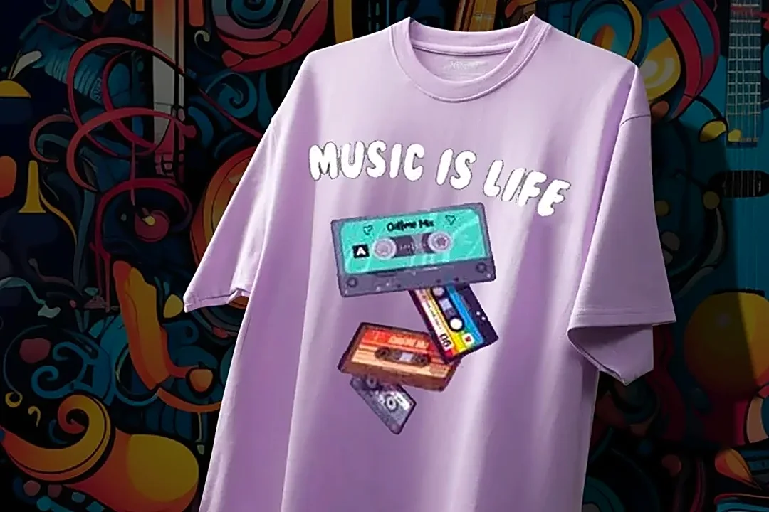
Camp Flog Gnaw’s visuals often reject clean, corporate slickness in favor of a style that feels more analog and human. The typography can be bubbly, distorted, or have a hand-drawn feel. The illustrations are playful and sometimes chaotic, drawing inspiration from vintage cartoons, skate culture, and a DIY zine aesthetic. This 'weirdness' is intentional and serves a crucial purpose: it makes the brand feel approachable and authentic, like it was made by a person, not a committee. Designers can learn to strategically introduce imperfections. Whether it's through slightly off-kilter graphics, nostalgic film-grain photo styles, or unconventional fonts, these choices can create an emotional connection that polished perfection often lacks.
Use Color as an Unmistakable Signature
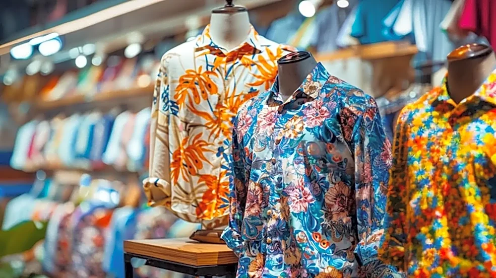
You know a piece of Camp Flog Gnaw or Golf Wang merch from a block away, and the primary reason is color. The brand is famous for its use of vibrant, often pastel-heavy color palettes that defy traditional streetwear norms. Soft pinks, baby blues, and mint greens are used as confidently as bold primary colors. This distinctive approach to color makes the items instantly recognizable and turns fans into walking billboards for the brand's unique sensibility. The takeaway for designers is to be deliberate and bold with color. Don't just pick colors that look good; pick colors that tell a story and create an identity. A unique color signature is one of the most powerful and immediate tools for brand recognition.
Turn Mascots Into Characters
The visual world of Camp Flog Gnaw is populated by recurring characters and motifs, from stylized bees to the distinctive 'Cherry Bomb' face. These aren't just static logos; they are characters with implied personality and attitude. They appear across different apparel items and festival branding, creating a sense of familiarity and inside knowledge for the fans. This transforms a simple graphic into a beloved mascot that people feel a connection to. Instead of just stamping a logo on a shirt, designers should consider developing characters that can represent the brand's spirit. A character can be playful, rebellious, or weird, allowing for more expressive and emotionally resonant designs.
Sell an Attitude of Playful Subversion
At its core, the festival's visual identity, curated by Tyler, the Creator, is designed to not take itself too seriously. There's a layer of humor, subversion, and joyful rebellion in the graphics. The designs often have a tongue-in-cheek quality, blending preppy staples like sweater vests with loud, unconventional patterns. This attitude gives fans permission to be bold, to clash colors, and to embrace a style that is uniquely their own. For designers, this is a reminder that merch can be more than just memorabilia; it can be a tool for self-expression. By infusing designs with a distinct attitude—be it humor, irreverence, or pure joy—you empower customers to wear their personality on their sleeve.