

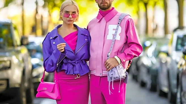
Fashion’s Unspoken Language
Before a single silhouette is praised or a fabric identified, the colors of a collection have already started telling a story. This isn't accidental; it's a deliberate use of color psychology, the study of how hues affect human emotion and behavior. Designers
are fluent in this unspoken language, using it to build a world and evoke specific feelings, from joy and passion to calm and introspection. A collection’s palette is its first handshake, setting the emotional tone before the intellect has time to process the details of the design. It’s the difference between a show that feels like a jolt of energy and one that feels like a quiet, contemplative poem.
The Fiery Impact of Red and Orange
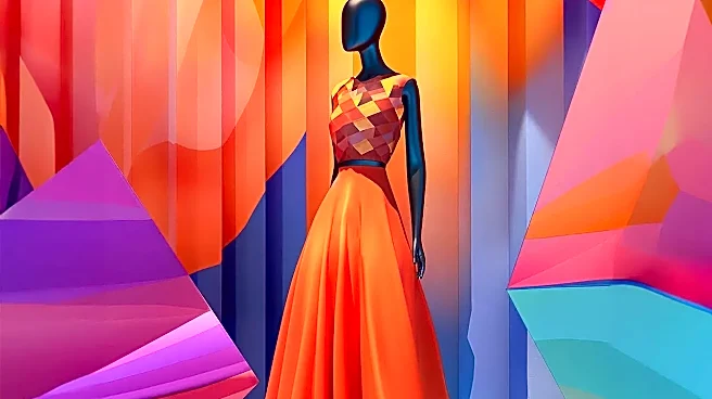
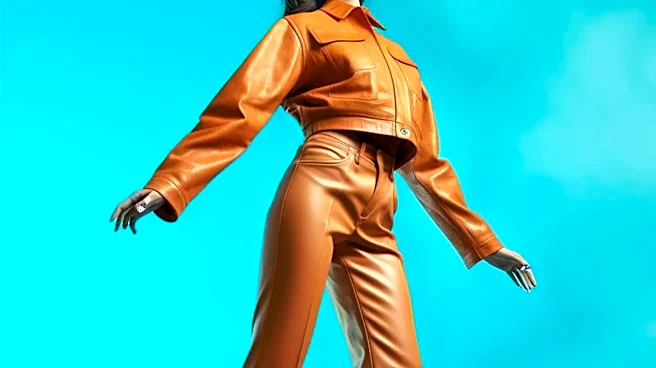
Few colors command attention like red. Associated with passion, power, energy, and even urgency, red is a tool for high-impact statements. A designer who sends a wave of crimson down the runway is signaling confidence and intensity. It’s a color that can quicken the pulse, making it perfect for a collection meant to feel bold, dramatic, and unapologetically present. Similarly, warm and enthusiastic orange evokes friendliness and creativity. In a London collection, you might see these shades used for standout evening wear or as a powerful accent in an otherwise neutral daytime look, designed to grab focus and project an aura of self-assurance.
The Cool Composure of Blues and Greens
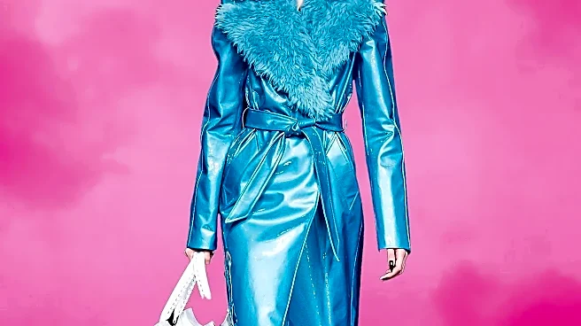
On the opposite end of the spectrum, cool tones like blue and green offer a sense of calm and stability. Blue is overwhelmingly linked to trust, serenity, and professionalism, which is why it’s a staple in business attire. In a high-fashion context, a collection dominated by blues might aim to convey a feeling of sophisticated, quiet confidence. Greens, tied to nature, harmony, and growth, can create a mood that feels restorative and balanced. For London Fashion Week, where heritage often meets innovation, a designer might use deep forest greens to evoke a sense of grounded tradition or lighter, airy blues to suggest a forward-thinking, tranquil modernism.
Optimism and Joy in Yellows and Pastels
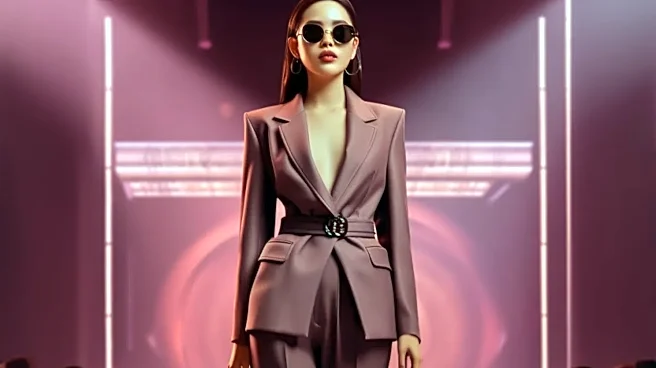
Yellow is the color of optimism, joy, and energy. It’s a difficult color to wear but powerful on the runway, often used in spring and summer collections to create a sense of fun and adventure. A designer deploying shades of yellow is likely crafting a narrative of happiness and vibrancy. This feeling of softness and light is shared by pastels. Muted shades like lavender, mint, and soft pink are often used to create a look that is delicate, feminine, and gentle. Recent LFW palettes have included these softer shades, balancing comfort and creativity to reflect a mood of fresh optimism.
The Power of Black, White, and Neutrals
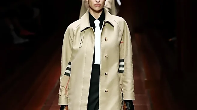
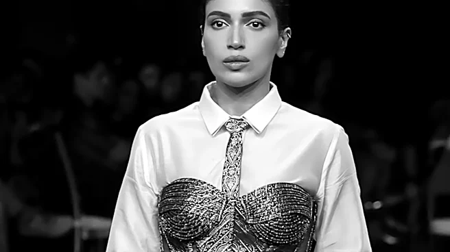
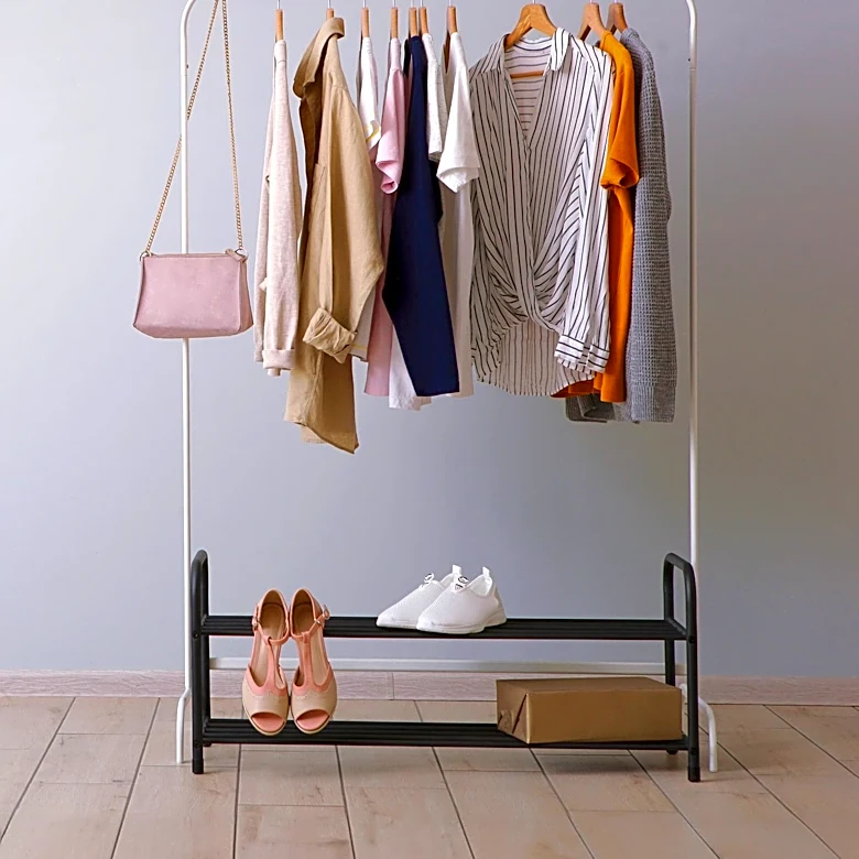
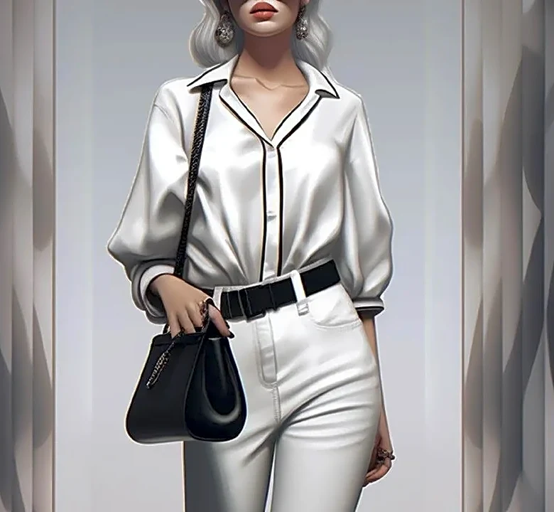
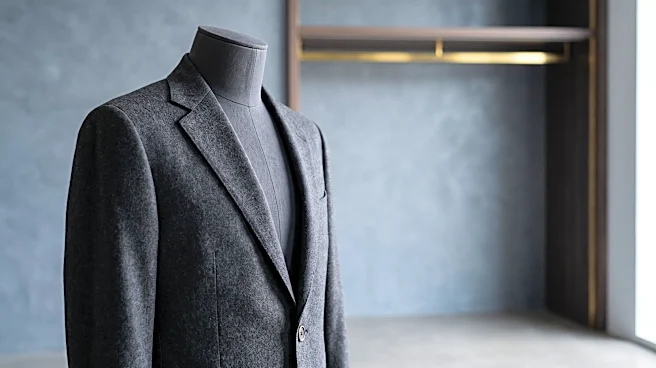
It’s a common misconception that neutrals are a passive choice. In reality, they are some of the most powerful tools in a designer's arsenal. Black is associated with sophistication, power, and mystery, while white can signal purity, minimalism, and new beginnings. The cultural context is key; in Western cultures, black is for formal elegance and mourning, while white is for weddings. An all-black collection can feel intensely dramatic and luxurious, while an all-white one can feel modern and almost architectural. Neutrals like beige, gray, and cream provide balance and are often used to make bolder colors pop or to create an entire mood of understated elegance and ease.