





A Palace of Glorious Decay
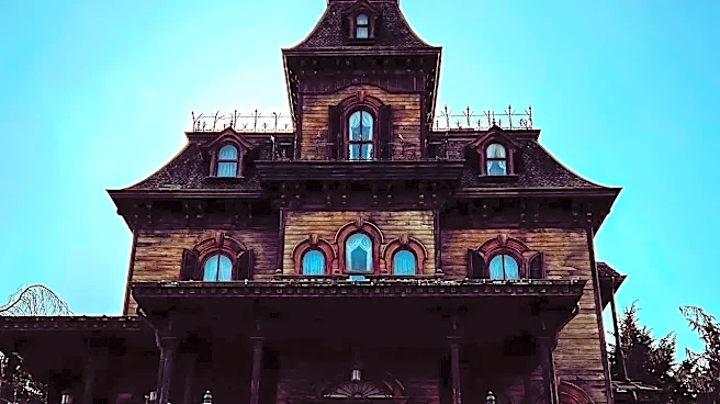
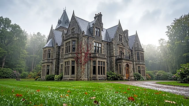
The primary setting of the show, the vampires’ Staten Island mansion, is more than just a spooky backdrop; it’s a physical manifestation of their characters. The design team, led for much of the series by production designers Kate Bunch and later Shayne
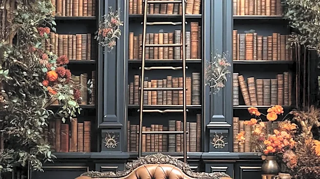
Fox, has meticulously crafted a world that feels both ancient and hilariously out of touch. The guiding principle isn't just to make it look like a vampire den, but to build a home for centuries-old beings who have stopped paying attention. The comedy doesn't come from the horror elements themselves, but from the juxtaposition of gothic grandeur with the residents' utter lack of taste and petty squabbles. The details tell the story: priceless tapestries hang next to smoke detectors, ancient relics are used as coat racks, and the overall vibe is one of magnificent, dusty neglect. It’s the perfect stage for immortal beings who still need to argue about whose turn it is to do the dishes (of blood).
Comedy in the Clutter
The show’s sharpest jokes are often hidden in plain sight, embedded in the set decoration. Shayne Fox, who moved from set decorator to production designer, has spoken about the exhaustive conversations that can go into a single lampshade. This attention to detail creates a dense visual language where every prop has the potential to be a punchline. Think of Laszlo’s topiary garden filled with vulvas from his past lovers, or the absurdly cursed witch’s-skin hat that nearly destroys Nandor. These aren’t just gags; they build character and lore. The team’s work is so effective because it feels authentic to the vampires themselves—a collection of mismatched, historically significant junk that reflects their long, chaotic, and often idiotic lives. The original film set a precedent for this scrappy, detail-oriented approach when co-creator Taika Waititi admitted to using discarded props from 'The Lord of the Rings' to flesh out their vampire world on a budget.
Gothic Meets Suburban Banal
Much of the show's humor derives from the vampires' clumsy attempts to navigate the modern world, and the production design brilliantly underscores this conflict. It’s in the clash of aesthetics that the comedy truly sings. When the vampires throw a Super Bowl party, the ancient, gothic hall is pathetically decorated with cheap streamers and a sad-looking snack table. When a room is renovated, it's not a simple construction job; the entire mansion might appear to be falling apart, with a giant tree crashing through the ceiling, only to be meticulously restored by the next episode. This constant tension between their grandiose, horror-infused environment and their failure to understand basic modern customs is a running visual joke. The house itself acts as the straight man, a serious, imposing horror set that makes the vampires’ suburban aspirations and domestic failures all the more pathetic and hilarious.
Designing for Idiots (With History)
The environment is also tailored to the individual personalities of its residents. Nadja and Laszlo’s bedroom is a reflection of their lustful, somewhat tacky romanticism, filled with opulent fabrics and dramatic furniture. Nandor’s room, by contrast, feels more spartan and vaguely militaristic, a nod to his past as a relentless pillager, but it’s also tinged with loneliness. And then there’s Guillermo’s room—for seasons, a tiny, cramped closet under the stairs, a perfect visual metaphor for his status as an overlooked, underappreciated familiar. As his character evolves, so do his surroundings. The design team uses these personal spaces to tell stories and land character-based jokes, reinforcing the core traits of each vampire without a single line of dialogue. Every design choice, from a custom-built piece of furniture to the selection of drapes, serves to deepen our understanding of these lovable morons.