
An Event in a Single Frame
It’s impossible to discuss the single-image summer movie poster without starting in 1975, the year a great white shark changed Hollywood forever. The poster for Jaws is a masterclass in minimalist terror:
a lone swimmer, an impossibly large predator rising from the depths, and one word. It doesn’t show the heroes or the bloody details; it sells a primal concept. This was the birth of the modern blockbuster, a film marketed not just as a movie, but as a cultural event. The poster had to communicate that scale. It had to be simple enough to be understood at a glance on a billboard but powerful enough to lodge itself in the public consciousness. It promised an experience, a visceral feeling that you couldn't get anywhere else. This approach set the template for the decades to come.
The Illustrated Ideal
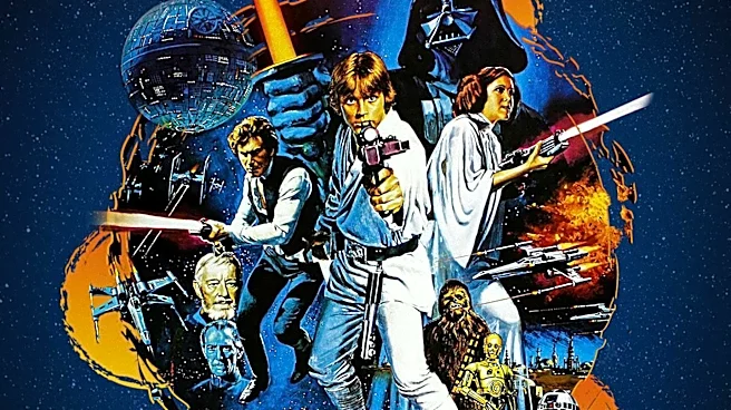
The golden age of the single-image poster, running from the mid-70s through the 80s, was dominated by illustrators, not photographers. Artists like Drew Struzan, Richard Amsel, and John Alvin became the unofficial visual storytellers for a generation of moviegoers. Their job wasn't to create a literal depiction of a scene, but to capture the film’s soul. John Alvin’s poster for E.T. the Extra-Terrestrial, for instance, famously depicts the touching of two fingers, a concept that became a globally recognized symbol of connection and wonder. These artists were known for creating an "Alvinesque" style, blending realism with a magical, often romanticized quality. The illustrated poster sold an idealized version of the movie, a promise of adventure, terror, or awe that the film itself would then have to live up to.
One Image to Rule Them All
From a marketing perspective, the single-image strategy was ruthlessly effective. In a pre-internet world, a poster was a campaign's most versatile weapon. That one iconic image had to work in a newspaper ad, on a bus stop, and looming over a theater lobby. A complex collage of faces and scenes would lose its impact when scaled down. A singular, bold concept, however, was instantly recognizable and memorable. It turned the film into a brand. Think of the ghost-in-a-no-smoking-sign for Ghostbusters or the silhouetted adventurers of Raiders of the Lost Ark. You didn't need to see the actors' faces to know what you were getting; the symbol was enough. This was about creating modern mythology, one unforgettable sheet of paper at a time.
The Rise of the Floating Heads
So, what happened? The shift began in the late 1990s and solidified in the 2000s with the rise of affordable photo editing software and shifting market demands. Studios realized it was cheaper and often easier to create posters by compositing photos of the cast, leading to the now-ubiquitous "floating heads" design. This approach served a different purpose: selling the cast first and the concept second. As star salaries ballooned, contractual obligations often dictated whose face was biggest and where it was placed. Furthermore, for a global market, a famous actor's face is a more universal selling point than a conceptual image that might require cultural translation. The result is a sea of similar posters, often using the same teal-and-orange color scheme for maximum visual contrast, that feel more like a cast list than an invitation to a unique world.