




The Myth of 'Effortless' Style
The single biggest hurdle for first-time beach-goers is the pressure to look “effortlessly chic.” We see images of perfectly styled vacationers and assume they just threw something on. In reality, that relaxed look is highly intentional. It’s a curated
performance of ease. This creates a confusing standard. You’re trying to look like you didn’t try, which is a mind-bending style goal. The result is often overpacking things that don't work together or defaulting to boring basics out of fear. The first step to success is admitting that “beach casual” is a specific dress code with its own set of considerations, not just an absence of formality.
Your Brain on Beach Lighting
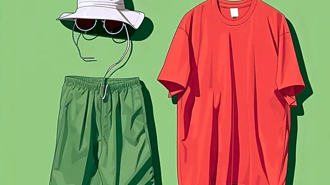
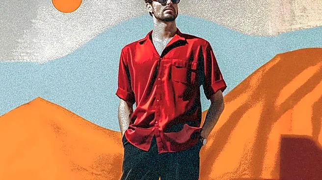
The second reason beach palettes are tricky is scientific: the light is completely different. The intense, direct sunlight on a coast drastically changes how colors appear to the human eye. A rich burgundy that looks sophisticated in the city can appear dull and heavy by the ocean. A subtle pastel might get completely washed out by the bright, reflective sand and water. Bright sunlight amplifies saturation, which can make some vibrant colors look brilliant, while others become garish. A shirt that looked like a perfect red indoors might suddenly appear orange in the bright sun. This isn’t your imagination; it’s color science, and it’s why an outfit that looked great in your bedroom mirror can feel “off” once you’re on the sand.
Breaking Free from the Color Traps
First-timers often fall into two color traps: the “tropical costume” or the “neutral-and-nothing-else” rut. The first involves leaning too hard on hibiscus prints and neon colors, which can feel less like you’re on vacation and more like you’re in a vacation-themed movie. The second is sticking to black, gray, or navy. While dark colors can be chic, they absorb more heat and can look harsh in bright daylight. A successful beach palette finds the middle ground—colors that complement the environment without mimicking it, and neutrals that feel light and airy rather than stark.
Solution: The Modern Beach Palette
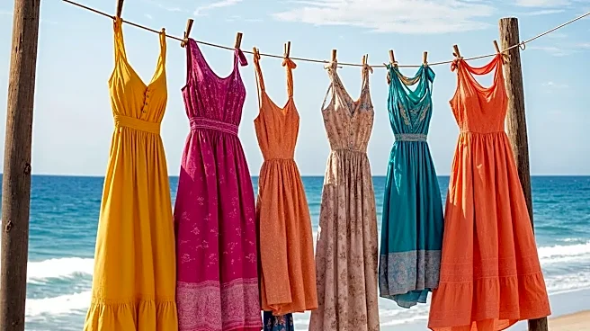
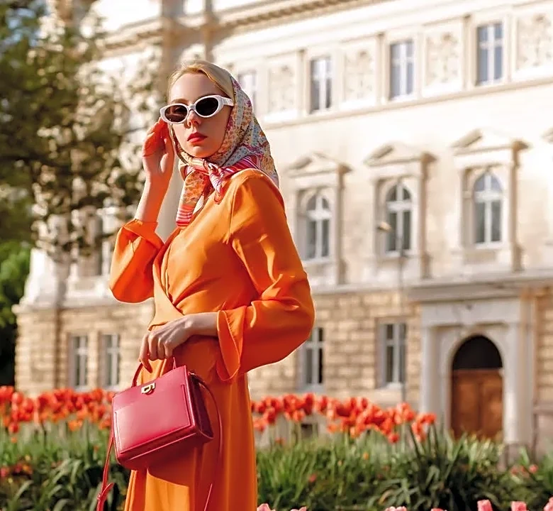
Instead of focusing on specific colors, think in terms of color stories. One of the most successful approaches is using the landscape as inspiration, but in a muted way. Think sandy beige, soft taupe, muted sage green, and warm terracotta. These earthy tones create a sophisticated, quiet-luxury look and pair beautifully with natural textures like linen and straw. Another strategy is to embrace sun-faded brights. Instead of a fire-engine red, choose a washed-out coral or a soft peach. These hues have the vibrancy of a bright color but feel softer and more integrated with the sunny environment. Crisp white and ivory are also foolproof choices, as they reflect light to keep you cool and make any skin tone appear more radiant.
Master the Art of the Accent
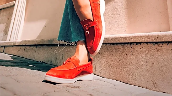
A simple way to build a versatile and stylish beach wardrobe is to create a neutral base and add pops of color with accessories. A foundation of cream, beige, or light grey pieces—like linen pants, simple tops, and cotton dresses—can be mixed and matched endlessly. The personality comes from the accents. This could be a vibrant coral tote bag, turquoise jewelry, or a brightly colored scarf tied to your hat. This approach is practical, as it allows you to pack fewer core clothing items while still creating multiple distinct looks. A single splash of a well-chosen bright color, like sunny yellow or fuchsia, against a neutral backdrop is often more visually striking than a head-to-toe bright outfit.