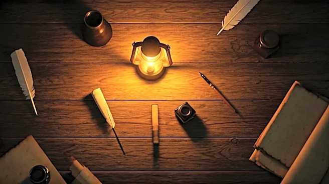


The Digital Paintbrush Called Color Grading
At its core, color grading is a post-production process where filmmakers digitally adjust the color of their footage. It’s the step that comes after color correction, which is about making the image look natural and consistent. Color grading, on the other
hand, is purely artistic. Think of it as a sophisticated version of the filters you use on your phone, but instead of a one-click fix, it's a meticulous process of altering contrast, saturation, and hue to create a specific visual mood. A colorist can isolate specific shades—the red of a soldier's coat, the yellow of candlelight—and change their intensity or tone to serve the story. This isn't just decoration; it's a powerful psychological tool that can make a scene feel warm and nostalgic, or cold and unsettling.
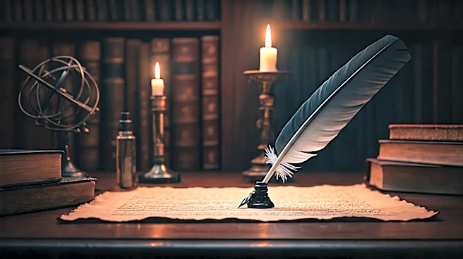
What Exactly Is 'Political Noir'?
The term "noir" probably brings to mind black-and-white detective films from the 1940s and '50s. Visually, it's defined by high-contrast lighting, deep shadows that seem to swallow the scenery, and a generally claustrophobic, urban feeling. Thematically, noir is steeped in cynicism, moral ambiguity, and a sense of paranoia. It’s a world of antiheroes, femme fatales, and conspiracies where no one is truly innocent. When you add "political" to the mix, the focus shifts from street-level crime to the shadowy corridors of power. It suggests that the levers of government and revolution are being pulled by compromised individuals in smoke-filled back rooms, driven by motives that are far from pure.
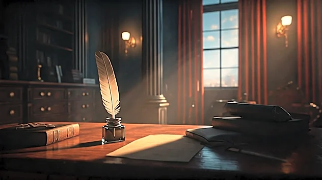
Trading Sunshine for Suspicion
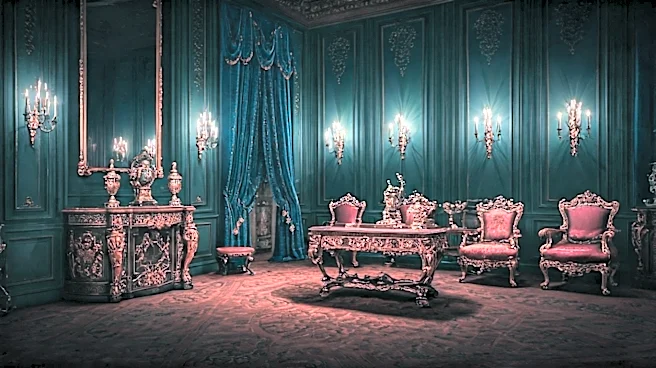
Modern television has embraced this aesthetic to reframe America's founding myths. Instead of presenting the revolution as a straightforward tale of liberty versus tyranny, shows are giving it a darker, more complex visual language. Take Apple TV+'s series Franklin, which chronicles Benjamin Franklin’s high-stakes diplomatic mission in France. The show's director, Tim Van Patten, cited Stanley Kubrick's Barry Lyndon—famous for its natural, candlelit look—as a visual inspiration. The result is a world of opulent but shadowy chateaus, where crucial conversations happen in rooms dominated by darkness. The color palette is often desaturated, leaning into cool blues and murky grays, making the 18th-century politics feel less like a history lesson and more like a tense spy thriller. Similarly, AMC's Turn: Washington's Spies used its visuals to underscore the dirty business of espionage. The series, focused on the Culper Ring of spies, often employed a gritty, de-saturated look that stripped the period of its usual pomp. The colors are frequently muted and earthy, reflecting the rural setting but also the grim, dangerous work of the spies. By bleeding the vibrancy from the frame, the showrunners emphasize the moral compromises and constant threat of death, turning familiar historical figures into characters in a high-stakes intelligence game.
Why Rewrite History in Shadows?
This artistic choice is about more than just looking cool and modern. It’s a deliberate narrative strategy. By adopting the visual language of noir, these shows tell the audience that this isn't the sanitized history from your school textbooks. This is history with the complexity, moral messiness, and psychological depth that modern audiences expect from their dramas. Draining the bright, patriotic colors and replacing them with a palette of suspicion makes the story feel more psychologically realistic and politically relevant. It reframes the Founding Fathers not as marble statues, but as flawed, ambitious people navigating a world of secrets, lies, and betrayals. It suggests that the birth of the nation was not an immaculate conception, but a complicated, often ugly, process—much like politics today. The noir aesthetic makes the 18th century feel less like a distant, unrelatable past and more like a direct ancestor to our own turbulent present.