



Color as a Cultural Mood Ring
Before a single swimsuit is stitched, its color has been decided—often years in advance. This isn't just about what looks good with a tan. Swimwear color palettes are a direct reflection of the global cultural mood. Think of it as a society-wide mood ring.
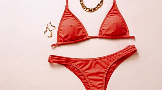
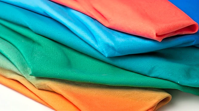
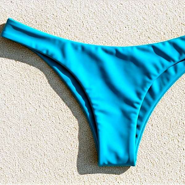
Are we feeling optimistic, adventurous, and ready to party? Expect to see racks flooded with “dopamine dressing” colors: vibrant oranges, hot pinks, and electric blues. These shades are designed to evoke joy and energy, a visual shot of caffeine for a world emerging from a collective slump. Conversely, if the global outlook is more uncertain or introspective, the color story shifts. Economic anxiety or a collective desire for calm and stability often ushers in palettes of muted, earthy tones. Think olive greens, sandy beiges, rich terracotta, and deep-sea blues. These colors feel grounding, safe, and connected to nature—a far cry from the look-at-me neons of a boom period. The swimwear section of your favorite department store is less a collection of clothes and more a snapshot of our collective psyche.
The Trend Forecasting Machine
So who decides we’re in a “terracotta mood”? This isn’t guesswork; it’s a multi-billion dollar industry led by trend forecasting agencies like WGSN (Worth Global Style Network) and Pantone. These companies act as fashion’s intelligence arm. Their analysts don't just look at runway shows; they dissect everything. They track shifts in art, technology, sociological trends, travel patterns, and even global politics. They synthesize this mountain of data to predict what consumers will want to feel, experience, and—most importantly—buy in 18 to 24 months. Their reports are the gospel for major brands and retailers. When they declare that “Apricot Crush” or “Digital Lavender” will be a key color, designers and buyers listen. They provide the foundational color story, complete with mood boards and psychological justifications, that will eventually trickle down to the bikini on the rack.
How Buyers Place Their Bets
A forecast is just a prediction. It’s the retail buyers who turn that prediction into a reality. Buyers for major brands—from Target to Net-a-Porter—take the broad themes from forecasters and make specific, high-stakes decisions. They don’t just pick one forecasted color; they build a curated collection around a story. They have to decide which version of “blue” will resonate with their specific customer. Is it a serene, spa-like powder blue for a wellness-focused brand? Or a bold, Mediterranean cobalt for a brand that sells the dream of a European holiday? Buyers analyze past sales data, but they also use their intuition. They are betting on which slice of the cultural mood their customers will want to buy into. A buyer for a youthful, fast-fashion brand might go all-in on a TikTok-driven neon green, while a buyer for a luxury resort wear line might opt for a timeless and sophisticated navy, accented with a trend-forward metallic.
Decoding This Season’s Palette
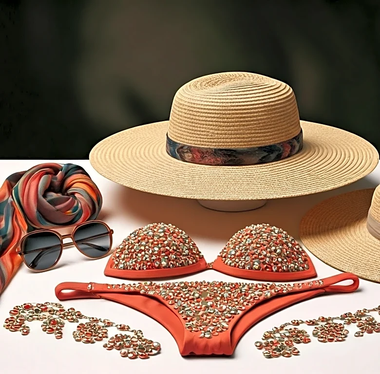
Right now, the swimwear world is telling a fascinatingly complex story. We’re seeing a split personality in the color aisles. On one hand, there's the continued dominance of rich, earthy neutrals. Chocolate brown, once a '70s throwback, is now a sophisticated staple, suggesting a desire for classic, long-lasting pieces. It feels chic, reliable, and a little bit luxurious. On the other hand, there’s an explosion of high-shine metallics and shimmery fabrics. Liquid-like golds, silvers, and bronzes are everywhere. This isn’t the subtle earthiness of brown; this is unapologetic glamour. It speaks to a post-pandemic desire to be seen, to celebrate, and to embrace a little bit of fantasy. The fact that both of these trends can coexist tells you everything you need to know: we crave both stability and escapism, and our swimwear choices reflect that.