





The Untouchable Classic: Brazil's Canary Yellow
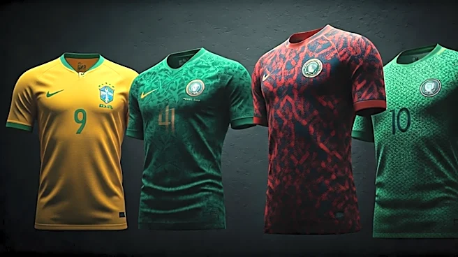
You can’t start a conversation about World Cup kits without paying homage to Brazil's iconic canary yellow jersey. It’s not just a shirt; it’s a symbol of joyous, attacking football—the joga bonito. Paired with blue shorts and white socks, the color combination is instantly recognizable from the furthest seat in the stadium. Adopted after the national trauma of losing the 1950 World Cup in their old white kits, the yellow jersey represents a complete rebirth. Its simple, sun-drenched design has barely changed in decades for a reason: you don’t mess with perfection. It’s the benchmark against which all other kits are measured, carrying the weight of five championships and the ghosts of Pelé, Ronaldo, and Ronaldinho.
The Graphic Game-Changer: West Germany, 1990
For a certain generation, this
is the soccer jersey. Adidas took the black, red, and gold of the German flag and shattered it into a dynamic, jagged graphic across the chest. It was bold, futuristic, and a radical departure from the simple, block-color designs that dominated the era. Worn during their triumphant campaign in Italy, the kit became synonymous with the power and efficiency of German football, but with a new, stylish edge. It was so influential that its DNA can be seen in countless designs that followed, proving that a great uniform can capture a specific moment in time and become eternally cool.
The Culture-Shifting Phenom: Nigeria, 2018
Few kits have transcended the sport like Nigeria's 2018 home shirt. Dubbed the "Naija" kit, it was a cultural phenomenon. The design—a vibrant lime green and white chevron pattern on the torso with black-and-white sleeves—was a nod to Nigeria's 1994 kit but reinterpreted with modern swagger. It broke from the boring templates and went all-in on national identity. The result? It sold out in minutes, with Nike receiving over three million pre-orders. It wasn't just a jersey; it was a statement of pride worn on the streets of Lagos, London, and New York. This kit proved that a bold, culturally specific design could have massive global appeal, redefining what a "risky" design could achieve.
The Unapologetic Signature: Croatia's Checkerboard
Some teams flirt with patterns; Croatia built its entire identity on one. The red-and-white checkerboard, or šahovnica, is taken directly from the country's coat of arms. On paper, a full checkerboard jersey sounds like a chaotic mess. In reality, it’s one of the most distinctive and memorable looks in international sports. Whether in their classic red-and-white home kit or the darker, moodier away versions, the pattern is non-negotiable. It’s a brave design choice that could have easily failed, but through consistent use and on-field success, particularly their stunning run to the 2018 final, it has become an undeniable classic. It's a risk that paid off spectacularly.
The Glorious Risk: USA's 1994 "Denim" Kit
Oh, this one. As hosts of the 1994 World Cup, the U.S. needed a kit that screamed "America!" The designers apparently decided that nothing says America in the '90s like faux-denim and wavy, abstract stars. The infamous "denim" away kit is either a work of avant-garde genius or a complete disaster, with no middle ground. It was loud, a little goofy, and completely unforgettable. While traditionalists scoffed, the kit perfectly captured the optimistic, slightly clueless energy of a nation falling in love with soccer. It was a risk, a big one, and it remains one of the most divisive and talked-about jerseys ever made. Love it or hate it, you can't ignore it.
The Artistic Triumph: Japan's Origami Crow, 2022
Japan consistently produces some of the most thoughtful and aesthetically pleasing kits, and their 2022 design was a masterclass in modern, meaningful design. The "Blue Lock"-inspired home shirt featured a subtle, complex graphic based on origami, with folded lines creating the image of a crow's wing—a nod to the three-legged crow, Yatagarasu, a symbol of guidance from Japanese mythology that also appears on the team's crest. It’s a design that rewards a closer look, blending ancient tradition with modern pop culture (the anime tie-in) and graphic design. It represents the perfect modern risk: deeply conceptual and culturally specific, yet undeniably sleek and beautiful.