




Drawing the Eye, Defining the Symbol
The original superhero costumes were designed with the limitations of four-color printing in mind, using bold, simple colors to pop off the cheap newsprint. But what works on a comic page doesn't always translate to the screen. A modern, more restrained
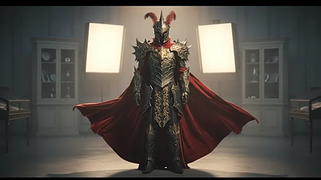
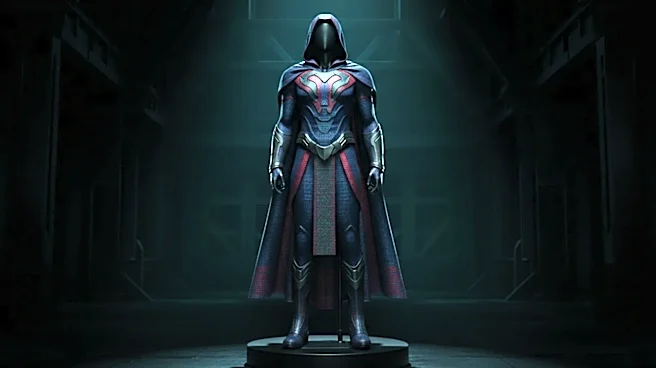
approach uses color not as a default, but as a weapon of focus. When a costume is largely monochromatic—think of the tactical, predominantly black suits of modern Batman or the X-Men's black leather—any color that is present becomes immensely more significant. A simple gray and black bat symbol on a chest plate doesn't just identify the hero; it becomes the focal point, a deliberate statement in an otherwise muted design. This selective use of color forces the viewer's eye to the most important elements, turning a costume into a clear, powerful piece of visual branding.
More Than Just 'Dark and Gritty'
It’s easy to dismiss the trend towards darker costumes as a simple shorthand for “realism” or a “gritty” tone. While it certainly helps establish a more serious mood, the choice is more nuanced than that. Compare the brilliant, optimistic blue and red of Christopher Reeve's Superman with the desaturated, almost metallic sheen of Henry Cavill's suit in "Man of Steel." Reeve’s colors screamed hope and unambiguous goodness. Cavill’s costume, with its muted tones and textured details, tells a different story: this is a powerful being struggling to find his place in a complex, cynical world. The color palette itself becomes a narrative tool, reflecting the internal and external conflicts of the character. It’s not just about making things look darker; it’s about making them feel more emotionally complex.
The Power of a Single Splash
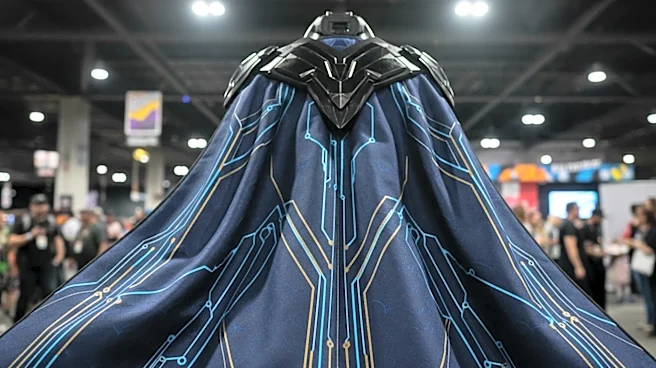
Perhaps the most dramatic effect of a restrained palette is how it amplifies a single splash of color. When a design is dominated by blacks, grays, or deep blues, one vibrant element can carry enormous symbolic weight. Consider the evolution of Daredevil's suit in the popular Netflix series. He spends most of the first season in a functional, all-black outfit. When he finally dons his iconic red suit, the color feels earned and significant—a representation of him fully embracing his identity. In a similar vein, the iconic red of Superman's cape has more visual impact when the rest of his suit is a deeper, less saturated blue. This technique, using color as an accent rather than a base, creates a visual exclamation point that is far more powerful than a costume drenched in competing hues.
From Four-Color Fun to Cinematic Realism
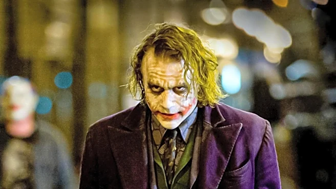
Ultimately, the shift towards more restrained color in superhero dressing is a story of adaptation. The bright, primary colors of the Golden and Silver Ages were perfect for grabbing a child’s attention on a spinner rack. They established a clear visual language: heroes wore bright, primary colors, while villains often wore secondary colors like green, purple, and orange. But as superheroes have become the dominant force in blockbuster cinema, the aesthetic has evolved to match audience expectations of realism and sophistication. A man in bright blue and yellow spandex might look powerful on a comic page, but on screen it can look out of place. Designers have found that by grounding costumes in darker, more tactical, and texturally complex palettes, they can make the fantastic feel more believable, creating heroes that look like they could exist in our own world.