


The Foundation: Miami's Chromatic Identity
You can't separate the fashion from the location, and Miami is a city built on a foundation of audacious color. From the pastel fantasies of the Art Deco Historic District to the saturated murals of Wynwood Walls, the city pulses with a visual energy
that most places can't match. This isn't the muted, serious palette of New York or the earthy tones of Los Angeles. Miami's native language is color. When designers descend for Swim Week, they are not introducing color to a blank canvas; they are amplifying a pre-existing dialogue. The brilliant sun acts as a natural spotlight, making turquoise waters look more electric and fuchsia bougainvillea more intense. This environment doesn't just tolerate bright colors; it demands them. A beige swimsuit would be whispering in a room where everyone else is shouting. By embracing this setting, designers tap into a powerful sense of place, immediately coding their collections with Miami's inherent vibrancy and joie de vivre.
The Vocabulary: Beyond Just 'Bright'
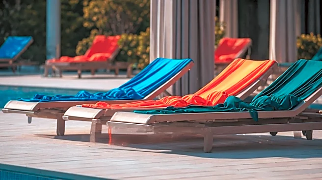
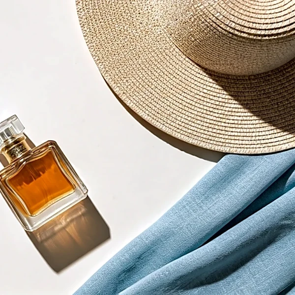
The luxury language spoken at Swim Week isn't just any bright color. It’s a highly specific and curated vocabulary. You won’t find the flat, garish shades of a discount store. Instead, you see a spectrum of sophisticated, saturated hues. There are the jewel tones: deep emeralds, rich sapphires, and regal amethyst, often rendered in shimmering fabrics that catch the light like polished gems. Then there are the electric neons—not the highlighter yellow of the '80s, but a refined chartreuse or a shocking pink used with surgical precision on a strap or panel. Most prevalent are the sun-drenched tropicals: mango, papaya, tangerine, and passionfruit. These are colors that evoke exoticism, travel, and leisure—the very essence of a luxury getaway. This careful selection elevates the color from merely being 'loud' to being 'expressive.' A tangerine-hued silk caftan doesn't just say, "Look at me"; it says, "I belong on a yacht in the Mediterranean."
The Grammar: Material, Cut, and Confidence
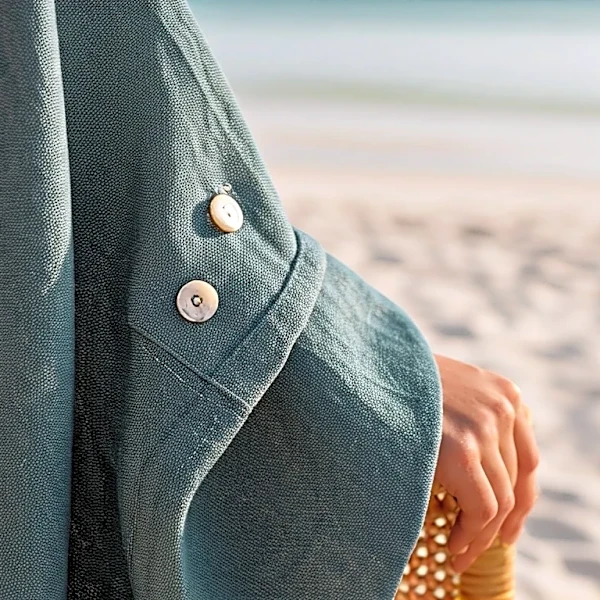
Color, no matter how beautiful, is just a word. To form a sentence, it needs grammar—and in fashion, that grammar is material, cut, and confidence. This is where the true alchemy of luxury happens. The same shade of electric blue looks entirely different on a cheap, flimsy polyester than it does on a high-tech Italian knit that sculpts the body, or a fluid silk chiffon that billows in the ocean breeze. Luxury swimwear brands invest heavily in fabric innovation, creating materials that are not only beautiful but also offer support, UV protection, and a second-skin feel. The cut is equally important. A boldly colored swimsuit with an architectural silhouette, a surprising cut-out, or intricate hand-beading communicates craftsmanship and design intent. It turns a simple piece of clothing into a statement. Finally, these pieces are worn with an unapologetic confidence that is, perhaps, the ultimate luxury. The message is one of comfort in one's own skin and the audacity to be seen.
The Meaning: Dopamine Dressing as Status
At its core, this language of color is about psychology. The trend of "dopamine dressing"—wearing bright clothes to improve one's mood—has a special resonance in the world of high-end resort wear. It's a visual shorthand for optimism, joy, and vitality. In a world fraught with anxieties, the ability to project pure, unadulterated happiness is a powerful status symbol. It signals that you are not just surviving but thriving. Choosing to wear a brilliant yellow bikini or a magenta one-piece is an act of defiance against the mundane. It says you have the leisure to escape, the means to invest in beauty, and the confidence to be the center of attention. This is why the colors of Miami Swim Week feel so luxurious: they aren't just selling swimwear; they're selling an aspirational feeling. They are bottling sunshine, confidence, and the dream of a life lived in full, glorious color.