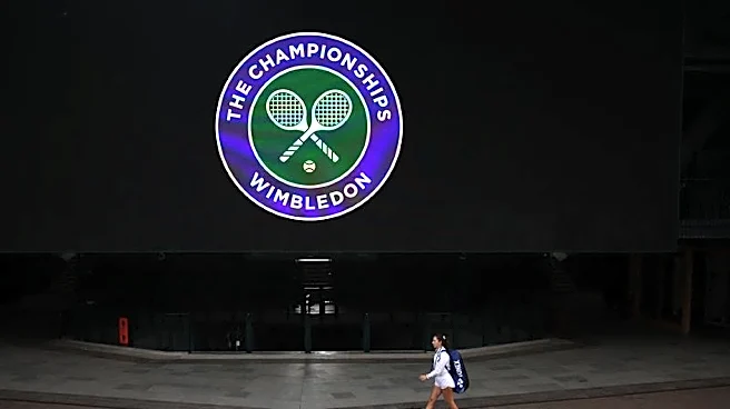


The Foundation of White
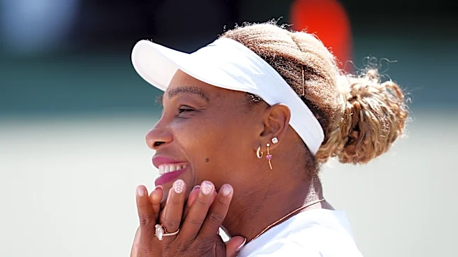
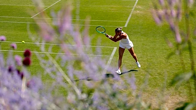
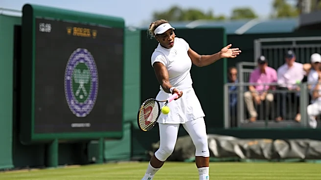
The story of Wimbledon’s style begins with a very Victorian problem: sweat. In the late 1800s, the sight of perspiration was considered uncouth, especially on women. Since tennis was a rare sport men and women could play together, social decorum was paramount.
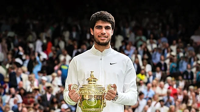
White clothing, it was decided, minimized the appearance of unsightly sweat patches far better than colored fabrics. This practical solution soon became an unwritten rule of good taste for the well-heeled players of the era. By 1963, this preference was codified into a "predominantly in white" rule, which has only grown stricter over the decades. Today, it serves as the pristine canvas upon which the entire Wimbledon brand is built, creating a powerful visual signature that is recognized globally.
The Official Colors of Prestige
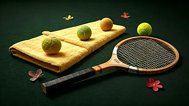
While players are bound to white, the tournament itself is defined by two other colors: a deep green and a regal purple. Adopted in 1909, this combination replaced a previous palette that was too similar to that of the Royal Marines. The new colors were chosen to signify prestige. Green is the most obvious nod to the tournament's unique identity as the only Grand Slam still played on grass courts. Purple has long been associated with royalty and luxury, reflecting the tournament's esteemed status in the sporting world. This duo appears on everything from the official logo and staff uniforms to the coveted player towels, creating a consistent and premium atmosphere throughout the grounds.
The 'Butter-Yellow' Accent
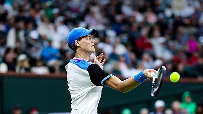
And then there’s the flash of yellow. This isn't an official brand color, but it’s an undeniable part of the visual landscape. The “pale butter-yellow” is, of course, the color of the tennis ball itself. Until 1986, Wimbledon stubbornly used traditional white balls. The switch to what’s technically called “optic yellow” was made purely for television viewers, as the brighter color was much easier to follow on screen. What began as a practical broadcast decision has since become the unofficial third accent in the Wimbledon palette. That bright, zipping sphere provides a constant, kinetic pop of color against the green court and white attire, completing a trio of colors that is now inseparable from the action.
The Ralph Lauren Capsule
This tightly controlled aesthetic found its perfect commercial partner in 2006 when Ralph Lauren became the first designer in Wimbledon's history to outfit all on-court officials. It was a match made in branding heaven. Ralph Lauren built its empire on aspirational, heritage-infused style—the very essence of Wimbledon's appeal. The brand doesn't just slap a logo on a uniform; it interprets the Wimbledon DNA. The navy, cream, green, and purple uniforms for umpires and ball persons are designed to be classic, elegant, and contemporary, reinforcing the tournament's premium feel. The partnership extends to a retail collection that allows fans to buy into the aesthetic. This isn't just merchandise; it's a curated “capsule collection” that offers a piece of the exclusive, timeless Wimbledon lifestyle.
A Masterclass in Branding
Wimbledon’s strict color code is its greatest marketing asset. In a world of loud, flashy sports kits, its minimalist approach creates an aura of exclusivity and timelessness. By tightly controlling its visual identity—from player attire to the color of the tennis ball and the designer of the officials' blazers—the tournament has transformed its traditions into a powerful global brand. It operates less like a sporting event and more like a luxury house, where heritage is the foundation, and every element is meticulously curated to reinforce a single, powerful idea of elegance. The result is a brand that feels both eternally classic and perpetually in style, proving that sometimes the most restrictive rules create the most enduring appeal.