




The Deceptive Simplicity of Neutrals
Bright, saturated colors are loud. A fire-engine red dress or a cobalt blue coat makes its own statement. Styling them is often a simple act of letting the color be the star and keeping everything else minimal. Muted colors, however, operate on a different
frequency. Shades like beige, taupe, olive, and dusty rose are defined by their low saturation—they're softer, quieter hues created by mixing a pure color with gray, black, or white. We assume their subtlety makes them easy to pair, but this quietness is exactly what makes them so demanding. Without the 'wow' factor of a vibrant hue, other details—undertone, texture, and silhouette—suddenly become much more important. An outfit of bright colors can get by on sheer chromatic energy; an outfit of muted colors needs to be built with more intention to avoid looking flat.
The Undertone Trap
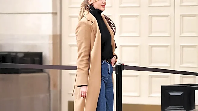
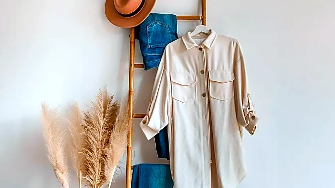
The single biggest reason muted color palettes fail is clashing undertones. Every color has a warm (yellow/peach), cool (blue/pink), or neutral base. With brights, these differences can be obvious. With muted colors, they are subtle and treacherous. A yellow-based khaki pant paired with a pink-based beige sweater can create a muddy, discordant effect that just feels 'off,' even if you can’t pinpoint why. Bright colors often work through contrast, but muted shades thrive on harmony. To succeed, you must group colors from the same undertone family. A cool, greyish taupe works beautifully with a dusty slate blue and charcoal because they share a cool base. A warm, creamy ivory sings next to camel and olive green because they all share a golden, earthy warmth. The trick is to identify your neutrals not just as 'beige' or 'gray,' but as 'warm beige' or 'cool gray.'
The Critical Role of Texture
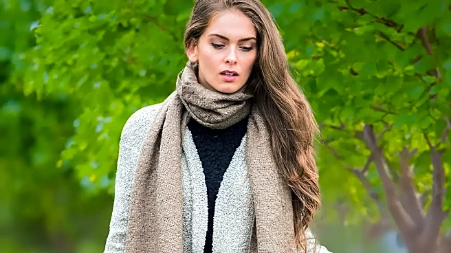
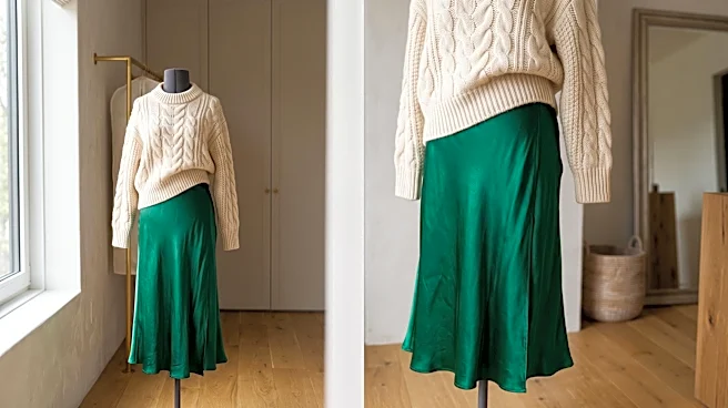
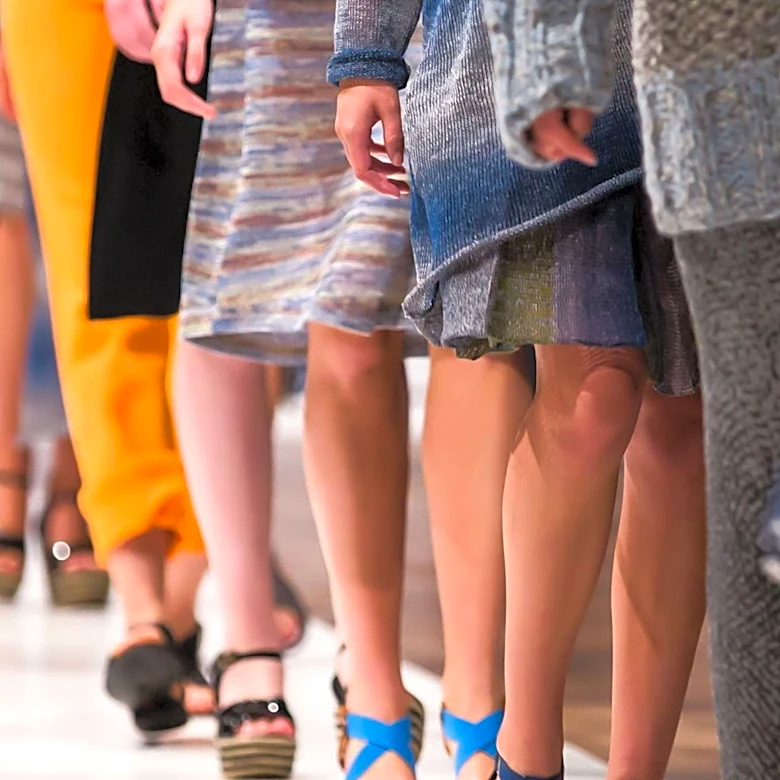
When color doesn't shout, texture has to speak. An outfit of flat, plain-weave fabrics in muted tones will almost always look one-dimensional and boring. This is where bright colors have an unfair advantage; their intensity creates visual interest on its own. Neutrals, however, need help. To make a muted palette feel rich and intentional, you must mix and match textures. Think of pairing a chunky knit sweater with sleek leather pants, a smooth silk camisole under a structured linen blazer, or a soft cashmere sweater with crisp denim. Each material catches the light differently, creating depth and contrast that prevent the colors from blending into a single, uninteresting block. An all-cream outfit can look incredibly luxurious, but only if it involves a variety of surfaces—perhaps a ribbed knit, a smooth satin, and a soft suede.
Fit and Silhouette Become Everything
Vibrant colors can draw the eye and create focal points, sometimes disguising a less-than-perfect fit. Muted colors offer no such distraction. When your palette is understated, the cut and shape of your garments are thrown into sharp relief. Proportions become paramount. A boxy, ill-fitting sweater in a dull brown looks frumpy, but the same sweater in a shocking pink might be perceived as an intentional, avant-garde statement. With neutrals, the focus shifts to tailoring and silhouette. Ensuring your pants have the right break, your jacket fits perfectly in the shoulders, and your layers create a pleasing overall shape is non-negotiable. An outfit built on strong silhouettes—like a well-tailored blazer, wide-leg trousers, and a simple top—looks powerful and chic in a muted palette because the quality of the design is allowed to shine through.