





The Primal Power of Red
Before it ever touches a player’s kit, primary red comes loaded with psychological meaning. It's a color that speaks a universal, primal language of energy, dominance, and warning. Studies in sports psychology have consistently shown a correlation between
wearing red and a perceived edge in competition. Research has indicated that athletes in red are often seen as more aggressive and dominant, which can subtly intimidate an opponent before the first serve is even struck. This isn't just a learned association; it's tied to biological responses, like the reddening of the face in anger, signaling aggression and readiness for conflict. In a game of inches and split-second decisions like tennis, harnessing this built-in psychological power can offer a tangible, if subconscious, advantage. A player wearing red isn't just making a fashion statement; they're broadcasting intent and tapping into a deep-seated human response to the most activating color in the spectrum.
A Complicated History on the Court
Tennis wasn’t always a riot of color. For much of its history, the sport was defined by a strict, all-white dress code, a symbol of purity and status that also conveniently masked perspiration. This tradition, most famously upheld at Wimbledon, meant that bold colors like red were absent from the court for decades. The introduction of color began slowly, gaining momentum in the latter half of the 20th century as television broadcasts sought more visually engaging players and outfits. Still, red's entry was complicated. Unlike the calming blues or the fresh greens that felt like a natural fit for the court, red was loud and rebellious. Players who embraced it, like the Williams sisters with their daring red-and-black lace designs, were often making a statement that went beyond fashion, challenging the sport's conservative roots. This history has left primary red in a unique position: it's a classic, powerful color, yet one that still carries a faint echo of defiance against tennis tradition.
The Strategic Impact of the Accent
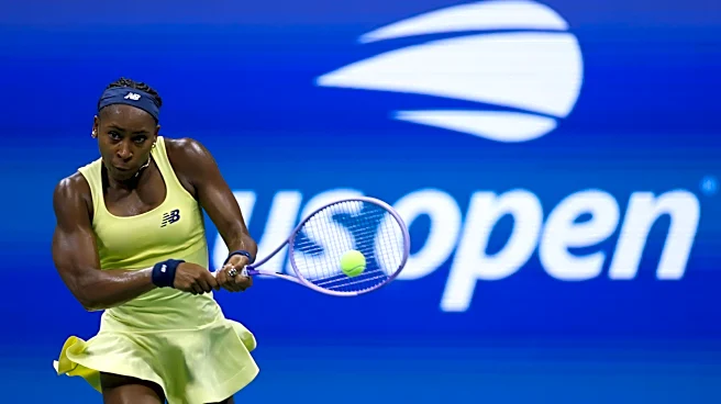
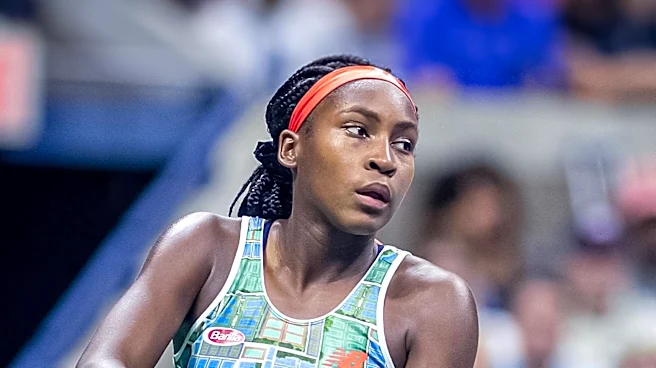
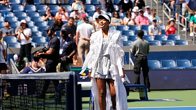
While a full head-to-toe red outfit can be effective, the true genius often lies in the accent. A flash of red on a shoe, a wristband, or the trim of a collar can be more potent than a monochrome look. The human eye is naturally drawn to points of high contrast, and a sharp red detail on an otherwise neutral uniform creates a powerful focal point. It says everything about confidence without shouting. This is where the "overlooked" aspect of the headline comes into play. In an age where players like Naomi Osaka and Coco Gauff have embraced bold, full-color kits, the subtle power of a single, searing red accent can be forgotten. An accent allows a player to leverage the psychological weight of red—its energy, its aggression—in a controlled, targeted way. It’s a sniper rifle, not a cannon. It’s the visual equivalent of a sudden, sharp crosscourt winner that appears out of nowhere, drawing all attention and asserting dominance with surgical precision.
Overlooked in a Sea of Modern Hues
Today’s tennis fashion is a vibrant landscape of custom kits, featuring everything from soft pastels to electric neons and intricate patterns. In this context, a simple, primary red can feel almost too traditional, too basic. Brands and players are constantly seeking the next new thing, and a foundational color like red can be passed over in favor of more complex or trendy shades. Yet this is precisely why it remains such a strong choice. While neons and patterns follow trends, primary red is timeless. It doesn't rely on novelty for its impact. Its power is inherent. When a player steps onto the court with a sharp red accent, it cuts through the noise of fleeting fashion. It’s a statement of classic confidence, a nod to the color’s enduring psychological power rather than a bow to the season’s latest palette. It’s a choice that says the player’s game—not their outfit—is the main event, but that they’re still bringing the fire.