






The Hidden Language of Color
Before we dive into this season’s premieres, let's talk about what color grading actually is. It’s not the same as color correction, which is about fixing technical issues to make footage look natural and consistent. Think of correction as cleaning the canvas.
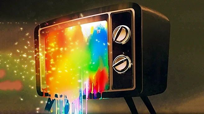
Color grading is the actual painting. It’s a post-production process where artists digitally tweak the hue, saturation, and contrast of every shot to create a specific, unified visual identity. A colorist can make a scene feel warm and nostalgic, cold and clinical, or vibrant and otherworldly. This process is one of the most powerful, if invisible, tools in a filmmaker's kit for setting a mood and telling a story without a single word of dialogue.
The Palette of the 'Real' World
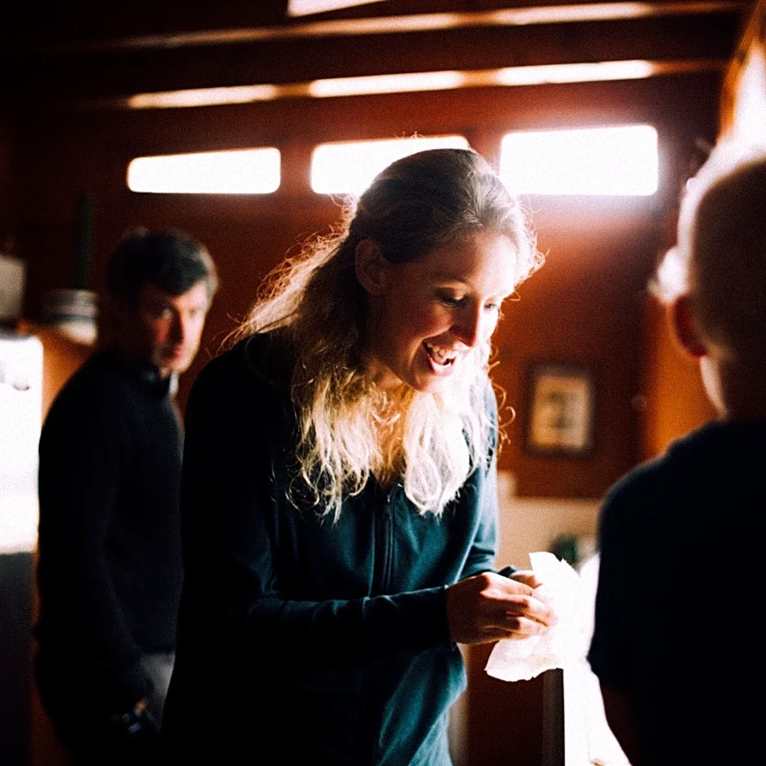
When a show wants to ground you in a believable, everyday reality, its color palette often mimics the real world—or a slightly heightened version of it. Naturalistic grading aims for balance and accuracy, with subtle enhancements that make colors feel authentic. Think of a family drama's warm, inviting kitchen or the neutral, functional look of a workplace sitcom like 'Black-ish', where the goal is to create a relatable environment. However, 'reality' is a flexible term. The gritty, desaturated look of a police procedural establishes a 'real world' that feels dangerous and somber, while the bright, high-contrast colors of a reality TV show are designed to make everything pop, creating a hyper-real, attention-grabbing world. The key is that this baseline color scheme becomes the visual truth of the story, the world we accept as normal before things get weird.
Coloring Outside Reality's Lines
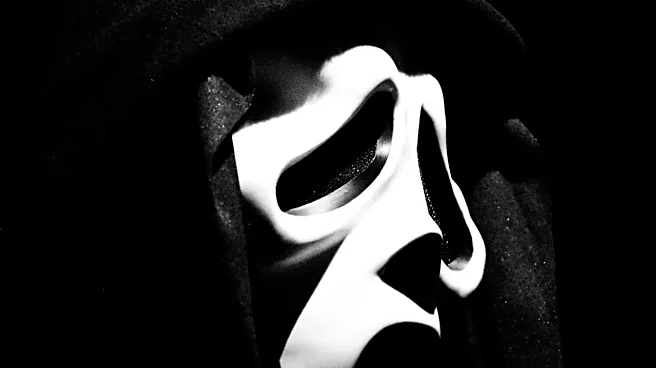
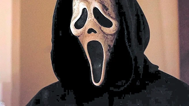
This is where October's genre premieres really get to play. Fantasy, horror, and sci-fi often use distinct color palettes to signal a departure from the ordinary. This spooky season, a series like Mike Flanagan's 'Carrie' adaptation is likely to use its grade to heighten dread, perhaps starting with a normal suburban look that curdles into something more sinister as her powers emerge. Horror often leans on high contrast and desaturated colors to create tension. A show like 'VisionQuest', following the eerie White Vision, might use a sterile, monochromatic palette to emphasize his synthetic nature and existential crisis, contrasting sharply with the warmer, more human tones of other MCU projects. Fantasy can go in many directions: the upcoming 'Avatar: Seven Havens' could use vibrant, otherworldly color schemes to build its magical world, just as 'The Wizard of Oz' once used the shift from sepia to Technicolor to signify Dorothy's journey.
When Worlds and Colors Collide
The most interesting use of color grading is when a show forces different palettes to coexist or blend. This technique is perfect for stories that question the nature of reality itself. A series like the sci-fi horror show 'From', which traps its characters in a mysterious town, can use color to differentiate between the seemingly normal town by day and the terrifying world that emerges at night. Color shifts can also signal a character's changing psychological state. A descent into madness might be shown by the world's colors slowly draining away, or a flashback can be instantly identified by a switch to a nostalgic, golden-hour glow. In these shows, color isn't just setting a scene; it's an active participant in the plot, guiding the audience's understanding of what's real, what's a memory, and what's a threat.