


The One Simple Rule
Before we get to the glorious chaos, let's start with the simple, functional reason goalkeepers dress differently. According to the Laws of the Game maintained by the International Football Association Board (IFAB), each goalkeeper must wear colors that
distinguish them from the other players and the match officials. It’s a practical rule designed to help the referee instantly identify the one player on the field who is allowed to handle the ball in their own penalty area. In a crowded, chaotic box during a corner kick, the ref needs a clear, unambiguous visual cue. This prevents confusion over handballs and ensures the game flows correctly. While outfield players on opposing teams wear contrasting kits, the goalie is an exception within their own team—a lone wolf by decree.
The Freedom of the Outsider
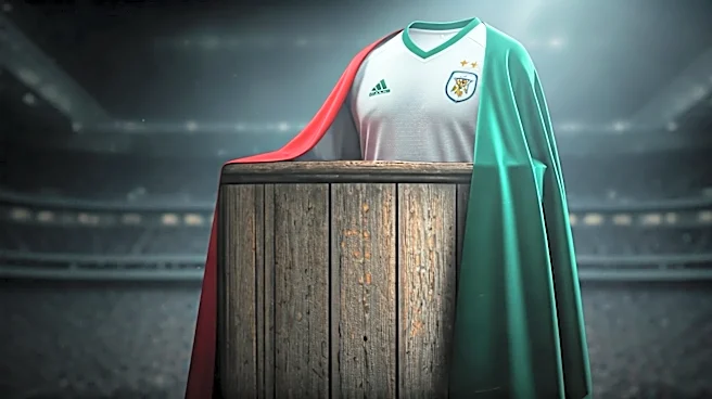
But that simple rule doesn't explain *why* the designs get so wild. The answer lies in the psychology of the position itself. Goalkeepers are specialists, operating under a different set of rules and pressures. They are the last line of defense and the first line of attack. They experience the game in isolated bursts of high-stakes action, separated from the fluid back-and-forth of their teammates. This unique status grants them a kind of sartorial freedom. While outfield kits are sacred, tied to national flags and club heritage, the goalie jersey has no such constraints. It exists in its own aesthetic universe, free to become a canvas for personality, aggression, and pure, unadulterated fun. It’s a visual representation of the keeper’s maverick role.
The Patron Saint of Psychedelia
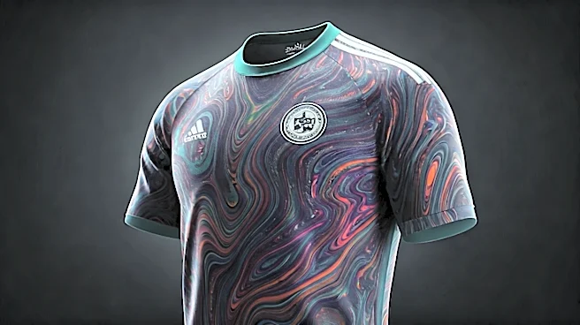
You can't talk about weird goalie jerseys without talking about the 1990s and the undisputed king of chaotic kits: Jorge Campos. The Mexican national team keeper was a phenomenon, not just for his acrobatic saves and occasional forays upfield as a striker, but for the astonishingly bright, baggy, and bizarre jerseys he wore—many of which he designed himself. Inspired by the surfing culture of Acapulco, his kits were a fever dream of neon pinks, highlighter yellows, and jagged geometric patterns. Campos wasn’t just following a trend; he *was* the trend. He turned the goalkeeper jersey from a simple differentiator into a statement piece, a work of performance art. He embodied the idea that if you have to stand out, you might as well be unforgettable. His influence is so profound that any brightly colored, abstract goalie kit today owes him a debt of gratitude.
From Distraction to Brand Statement
For decades, a popular theory held that loud jerseys served a tactical purpose: to distract an onrushing striker. A flash of garish color in the shooter’s peripheral vision might make the goal seem smaller or the keeper larger, causing a split-second hesitation. While the science on this is debated, the psychological impact is undeniable. However, the modern goalkeeper jersey has evolved beyond just potential distraction. Today, it’s also a powerful branding tool. Unique keeper kits are highly marketable, and top players like Alisson Becker or Manuel Neuer often have their own signature colorways that sell out quickly. The designs are still wild—think gradients, pixelated graphics, and abstract patterns—but they are now focus-grouped and market-tested. The weirdness has been professionalized, turning what was once a personal quirk into a commercial asset, proving that the spirit of Jorge Campos lives on, albeit with a modern, corporate twist.