



There’s a quiet frustration every sewer knows: a beautifully constructed garment undermined by wobbly, amateur-looking topstitching. Before you blame an unsteady hand, consider the thread itself. The secret to a professional finish is surprisingly simple.
The Goal: Crisp, Deliberate Stitches
Topstitching is the signature on your work. It’s the set of visible stitches on the outside of a garment that can define a collar, secure a pocket, or add structural flair to a jeans yoke. When it’s good, it looks clean, sharp, and intentional, elevating the entire piece from 'homemade' to 'hand-finished'. But when it’s slightly off—a little shaky, a bit too stark, or uneven—it can distract from an otherwise flawless project. Many sewers focus on stitch length, needle type, or speed, and while those are important, they often overlook the most critical decision: the thread color.
The Common Mistake: The Perfect Match
Intuition tells us to find a thread that perfectly matches our fabric. You hold the spool against the cloth, squinting to see if it disappears. This seems logical, but it’s often the source of the problem. An exactly matched thread, especially on solid-colored fabric, sits on the surface and highlights every tiny imperfection. Because it offers no contrast at all, any slight waver in your stitch line is magnified. The light catches the texture of the thread against the identical texture of the fabric, creating a subtle but visible disruption that reads as a mistake rather than a design choice.
The Real Secret: Choose One Shade Darker
Here is the hidden rule that professionals follow: for inconspicuous topstitching that looks intentional, choose a thread color that is one to two shades darker than your fabric. This choice might seem counterintuitive. Won't it be more visible? The answer is no, due to a simple trick of the eye. A slightly darker thread recedes visually. It creates the illusion of a subtle shadow in the groove of the stitch, causing the stitch line to look more integrated into the fabric itself. Instead of a line sitting on top of the material, it looks like a clean, crisp crease in the material. This effect masterfully hides miniscule wobbles and inconsistencies in your sewing, fooling the eye into seeing a perfectly straight line.
When to Use Contrast Thread
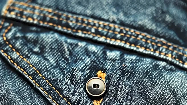
Of course, sometimes the goal is for the topstitching to stand out. Think of the classic gold thread on blue denim. In these cases, you are intentionally using a contrasting color as a decorative element. This is a bold design choice, and it works because the contrast is so high that the stitching becomes a feature in its own right. The 'one shade darker' rule is for situations where topstitching is primarily functional—tacking down a facing, reinforcing a seam, or finishing a collar—and you want it to look polished and integrated, not decorative and loud. For a high-contrast look, you also typically use a heavier topstitching thread to ensure the line is bold and consistent.
Putting It Into Practice
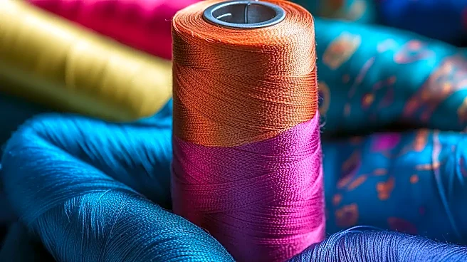
To select the right darker shade, take a scrap of your fabric to the store. Unwind a few inches of a few potential thread colors and lay them across your fabric. Don't just hold the spool against it. Look for a thread that doesn't scream for attention but also doesn't completely vanish. It should offer just enough depth to define the stitch. Also, remember to always use regular, all-purpose thread in your bobbin, even when using heavier topstitching thread for the needle; this is crucial for maintaining proper tension and preventing nests of thread on the underside of your fabric. Combining the right color with a slightly longer stitch length (3.0 to 3.5mm) is the ultimate formula for a professional look.