


The Prom Tuxedo Problem
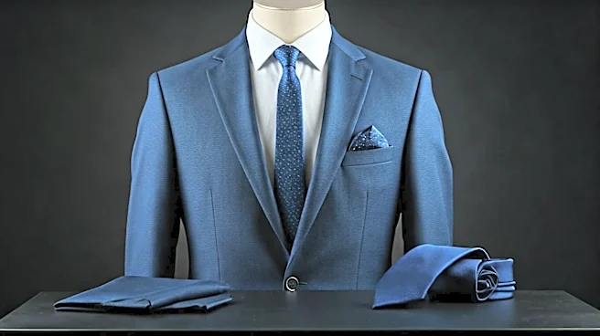
Remember your high school prom? You went to a department store, and they handed you a vest, tie, and maybe a pocket square, all made from the exact same shiny, polyester satin. The color was 'Malibu Blue' or 'Fuchsia Fury,' and the goal was to perfectly
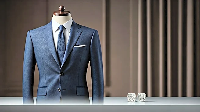
match your date's dress. It's a look that screams 'rented' and 'first time wearing a suit.' When a multi-million-dollar NBA prospect does the same thing—perfectly matching their tie, liner, and pocket square in the same fabric and hue—it triggers that same stylistic alarm bell. It looks pre-packaged and juvenile. An expensive, bespoke suit suddenly feels like a kit. True style is about making deliberate choices, not buying the all-in-one combo pack. The goal is to look like you own the suit, not like the suit owns you.
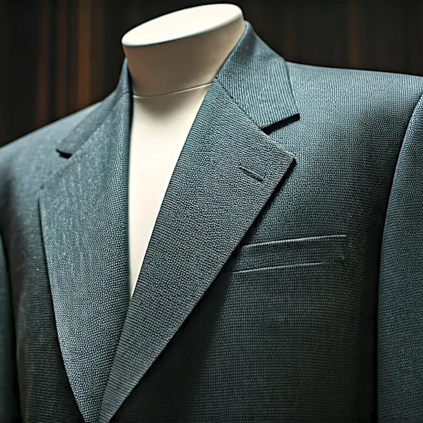
It Kills Texture and Depth
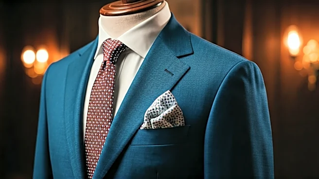
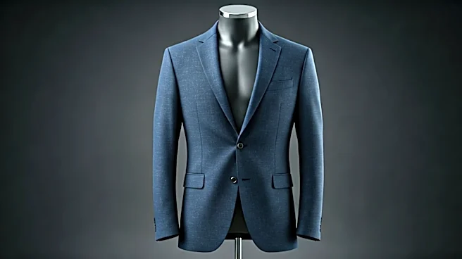
A great outfit has dimension. It’s a conversation between different textures, sheens, and materials. A wool suit has a matte finish, a silk tie has a subtle luster, and a linen pocket square has a rough, organic feel. These contrasts are what make a look visually interesting. When every accessory is cut from the same bolt of shiny fabric, that dimension vanishes. The eye has nowhere to go. The entire look becomes a single, monotonous block of color, which ironically makes an expensive suit look cheaper. Think of it like a painting: a master uses different brushstrokes and shades to create depth. A flat, single-color canvas is just… a colored canvas. Players who opt for a burgundy suit with a burgundy satin tie and a burgundy satin pocket square are effectively erasing all the nuance that makes tailoring special.
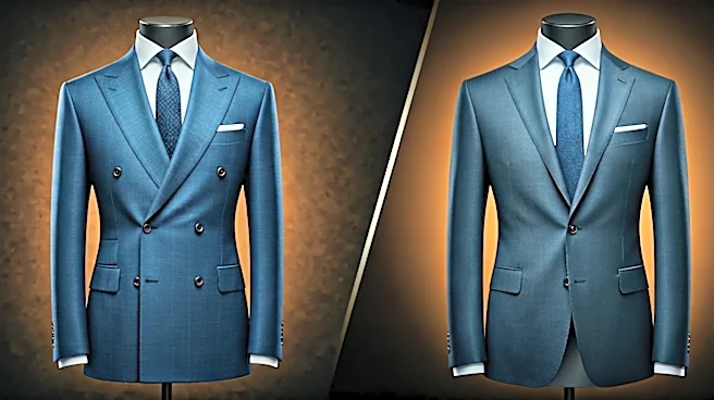
Embrace Coordination, Not Duplication
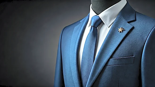
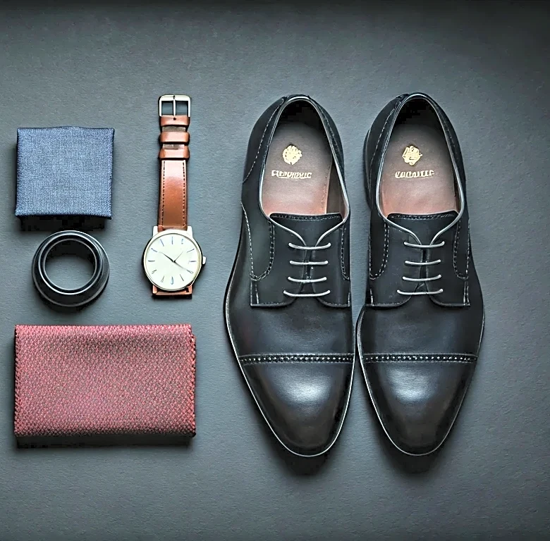
The antidote to being too matchy isn't chaos; it's coordination. This is the secret style vets know well. Instead of matching a color exactly, you find colors that complement or harmonize with it. Wearing a navy suit? Instead of a navy tie, try one in a burnt orange (a complementary color) or a lighter shade of blue with a pattern that includes a hint of another color. A pocket square shouldn't be a clone of the tie. It should pick up a secondary color from the tie, the shirt, or even your socks. For example, if your tie has a small gold detail, a pocket square with a gold pattern or a simple cream-colored linen square works beautifully. It shows you’re thinking about the entire outfit as a composition. This is where personal style emerges—in the thoughtful pairing of items, not the lazy duplication of them.
Confidence Comes From Contrast
Ultimately, draft night is a player's introduction to the world as a professional. Their outfit is their first statement. A perfectly matched, one-note look can read as timid, as if the player (or their stylist) was afraid to make a wrong move and opted for the safest choice possible. But GMs aren't looking for timid players. They want confidence, creativity, and a bit of an edge. An outfit that expertly mixes patterns, textures, and complementary colors projects exactly that. It says, 'I understand the rules, and I know how to bend them to my advantage.' It’s a sign of sartorial intelligence. A player like Shai Gilgeous-Alexander has become a style icon because he understands this implicitly. His looks are daring and cohesive, but rarely do you see him in a simple, one-to-one match. His confidence on the court is mirrored by his confidence in his closet.