



More Than Just a Pretty Hue
When a designer sends a collection down the runway, every color choice is deliberate. It’s a calculated decision designed to evoke a specific feeling, tell a story, or tap into the cultural zeitgeist. This is the core of color psychology in fashion: the idea
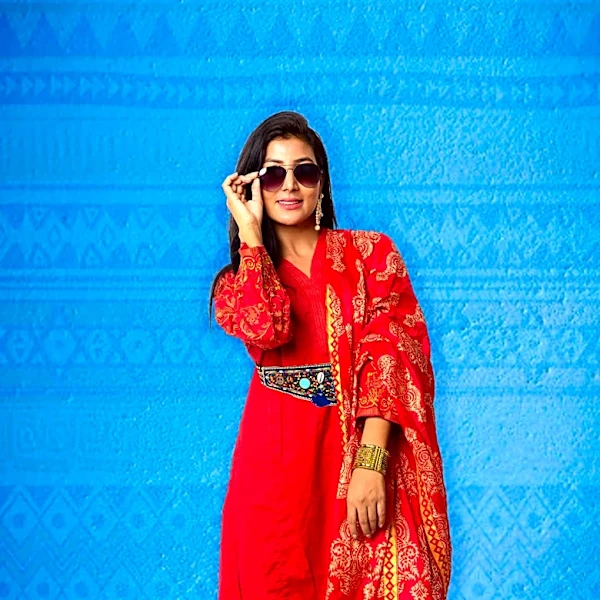
that hues can influence our moods, perceptions, and behaviors. A fiery red dress isn't just red; it's communicating power, passion, and confidence. A sea of calm blues might suggest stability and trust, which is why it's a perennial favorite in business attire. Designers aren't just dressing bodies; they're crafting emotional experiences, and color is their primary medium.
This Season's Emotional Palette
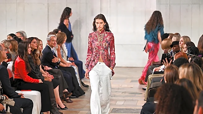
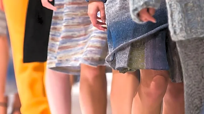
The Spring/Summer 2027 shows unfolding this week in New York offer a fascinating study in emotional direction. Forecasters are pointing to a palette that holds two distinct energies in tension: one rooted in warm, earthy tones and another in cool, digitally-inspired brights. We're seeing warm neutrals like terracotta, sand beige, and coffee brown, which suggest a collective desire for grounding, comfort, and authenticity. These aren't just background shades; they are being presented as primary colors that feel reliable and sophisticated. At the same time, vibrant, almost electric shades like what color authority Coloro has dubbed "Luminous Blue" are making a splash. This deep cobalt has a timeless authority but with a futuristic, tech-forward energy, suggesting a mood of confident optimism and innovation.
A Palette Is a Narrative
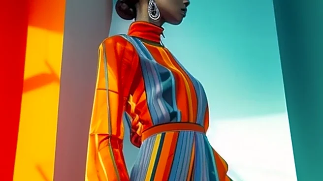
Individual colors are only one part of the equation. The real artistry emerges in how designers combine them. A monochromatic collection, using different shades of a single color, can create a powerful, immersive mood, whether it's the serene feeling of an all-white lineup or the bold optimism of a head-to-toe pink show. In contrast, using complementary colors—those opposite each other on the color wheel, like red and green—creates high-energy friction and visual excitement. For the Spring/Summer 2027 season, the story is about balance. Designers are pairing the season's earthy neutrals with pops of synthetic brights, creating a conversation between the natural and the artificial. This interplay between a grounded terracotta and a vibrant teal, for example, tells a more complex story about our interconnected world—one that values both heritage and innovation.
Color, Culture, and You
Runway colors are never chosen in a vacuum. They are a reflection of the wider cultural mood. The current focus on earthy, reliable neutrals speaks to a world craving stability and a connection to nature. Simultaneously, the injection of luminous, energetic brights reflects a persistent sense of optimism and a forward-looking embrace of technology and the future. By understanding the 'why' behind these trends, you can start to see fashion not as a set of rules, but as a language. A designer uses a palette to express an idea, and we, in turn, use color to express our own identity and mood. The colors you gravitate towards in your own closet are part of your personal story—a way to communicate who you are without saying a word.